Vogue Italia August 2018 : Madonna by Mert Alas & Marcus Piggott

To me this screams US Vogue and not Vogue Italia.
 
I actually like the whole thing. It’s classic and almost cliché Madonna but hey, we got classic Kate, Naomi, Gisele and even from the younger models...
So at least, a singer who does her aesthetic well rather than models who are Always giving the same type of stuff is welcome.
 
The reason why she's getting so much flak over her public image is because, as the Madonna-quins rightly rant, she's got complete autonomy to do as she please. And as with most things in life, that can be both a gift and a curse. If you've made a career out of reinventing yourself every 5 or so years, don't be shocked when others point out when you're stuck in a state of regressive stasis.
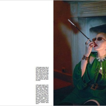
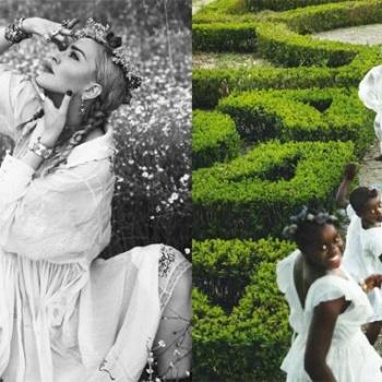
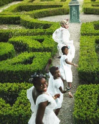
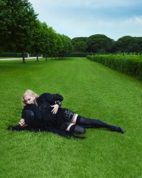
Also, she's surrounded by a team of yes-men. Supposed 'stylists' and 'photographers' who simply kowtow to every demand regardless of how stale, disjointed and overrated it may be. There's a huge disconnect with these images, and not even in a cool soft/hard light/dark kind of way. The shot of her and the girls running through the garden, the one with the buggy, these show a romantic side to her which I probably saw last when Testino shot her and Lourdes for Vanity Fair. A full edit only with that would've been refreshing for her. Then you have the rest of your usual fetishised Madonna x M&M/L&I gaudiness with a heady dose of photoshopping, of course. Who's still asking for that?

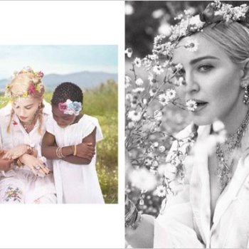
I always find these high-profile celebrity family pictorials very interesting because in many cases it shows just how carefully people craft their image and what message they're trying to send. It's an PR exercise after all, so the message they're trying to send is always intriguing. In this case, how the kids are styled (vaguely late 1800s), the activities, her positioning in the family pics, it's all very.......interesting. I'll just leave it at that.

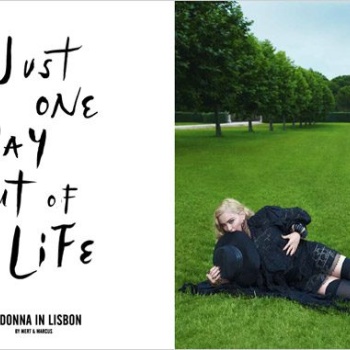
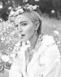
Anyway, there's one screen-cap showing a profile shot, with flowers covering half of her face. That would've been perfect for the 2nd cover instead.
 
Last edited:
The Lisbon angle would've made much more sense for Vogue Portugal, but something tells me that the Portuguese editors are on a brighter track than that. The fact that celebrities are now even dictating creative decisions for - once heroic titles such as VI - says everything about the state of fashion in the social age. -_-
 
Love the full editorial!
Some truly beautiful images.
That green dress shot is wonderful!
Will definitely be getting both covers.:heart:
 
I was a major Madonna fan throughout the 80’s and 90’s but she bores me now. Anyway, regarding the cover, I’d like to see something different from her. We’ve seen these images hundreds of times.

Who does she appeal to nowadays?

I’ve adored her for most of my life, and for the most part, she’s been a fascinating teacher. Her brutally honest— and brave admission of her impression of her fans 1993 Oct US Vogue, that “they’re not the brightest bunch” and that if she had one thing to say to them— it would be “strike out on your own. Do your own thing. Think for yourself.”. I’m paraphrasing, of course. But that sort of statement to her fans was the most impressive advice I ever took from her. And it’s by those standards that I have hold her to since then. Unfortunately, she has nothing interesting to say anymore, nevermind anything anything interesting, visually. All these shoots and looks of the last decade are nothing more than retreads of her past glories. The only imagery that are solid and fresh here are the ones of her on the lawn and the Voguing ones— and even the Voguing one is just her… Voguing… Everything else is a mishmash of looks and references I’m already familiar with. ZZzzzzzzz….

Her politics are so embarrassingly standard liberal arts-student 101 these days. And her worldview is that of the pampered, privileged superstar who is convinced that “love” will conquer all… :sigh: For the rest of us commoners way way way down toiling away below the stainless steel Art Deco tower of Metropolis, things aren’t as simple: She’s literally become that character in her “Express Yourself” video, rather than the shrewdly- observant, daring culture-chameleon, stunningly stylish urchin, and streetwise gamin I adored. Look up her interviews of the Erotica/SEX and Bedtime Stories era, and she was impossibly clever, rawly insightful and deftly defiant.

She’s still Madonna and I can appreciate her for that. Just not that Madonna that was a mentor anymore (sadly, she's more like the desperately-seeking-to-be-down-with-the-kidz aunt I'm rolling my eyes at-- affectionately... LOL...)
 
As we predicted in the Cover Rumor thread: Madonna dressed in black lace, lots of jewelry, chains and a hat. If someone held a gun to my head I'd pick the grass cover, but there is nothing to see here really.

AHAHAHAHAHHAH love your phrase with the gun ahaha :rofl: but yeah I KNEW the styling would be exactly like that and I KNEW because it would be Mert and Marcus that a horse would be there ahahaha :clap: but yeah the first cover had potential but there is no creative director so the picture lacks a lot of elements and the layout is bad. The second cover is like a cliché of what Vogue Italia once ever was... :doh:
 
Her brutally honest— and brave admission of her impression of her fans 1993 Oct US Vogue, that “they’re not the brightest bunch” and that if she had one thing to say to them— it would be “strike out on your own. Do your own thing. Think for yourself.”

She said that!?! Well, well, well. Maybe she should say it again for the newer crop of fans who very often seem to succumb to '10 Things I like about Madonna' rants. But I fear they'll still not desert her.

Modern Madonna is exasperating because I know there's more to her than this.

Btw, third allusion to Fritz Lang's silent masterpiece which shaped cinema since it's release. I'm rather impressed, actually.
 
The Lisbon angle would've made much more sense for Vogue Portugal, but something tells me that the Portuguese editors are on a brighter track than that. The fact that celebrities are now even dictating creative decisions for - once heroic titles such as VI - says everything about the state of fashion in the social age. -_-

I think If Madonna suggested at the Vogue PT office that a picture of her pretending to play the “cavaquinho” was in the order of the day they would have a collective heart attack.
 
Just today I was lurking a certain forum and I saw someone use a Metropolis gif of that same exact moment Phuel just described, I really dig that reference.
 
I love the fact that they chose to go with her considering that one of her iconic albums, Ray of Light, turns 20 this year. However, I wish she were styled differently. It's Madonna and she's known for being a chameleon, which means that the possibility is limitless for her. I wouldn't even mind a reinterpretation of her Ray of Light album cover because that idea, to me, is a lot more interesting than what Farneti and M&M offered here. And also, what's with the hideous layout? Can't Fashion Editors develop a better taste for fonts and layout anymore these days?
 
No other editorials in this issue? :unsure:
 
I expect nothing from VI anymore... this is ok, I guess :ermm:
 
Large covers


Large editorial images


instagram.com/vogueitalia
 
^ lmao I love how she rides and plays with horses, plays in a bar, plays with little kids in a flower field, and yaddaw yadda and it’s just “one day out of her life”

are there previews to other eds?
 

my screenshot on vogue.it

Currently their website is like madonna.com lol.
 
Just saw it now, looks like the work of an overzealous teen stan! Laughable.
 

Users who are viewing this thread

New Posts

Forum Statistics

Threads
210,721
Messages
15,125,046
Members
84,420
Latest member
paulpaul
Back
Top
monitoring_string = "058526dd2635cb6818386bfd373b82a4"
<-- Admiral -->