
- Joined
- Dec 25, 2009
- Messages
- 8,527
- Reaction score
- 12
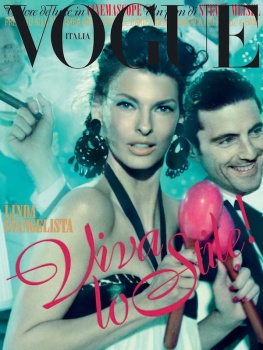
vogue.itLet’s mambo. A radiant Linda Evangelista is the face of this story dancing to the rhythms of the past and glam atmospheres. In sync the make-up, with Even Better Makeup SPF 15, neutral, a foundation cream that makes the complexion uniform, endowing maximum luminosity. On the cheekbones, the light nuance of Fresh Bloom Allover Color, posy, while the gaze is emphasized by the intense and defined stroke of Quickliner for Eyes, charcoal, and by High Lengths Mascara, black. The finishing touch? The Chubby Stick, super strawberry, pink on lips. All by Clinique.
Long cotton dress with contrasting leather sash top, Tod’s. Chandelier earrings, Kenneth Jay Lane. For him: suit Giorgio Armani. Hair Oribe using Oribe Hair Care. Make-up Pat McGrath. Manicure Jin Soon Choi for Jin Soon Natural Hand & Foot Spa. Fashion editor Carlyne Cerf de Dudzeele.
Last edited by a moderator:

 I can't even pinpoint what it is, it's just not a nice cover. Maybe it's the messy layout or the overwhelming covers... or that cheesy smile of the man with the cigar in the background.