Xenforo Cloud will be upgrading us to version 2.3.5 on March 12th at 12 AM GMT. This version has increased stability and fixes several bugs. We expect downtime for the duration of the update.
i know, it is kind of difficult because Linda and Meisel are known for their iconic collaborations but this definitely falls short... really disappointed... but at the same time it is good to try new things even if they don't work sometimes...
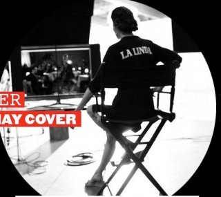
Linda's face looks really weird.
The last covers for VI have not been good imo, even the one with Laura which I thought was good at the beginning.
Maybe VI should for once let a other photographer shoot the cover like VP, VUK and VUS do.
What is this mess? Linda's face looks off and the editing is horrible. It looks like it's edited by some 15 year old who just discovered the coloring tools in Photoshop.
Personally I don't mind the general overall look of the cover, but there is no question that Linda looks quite odd. Strange expression.
The Meisel/Evangelista team have done iconic and memorable work......especially for this magazine and this is well below par, for them.
Having said that, from the gif of Linda dancing, I have high hopes for the editorial, so fingers crossed it turns into the treat, that I'm sure most folks are hoping for.
Though I agree with other members its a strange choice for the cover, Im always excited to see Linda and am still looking foward to see the Meisel/Evangelista collaboration inside.
This is bad and sad, Meisel and Evangelista were a magical combination... in the 1990s. This cover is the equivalent of seeing a performance from a musical act from a previous era and realizing that they can't vocalize and dance as well as they did back in the day. The gifs are cute and hopefully the ed will be better, but I am recalling the hot mess that was haute mess, nevertheless I am going to be keep my fingers crossed.
The best this thing about the cover image is the guy on the side, kinda like that other cover a few months ago with the woman in the red dress.
Love the GIFS and really excited for the inside editorial, but I am going to join the majority and say the preview shot for this cover is really not flattering for Linda. I absolutely love the concept, but not sure why Franca Sozzani would put the final stamp of approval on this particular photo choice for the cover. But I really need to see a bigger HQ version before casting final judgement.
The cover is not good.
But it could be easily corrected because the concept is great.
What I would do:
-Put Linda smilling - that would change it all, her expression is so strange.
-Take the "movie credits" under VI logo - its doing nothing there
-Change the colors - A softer version with hot colors would look much better with this theme
I always look forward to Vogue Italia's supermodel covers, for some reason I expected the cover to turnout bad but it isn't. Linda looks great thanks to photoshop. I'm liking the cool colour tones and yes it is a bit on the cheesy side. Nonetheless I'm looking forward to viewing the main editorial going on the previews so far.
i don't like how the male model is in it as well, but i love this otherwise the background is very cool like how the text is behind it as well! lovely colours
This site uses cookies to help personalise content, tailor your experience and to keep you logged in if you register.
By continuing to use this site, you are consenting to our use of cookies.

 .
. - vogue.it