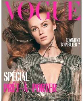
Right? I don't like it when covers are suffocated with headlines but one or two more would have worked wonders here. Otherwise it's a beautiful cover and Givenchy hasn't looked this eye-catching in a while.
They've finally done her justice! This should've been her debut cover, not that nightmarish Venice one a while back.
As a festive cover? Perfection. I don't think it's very suited to March.
I'm unsure how to feel about that cover. I certainly don't like that garish pink font.
At first sight, the image looks dated, and not for the best. Maybe because of the sepia lookalike filter? But I'm happy for Rianne and she makes it work.
This site uses cookies to help personalise content, tailor your experience and to keep you logged in if you register.
By continuing to use this site, you are consenting to our use of cookies.