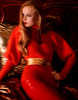
Indeed scary, reminds me of those evil clowns. Also very fake background merging with Rianne. I'm sorry for her. It catches your eye but not in a good way.
I gasped when I read the title. I was excited to see Rianne van Rompaey! But when I opened the thread, I quickly lost my enthusiasm. What is this? Wrong pose, wrong make up, wrong frame, fake background, that dizzy pink font...
i do not understand why people are criticising the background as "fake", actually that type of movie set artificial quality, with the colours pushed to the maximum, is one of the beauties of photographing in Italy in sunny days. Just add flash or any sort of illumination and that person's skin colour will defuse light in a way that the photograph will look more like a beautiful collage.
I was really excited to see this cover after reading the title because I was expecting similar to this editorial of Rianne for Vogue Paris by I&V
(From fashioneditorials)
But I don't like this cover, the make-up is too heavy, she almost looks like a scary clown, the pose is uncomfortable to look at on a cover and the text is so bad for me.
I would have used a different font for the line Mode a Venise and I would have placed it down, not near the Vogue Logo because those two big texts look bad together.. And I don't understand why they made the logo red. I'm sorry but this one of the ugliest covers I have ever seen.
So sorry for Rianne, her first Vogue Paris cover and she deserves much better than this
This site uses cookies to help personalise content, tailor your experience and to keep you logged in if you register.
By continuing to use this site, you are consenting to our use of cookies.