W September 2010 : Hollywood's New It Girls by Inez & Vinoodh

I adore that shot of Ginta leaning against the wall with half the path in shadow, it's such a wonderful shot.

I love seeing M&M revert back their familiar style of photography, and colour effects in that editorial is breathtaking.
 
Lara by Mert & Mercus is everywhere in this year's September issues, but she haven't gotten any covers so far.
 
some of the best editorial content i've ever seen in my life.
 
The editorial by M&M took time to grow on me. I think having some slightly newer, less experienced models like Kirsi and Ginta worked for the editorial as they sort of work themselves into their environments without overpowering the incredibly beautiful colours of a summer's day sky or a vivid yellow school bus, not to mention the best styling from Alex in ages (I really love the LV jacket over the Nina Ricci bustier over the CK top).
 
In the Cut HQs
Ph: Knoepfel & Indlekofer
Styling: David Vandewal
Models: Hanne Gaby Odiele, Jacquelyn Jablonski, Julija Steponaviciute


My Scans
 
Love In the Cut! I don't usually like black&white editorials but this one is really good. Thanks for the scans, behansu. Karma is going your way.
 
This is my favorite thing in the entire magazine. I think this story is just so beautiful, poignant and heartbreaking, especially for fans of Louise, so I thought it should be shared.

Louise's Last Year
Ph: Alex Van Gelder


My Scans
 
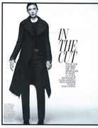
I'm not fond of the use of black and white when an editorial just boils down to displaying clothes, I think it doesn't do them justice. Nevertheless it works here because it fits the whole minimalist vibe and brings the cut and texture of the pieces chosen out (I particularly like the seventh shot for that matter..)

As for Ginta and Kirsi's editorial, it must be the most pleasant W story I've seen in months, visual-wise. There's no denying Mert & Marcus excel at the use of saturated colors but I also admire how these help create an atmosphere and drag you in to it (when looking at the sixth picture it seems like I can actually feel the heat portrayed.)
 
In the Cut is awesome! Simple & Beautiful. Very Richard Avedon. :heart:
 
I got this issue over the weekend and I'm very pleased with the direction the magazine is taking. The editorials were good and there were actual features for once! :lol:
Except I didn't get the point in including all the new "it" girls if the article pretty much focused on Jennifer Lawrence with a few quotes from the others here and there. lol. Not sure just how I feel about all the typography changes. :(
They stocked it in the celebrity section at my bookstore not the "Women's Interest" section like they usually do. Did they change it on anyone else?
 
They stocked it in the celebrity section at my bookstore not the "Women's Interest" section like they usually do. Did they change it on anyone else?

It's still in the "Women's Interest" section here but maybe the "Entertainment" section is where it might belong now. The new features remind me of Interview which they keep in the "Entertainment section at my local Barnes and Noble.
 
^why I don't see anything really wrong with it?
 

Users who are viewing this thread

New Posts

Forum Statistics

Threads
212,460
Messages
15,185,614
Members
86,326
Latest member
lallocavallo
Back
Top
monitoring_string = "058526dd2635cb6818386bfd373b82a4"
<-- Admiral -->