You are using an out of date browser. It may not display this or other websites correctly.
You should upgrade or use an alternative browser.
You should upgrade or use an alternative browser.
UK Elle January 2016 : Lupita Nyong'o by Kai F Zeng
- Thread starter Srdjan
- Start date
kokobombon
Well-Known Member
- Joined
- Oct 7, 2007
- Messages
- 18,643
- Reaction score
- 2,005
I like hair & makeup but the dress is so busy, it´s just a mess of print and ruffles 

honeycombchild
Well-Known Member
- Joined
- Jan 22, 2009
- Messages
- 8,841
- Reaction score
- 727
Yikes. What a waste of a beautiful girl. It's so busy!
mathiaskatz
Well-Known Member
- Joined
- Feb 4, 2015
- Messages
- 1,230
- Reaction score
- 566
One of the few celebrities I don't mind on covers, because she has style and cares about fashion.
Not a fan of the dress. Something sleeker would have worked better.
Not a fan of the dress. Something sleeker would have worked better.
tigerrouge
don't look down
- Joined
- Feb 25, 2005
- Messages
- 18,285
- Reaction score
- 8,081
The design of this magazine is a mess. It's literally a mess, in terms of that cover, but mostly, I mean that the page layout is usually more like a sight test than a pleasure to read, because of the microscopic nature of the font sizes, and the way they're crammed into the space available, in the name of modern design.
And don't even get me started on a magazine using its cover to promote the download of its "amazing stories". Personally, I'd prefer it if UK Elle put more effort into being a decent print magazine, but why get that right when you can just rush online and join in with all the other empty noise.
And don't even get me started on a magazine using its cover to promote the download of its "amazing stories". Personally, I'd prefer it if UK Elle put more effort into being a decent print magazine, but why get that right when you can just rush online and join in with all the other empty noise.
D
Deleted member 1957
Guest
i think Essence did a better job the one arm dress gives the cover an imbalanced look
WilliamsLe010919
Well-Known Member
- Joined
- May 26, 2010
- Messages
- 642
- Reaction score
- 142
i can't tolerate the layout. it would look much better without any cover lines
Benn98
Well-Known Member
- Joined
- Aug 6, 2014
- Messages
- 42,530
- Reaction score
- 20,570
I'm sorry, but this is an awful start for British Elle. On paper I cannot fault it because I'm quite fond of both Lupita and Kai, but this is just too busy. Also, it's about time magazines start thinking out of the box with Lupita. Every cover always feels like a 'statement' - it's getting quite boring now. Why do we always see her in prints and bright colours? Let I&V shoot her in a studio, with monochrome/minimalist styling. It might just make me look more than once.
Emmanuelle
Active Member
- Joined
- Oct 21, 2013
- Messages
- 1,320
- Reaction score
- 1
Her face looks amazing as always, but the cover doesn't really work, too messy.
kokobombon
Well-Known Member
- Joined
- Oct 7, 2007
- Messages
- 18,643
- Reaction score
- 2,005
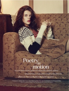
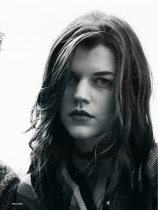
^ I'd have loved to see the second image as the cover as we never see her in a sexualized way. And even though the fourth image is very Lancome ad, it's also a beautiful image worthy of a cover.
VogueGirl8910
Well-Known Member
- Joined
- Apr 14, 2008
- Messages
- 50,076
- Reaction score
- 8,412
I don't like the dress on the cover, but Lupita looks great on her editorial.
Benn98
Well-Known Member
- Joined
- Aug 6, 2014
- Messages
- 42,530
- Reaction score
- 20,570
^ I'd have loved to see the second image as the cover as we never see her in a sexualized way. And even though the fourth image is very Lancome ad, it's also a beautiful image worthy of a cover.
Agree with you about the portrait shot, it's simply sublime and yes, we need to see her try different styles.
I'll say this again, Lorraine must have clout (or this is just more native advertising at play?) to get all these high-profile people. Yet I've never seen them looking really good in the magazine.
Fashion Mayhem
Active Member
- Joined
- May 15, 2013
- Messages
- 5,424
- Reaction score
- 48
Fashion Mayhem
Active Member
- Joined
- May 15, 2013
- Messages
- 5,424
- Reaction score
- 48
Similar Threads
- Replies
- 27
- Views
- 8K
- Replies
- 64
- Views
- 18K
- Replies
- 9
- Views
- 4K
- Replies
- 59
- Views
- 14K
- Replies
- 54
- Views
- 11K
Users who are viewing this thread
Total: 2 (members: 0, guests: 2)


