UK Vogue June 2020 : Judi Dench by Nick Knight

I think Judi looks fabulous! Beautiful cover and editorial. It's great to see her in Vogue and full fashion.
The content is not bad, but not great.
Kaia's editorial is such a waist, she is too young and generic for that setting; they needed an high fashion goddes there, not a teenager tomboy. Imagine somenone like Raquel!
Adut on the other hand looks amazing, that body is out of this world.
Thanks guys for posting!
 
Luna posted this on her Instagram. Is this an additional ed?

 
Great editorials! I am tired of seeing Adut all the time, but her photos are amazing! The issue looks like some effort has been put into it - something we rarely testify these days in the magazine world.
 
mighty aphrodite? oh please... i'm probably just unconsciously jealous as i'm aging, but kaia looks inappropriately juvenile in her ed, like a little kid dressing up in her mom's clothes. it goes beyond the universal fascination with youth and feels really weird in juxtaposition with judi dench's feature.
 
I can't believe they would come up with a 'mighty aphrodite' theme and somehow think of Kaia.. she may get there in her mid 20s but it just looks silly right now.. the b&w shoes, and the fourth shot lol.. if I saw that I would guess this girl's family is probably in the back of the ruins as she quickly sets up the timer for her tiktok. Some editors are too confident in their power, experience and then in the versatility of the models they want so bad to be stars to think they can extract anything out of them with enough work.

Adut looks great.. and the ballet ed is another story that could've had great casting and didn't.. there are far more captivating dancers at the royal ballet right now, it just takes seeing them on stage..
 
UK Vogue June 2020

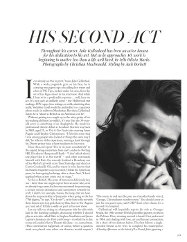
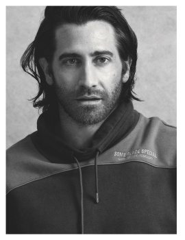
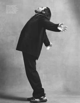
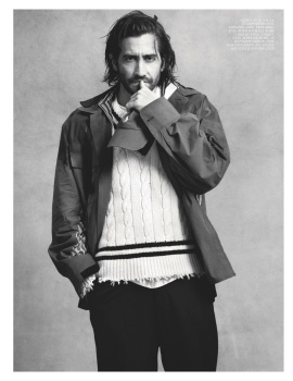
His Second Act


Photographer: Christian MacDonald
Stylist: Jack Borkett
Cast: Jake Gyllenhaal


UK Vogue Digital Edition

Gorgeous!!! Thanks for sharing, wish there were some textless version already ://
 
Even with another model, the concept there for an Aphrodite editorial is nonsense. Looks more like "we shot this in some Greek ruins, what title do we give it now, there's some skin showing?"
 
Another issue of nonsensical editorial content. Seriously, the Kaia editorial looks like it was conceived, styled and shot in under an hour! And the random blue eye make-up?! Can Alasdair McLellan do anything good, ever?
 
Love the eds and cover maybe apart from the rehearsal one. A solid issue IMO
 
I kinda like Kaia's ed, and Adut looks gorgeous. But the real star of this issue is Jake Gyllenhaal, I mean.. he's never looked hotter to me, and I've liked him my whole life.
 
So, the initial excitement over Judi wore off and I realised how tragic the cover actually is the more I looked at it. It looks like a gardening supplement, and it gets worse inside the cover story. I don't know what's going on with Nick Knight and British Vogue. He used to shoot stellar covers under Alexandra and fantastic editorials! Now it's all half-***ed and boring.
I occasionally like Alasdair's aesthetic, but that usually happens in Vogue Paris. This editorial doesn't do anything for me! And we've seen it before...
Roversi's on auto-pilot. It's not bad, I love it! But he can do better. I don't like the styling here, or the cast.
Adut's editorial is spectacular! The colors, the sea, the contrasts, her body. Fabulous! Highlight of the issue for sure.
Jake's just... Jake. Never felt attracted to him, which is weird cause there's probably a dozen bearded men that I like with gorgeous eyes looking exactly like him, but he just doesn't do it for me. So nothing special for me here.
Rehearsal Room is straight out of front ''trend'' section of Vogue Poland. Hate it!
Fashion Forward is my least favorite editorial by Fran so far. It's just terrible!
Faretta looks magnificent, but she's wasted on this Vogue India reject.

And that's it? For an issue prepared pre-pandemic, it's weak and it's ugly. Not so much of a must-have after all...
 
No content that is worth noting. Zero interest in this issue, and partial fault in this is the boring treatment of Judi Dench. Yeah, why bother at all, just put her in some generic pretty dresses and be done.
 
My subscription is yet to arrive but I seen this in Tesco earlier (for £3.99) and the colour of the masthead is a light coral, as opposed to the pink which the images suggest online - and it completely ruins the overall feeling of the cover and comes across very weak. It feels like a non-event, regardless of the hype surrounding the fact Dench is the oldest cover star throughout the magazine's history.

I've also noticed via Instagram that subscribers receive exactly the same as the newsstands offering, no different cover image or less text. I understand we're going through a global crisis right now but even the likes of Grazia are printing multiple covers and I'm a little puzzled as to why Enninful wouldn't have delivered subscribers a different cover (perhaps with the shot of Judi wearing the Elie Saab dress).

Nevertheless, it seems like a decent issue all things considered and I do love McLellan's story with Kaia Gerber - being a total sucker for Ancient Greece et al. The monochromatic styling looks glorious against the vivid blue sky. Also very much a fan of Adut by Emma Summerton, love how graphic those images are and think it's a vast improvement from last month's Australia-shot story.
 
Jack s2 finally is back at British Vogue.
He is so much better editor than Dena . I don’t understand how she can be style director
 

Users who are viewing this thread

New Posts

Forum Statistics

Threads
212,571
Messages
15,189,492
Members
86,465
Latest member
ajam
Back
Top
monitoring_string = "058526dd2635cb6818386bfd373b82a4"
<-- Admiral -->