US Vogue January 2008 : Kate Hudson by Patrick Demarchelier

^We should agree to disagree then,i definietly heard different things and i agree that HB does more interesting things sometimes just dont belive that its Glendas credit,but oh my how i miss Tilberis,they dont make editors like that anymore,sigh.
 
Last edited by a moderator:
^True, we must have different sources, but we agree on the key points, and anyways it's cool to have somewhat of an actual conversation with a fellow tfs'er. There are sometngs you just can't talk with friends without them looking at you like your crazy, such as the current state of Vogue and Bazaar!
 
^Hahah oh i know what you mean.:ninja:I love people that are passionate about fashion and its always a pleasure to discuss,and hear other opinons on matters like this.Thank god for TFS,where else could i rant about HB and Vogue like this!?!^_^:blush::lol:
 
Last edited by a moderator:
I found this issue very boring. Kate looks great, but the content was really lacking. I read it in an hour and i'm done with it.
 
That's why I stopped buying this Vogue, it's never worth the money aside from maybe the September and March issues.Besides, I can read it for free at any library.
 
For January, this isn't a bad issue.

The cover was awful and for once it's not because of the over-airbrushing of the subject or the cluttering texts but because the blouse (Dries' first in recent history, if not ever) is plain ugly. For all the heat that US Vogue's casting of models and cover girls has generated, I'm amused that what turns me off about this issue is fashion itself. Hudson is a professed Dries lover, but I don't know if anyone's grandmother would want that pattern as table linen.

The Trentini and Zimmermann shoot was okay. Would've been unbearably boring if anyone but McDean (or Demarchelier) shot it. The only thing that separates this editorial from a Spiegel's catalogue is the outrageous hair and makeup. That's US Vogue's only way of making something conservative (cardigan + shift dress) seem hip.

I can appreciate the thoughts that went into the composition in the Meisel and Natalia ed but would like it better if her skin doesn't look so icy and untouchable. Meisel tries so hard to achieve the porcelain effect we see in classic portraits that his models look about as lively as well-preserved corpses.

It's obviously a milestone for Chanel's burgeoning career, but sorry to say that the edit looks like an Allure outtake.

What I really like about the issue is the layout of the Best Dressed spread. For all its ambition at being grandiose and all, what US Vogue does particularly well, in my opinion, is a juicy section that's thrown in the back like an afterthought called Vogue Index. The Best Dressed spread borrowed some elements from Vogue Index (the collarge format) and the levity of that made these twenty or so pages a delight to flip through.

great review. :flower: i really enjoyed reading this and agree with everything you said here.
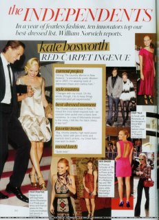
 
best-dressed list

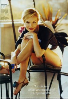
i found bigger scans of Kate Bosworth:

katebosworthvogue.jpgkatebosworthvogue2.jpg
superior pics


i loved all her looks in that 1st page^
 
Last edited by a moderator:
Yes, the index pages are the saving grace. How long have those been around and who is in charge of them?
 
For January, this isn't a bad issue.

The cover was awful and for once it's not because of the over-airbrushing of the subject or the cluttering texts but because the blouse (Dries' first in recent history, if not ever) is plain ugly. For all the heat that US Vogue's casting of models and cover girls has generated, I'm amused that what turns me off about this issue is fashion itself. Hudson is a professed Dries lover, but I don't know if anyone's grandmother would want that pattern as table linen.

The Trentini and Zimmermann shoot was okay. Would've been unbearably boring if anyone but McDean (or Demarchelier) shot it. The only thing that separates this editorial from a Spiegel's catalogue is the outrageous hair and makeup. That's US Vogue's only way of making something conservative (cardigan + shift dress) seem hip.

I can appreciate the thoughts that went into the composition in the Meisel and Natalia ed but would like it better if her skin doesn't look so icy and untouchable. Meisel tries so hard to achieve the porcelain effect we see in classic portraits that his models look about as lively as well-preserved corpses.

It's obviously a milestone for Chanel's burgeoning career, but sorry to say that the edit looks like an Allure outtake.

What I really like about the issue is the layout of the Best Dressed spread. For all its ambition at being grandiose and all, what US Vogue does particularly well, in my opinion, is a juicy section that's thrown in the back like an afterthought called Vogue Index. The Best Dressed spread borrowed some elements from Vogue Index (the collarge format) and the levity of that made these twenty or so pages a delight to flip through.

i agree with most of what you said. but i wouldn't mind to see that Dries' blouse on the cover if it was a MODEL wearing it, but i know it's US Vogue and i'm not supposed to expect a model... anyway, i just can't stand these smiling-celebrity-close-up covers... Penelope's was much better in this aspect for example.
i completely agree with you about that Working Girls ed. and i really, really dislike Trentini and Zimmermann.
what i most liked about Meisel's shoot was the outfits choosed to represent each designer, but i agree with you (again) about the icy look.
no comments about Chanel. and the best-dressed list was also my favorite part.
 
Last edited by a moderator:
Yes, the index pages are the saving grace. How long have those been around and who is in charge of them?

Since the 90's...Kate Betts started Vogue Index (the idea came from Japanese Magazines) & after she left Vogue it was Amy Astley & after she left to edit Teen Vogue...Meredith Belling Burke took over & is still in charge of them.

I'm surprised no one has mentioned that US Vogue is being slowly re-designed...the subtle changes have been taking place since the November issue & also there's a new section in the front: Flash.

:flower:
 
The Flash section is just another way for Vogue to insidiously get more celebs inside the pages of Vogue. And the sad thing is that they somehow always seem to speak about the same celebrities in each issue.
 
^Well, the optimist hiding inside of me says that it's there to be the pages where you read about celebs when the rest of the mag can be about fashion :wink: That's not terribly realistic, I suppose. The take reminds me of the socialite pages of Vogue Paris, at least from what it sounds like, I haven't had these issues of American Vogue in my hands because the editorials are simply too sub par. Maybe VP still has them, but I only recall looking at those from the 70s and 80s mags.
 
Last edited by a moderator:
I got the issue yesterday. I like it, but not one of the best issues that US Vogue dished out in the past. The adverts in there are interesting to say the least (I'm talking about this Alli Calender that came attached with the magazine). Natalia's editorial is amazing, so is Chanel's. I think the order of the editorials aren't right though. It just doesn't seem to flow this issue. Maybe they need new photographers (let's give Mr. Demarchelier some vacation time from US, UK, Australia Vogue) and let some less known, less overexposed, some people like Scott Bryant, or Yu Tsai, or even Kai Feng. I digress. The articles are really good this time around.
 
Annas *Vogue cover* is like the most snobbish club you have been to.Only actresses hyped beyond the belief make the cut,and once they do they are in it for life. Regardless of what they promote(fashion lines,bad movies,even worse perfumes)they can always count on getting the cover,their managment just needs to call Vogue offices and its done.

This is only true if you're white.
 

Users who are viewing this thread

New Posts

Forum Statistics

Threads
212,461
Messages
15,185,475
Members
86,316
Latest member
shrink33
Back
Top
monitoring_string = "058526dd2635cb6818386bfd373b82a4"
<-- Admiral -->