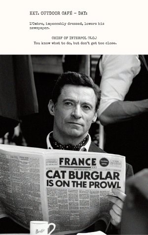
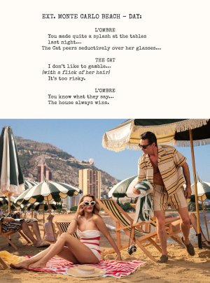
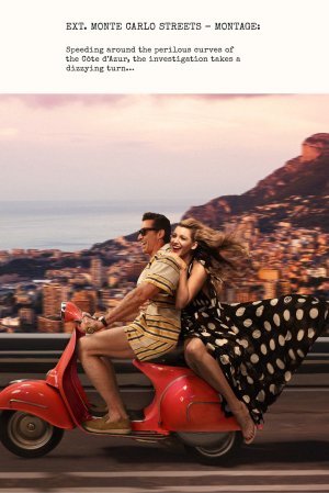
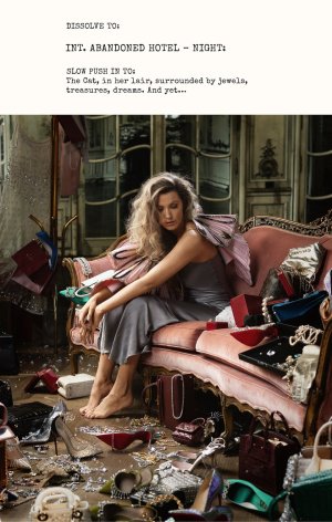
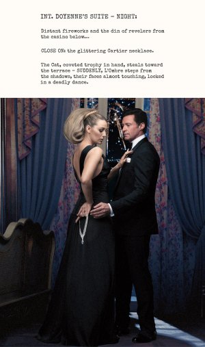
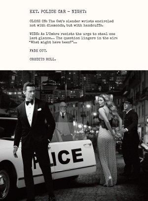
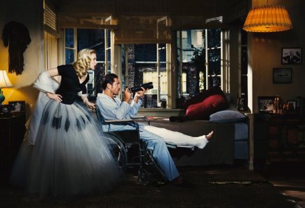
US Vogue September 2024 : Blake Lively & Hugh Jackman by Baz Luhrmann

See no, this explains why there is a necklace, but not why there is a necklace awkwardly held in her hand and not around her neck… it’s the bizarre placement I’ve got the beef with.
I think they're trying to do a To Catch a Thief reference? But yeah it looks awkward.
 
I see the editorial images now and I guess it becomes clearer in the context of the full thing, however, bad concept and bad shoot. What a shame, Blake is such a great blank canvas.
 
I like the cover of solo in a certain way.. the masthead is definitely silver..... it's glamorous and chic, things that haven't been seen in fashion magazines for a long time...... I think of Mario Testino and the great job he could have done
 
I’m sure it’s been one of the biggest thrills of Anna’s life to combine the names Blake Lively, Hugh Jackman and Baz Luhrmann. All that’s missing is Roger Federer and Sienna Miller.

Outside of these being some of Anna’s favourites, I don’t really understand the combination.
 
See no, this explains why there is a necklace, but not why there is a necklace awkwardly held in her hand and not around her neck… it’s the bizarre placement I’ve got the beef with.

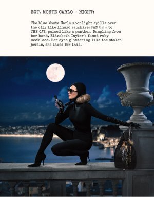
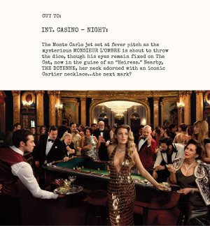
The theme of the shoot is more or less To Catch a Thief. Blake holding onto (rather than wearing) the jewelry sort of works, thematically? And of course, it draws that much more attention to the jewels.
 
I love the solo cover, it's very glamorous and confident. Looks very retro but also very modern and fresh. In case this turns out looking great in print, I'm most likely going to get it.
 
I could have been better imo... a closer shot, looking at the camera... it's not their worst cover but I find it super meh.

It also feels like: "how can we have Wolverine on the cover without having Wolverine on the cover?" :innocent: :rofl:
 
This is the type of expansive editorial that Grace and Annie Leibovitz would've done so well. It's left us all wanting I think...
 
How very Town & Country, indeed. There's a touch of glamour and drama which I generally like, but it feels quite gaudy here. They should've just paid Meisel to pull an Avedon or recreate his July 2002 story that was similarly themed. This doesn't work, at all. They both look rather stupid and it all looks criminally fake.
 
This is the type of expansive editorial that Grace and Annie Leibovitz would've done so well. It's left us all wanting I think...


Indeed. Missed opportunity to at least get Annie on board, though she can be hit-or-miss these days. Annie did a Hitchcock shoot for Vanity Fair, years ago. This photo with Scarlett Johansson and Javier Bardem shows the potential. It’s a more literal take, but more compelling than what Baz has done here.

IMG_6163.jpeg
Pinterest
 
I don't mind the concept, but fashion imagery these days is low-effort and one-dimensional. Long gone are the days of Meisel's sophisticated precision, Testino's golden glow, or even Mert and Marcus with their special effects from a 2004 US Vogue story - twenty years ago now.


Users who are viewing this thread

New Posts

Forum Statistics

Threads
212,569
Messages
15,189,392
Members
86,460
Latest member
danieleglin
Back
Top
monitoring_string = "058526dd2635cb6818386bfd373b82a4"
<-- Admiral -->