You are using an out of date browser. It may not display this or other websites correctly.
You should upgrade or use an alternative browser.
You should upgrade or use an alternative browser.
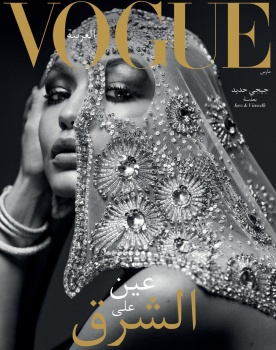
Vogue Arabia March 2017 : Gigi Hadid by Inez van Lamweerde & Vinoodh Matadin
- Thread starter vogue28
- Start date
liv4beauty
Active Member
- Joined
- Jul 21, 2005
- Messages
- 458
- Reaction score
- 80
I think both covers are absolutely beautiful.
Phuel
Well-Known Member
- Joined
- Feb 18, 2010
- Messages
- 5,726
- Reaction score
- 8,710
Very strong debut. Respectfully conservative and still sensual. Thank goodness some publications still haven’t forsaken skillful lighting, sharp composition and layout. Hopefully the content will continue the cover’s momentum instead of devolving into an expensive department store catalogue.
Gigi exudes such heat and silent-film star allure. I’d take her anytime, anyday anywhere over her sister with the only one expression.
Thanks vogue 28.
Gigi exudes such heat and silent-film star allure. I’d take her anytime, anyday anywhere over her sister with the only one expression.
Thanks vogue 28.
Benn98
Well-Known Member
- Joined
- Aug 6, 2014
- Messages
- 42,530
- Reaction score
- 20,571
Hhmm, for once I'm honestly on the fence! Both angles look quite spectacular and even memorable, but the holes in the scarf ruins it (not the scarf itself).
Gigi makes sense for them, I suppose. Even I&V, who really pulled out all the stops for these covers.
Gigi makes sense for them, I suppose. Even I&V, who really pulled out all the stops for these covers.
DutchHomme
Active Member
- Joined
- Sep 29, 2011
- Messages
- 2,913
- Reaction score
- 5
I love it
Miss Dalloway
Well-Known Member
- Joined
- Mar 3, 2006
- Messages
- 25,704
- Reaction score
- 997
Mysterious, beautiful, expensive, and powerful, such stunning covers. I knew they will use Gigi for the first cover, but wow at I&V, so happy for them!
I hope i can get this issue!
I hope i can get this issue!
Miss Dalloway
Well-Known Member
- Joined
- Mar 3, 2006
- Messages
- 25,704
- Reaction score
- 997
^ Beautiful, thanks for posting.
I just realized this is Gigi's THIRD March cover this year, she is seriously reaching Supermodel status!
I just realized this is Gigi's THIRD March cover this year, she is seriously reaching Supermodel status!
MON
Well-Known Member
- Joined
- Jun 20, 2009
- Messages
- 12,635
- Reaction score
- 5,184
It had all the elements to be iconic, but the angles are odd. It's like she's fitting herself to be on frame. Waste
One thing I've noticed, is this a bilingual magazine? See how one this is in their language, one cover is in English? Even "Arabia". Please don't let it be as such.
And for heaven's sake, don't use Didot! Don't end up looking like a franchise of Harper's Bazaar.
The first two previews of Gigi could have been such stunning a powerful covers! It exudes power imo
TaylorBinque
Well-Known Member
- Joined
- Apr 4, 2010
- Messages
- 2,876
- Reaction score
- 1,138
From the preview and the cover, I feel like this is Gigi's best work yet. The cover looks great. I prefer the first angle but I really like it. Something very intriguing about it.
VogueGirl8910
Well-Known Member
- Joined
- Apr 14, 2008
- Messages
- 50,021
- Reaction score
- 8,416
The previews are great, Gigi looks gorgerous on the covers.
Melancholybaby
Well-Known Member
- Joined
- Aug 25, 2011
- Messages
- 14,117
- Reaction score
- 1,475
Very strong debut. Respectfully conservative and still sensual. Thank goodness some publications still haven’t forsaken skillful lighting, sharp composition and layout. Hopefully the content will continue the cover’s momentum instead of devolving into an expensive department store catalogue.
New Vogues usually do these dramatic premiere covers, with minimal coverlines and striking photos and then it devolves into the usual mediocre mess in the space of two months. I hope this one actually makes a difference, but I'm not holding my breath.
Similar Threads
- Replies
- 30
- Views
- 7K
- Replies
- 106
- Views
- 30K
Users who are viewing this thread
Total: 2 (members: 0, guests: 2)


