Vogue Italia October 2021 : Chiara Ferragni by Scandebergs

Just saw some comments on Vogue Italia IG and they are unfavorable. This is atrocious. This is like a high school project. They are not even trying anymore.
 
This feels like the final bullet into the mangled carcass of Vogue Italia. Somebody put this it out of it's misery.
 
Vogue used to elevate the mundane into the sublime through the power of the imagery they produced. Words were not really necessary.

These days, they're reduced to hyping up their own miserably reduced circumstances via a constant stream of empty words - and the imagery is not worth speaking of. Even when something is nice, it's hardly ever memorable.
 
Not sure what is more basic - the cover or the editor's letter?

The editor’s letter for sure…one thing is to write captions for Ig other an Editor letter…it feels so disconnnected one parragraph from the other…so she needs to take lessons or need an Emily to do it for her bc its so bad…

Let’s lower our expectations and enjoy our old issues because the golden days of Vogue are not coming back.
 
First of all, I LOVE Chiara! :heart:

As an OG/IG (fashion) influencer and now an extremely successful entrepreneur, she made her multi-million dollar empire from the scratch and I have nothing but an utmost respect for that.

giphy.webp


Second, the same way she "made" herself, this cover-story is also made from the scratch (with the crew who basically don't know each other and have never worked together prior to this issue - plus, keep on mind that Chiara is NOT a professional model!), so I'll rather wait to see the full picture (i.e. the whole issue) before I pass any kind of judgement.

giphy
 
Francesca worked with Farneti and his team. I find his covers on her IG account. And she mentionts the previous era with positive words, so it could be the same without Verderi's art direction. I want to see the entire issue. It's her first, so I still have some expectations.
 
It seems like their new direction relies on pop culture than fashion itself. It's also evidently saturated if you
compare it to Farneti's dark/muted aesthetic.

I prefer this version more. At least it isn't pretentious. My only problem is that their new tone looks too simple and cheap.
 
That looks so bad, as her Instagram images or some “creative shooting” for OK magazine. This is the final nail in vogue Italia coffin. Seems like things getting so much worser than it even was after the covid. Everything is ruined at Condé Nast and they have to discontinue their sh*tty magazines. Anna and Edward can’t even handle properly their own editions and started to run (demolish) others…
 
The cover is not great but it’s not terrible either. I can give it a pass if the cover is a little basic as long as the content is good, and Ferdinando’s pretentious *** is OUT!
 
The blur and expression really did a number on it because the blue and red combo looked nice. Still better than many of the previous editor's covers with blank spaces and animals.
 
The magazine is out on Friday so maybe we can see how bad or good it is. From the previews there is not much expectations.Honestly the transition issues are never good. It's true that she was part from Farneti's team as a market editor but now she is in a different role, role that she was chosen to play in the very last minute it seems. Also means she is the boss at least in the Italian office. I blame Anna and Edward for this, because this girl is doing the best she can in her learning way. This is Voooogue (in a Carrie way) i know, but these are the new times. They are gonna make mediocre Vogue's in order to make shine US and UK. So stupid decision specially if Italy and France are some of the biggest markets in Europe.
 
Skimmed through this issue. The whole magazine is definitely more "safe" now layout wise, no more 'artsy' stuff from the previous era.

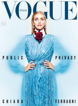
But the only original ed is only the Chiara one, and the Italian Bipoc designers feature.
The rest is the Annie Leibovitz ed from Us & Uk Vogue oct issue, Dan Martensen ed with Paloma & The I Love New York feature from UK Vogue oct issue & (all of them look so out of place in Vogue Italia...).

This doesn't feel like Vogue Italia at all.. kinda feel like Glamour or Instyle for me... at least during Farneti era the magazine still have distinct point of view & personality, no matter how much a lot of members here hate it. There is no point of buying Vogue Italia anymore if you already buy US Vogue / UK Vogue.. I'm kinda afraid to see what Vogue Paris will look like now....
 
RÉTRO RELOADED
Photography:
Jim C. Nedd
Styling: Luca Galasso
Hair: Fabio D'Onofrio
Make-up: Camilla Romagnoli
Models: Lara Biroli, Noemi Kassa & Nabob Thiam


Vogue Italia Digital Edition


TAKE 5
Photography:
Luca Anzalone
Styling: Georgia Tal
Hair: Adrian Carew
Make-up: Lucie Nguyen
Designers: Nyny Ryke Goungou, Romy Calzado Celda, Judith Saint Jermain, Zineb Hazim & Sheetal Shah


Vogue Italia Digital Edition
 
She would've fit in well in the era of Onopka-Roslyakova-Dziahileva etc. supremacy, she's quite pretty. Such beautiful eyes!
 
  • Like
Reactions: MON

Users who are viewing this thread

New Posts

Forum Statistics

Threads
212,258
Messages
15,177,731
Members
86,007
Latest member
redspot
Back
Top
monitoring_string = "058526dd2635cb6818386bfd373b82a4"
<-- Admiral -->