You are using an out of date browser. It may not display this or other websites correctly.
You should upgrade or use an alternative browser.
You should upgrade or use an alternative browser.
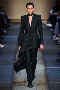
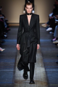
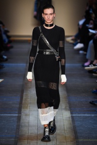
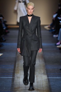
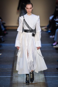
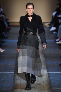
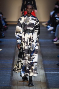
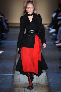
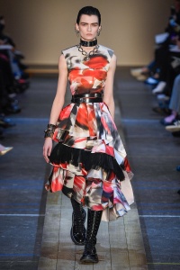
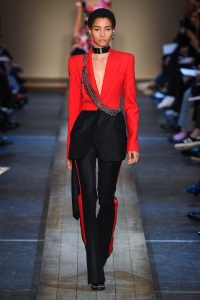
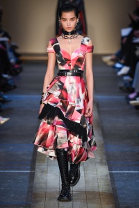
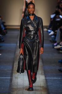
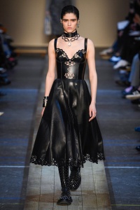
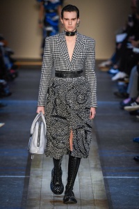
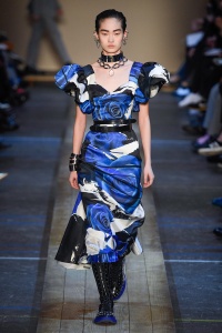
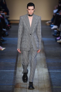
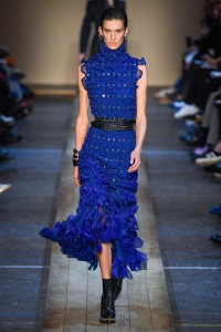
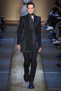
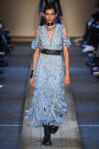
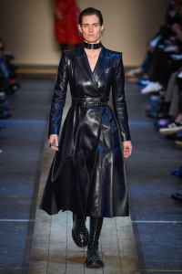
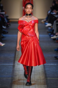
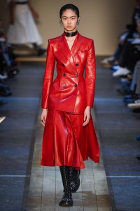
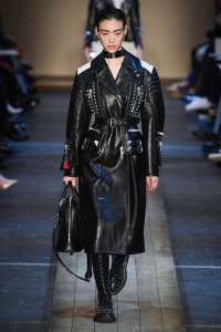
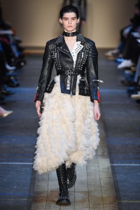
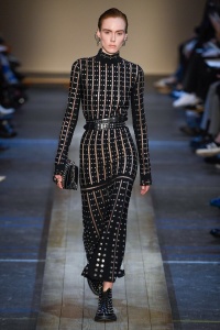
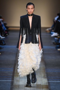
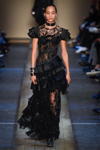
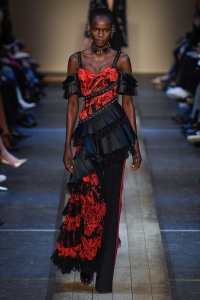
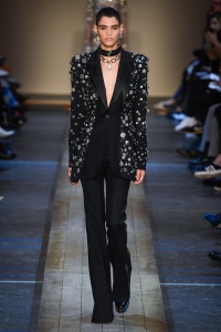
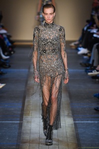
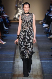
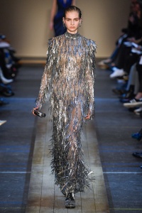
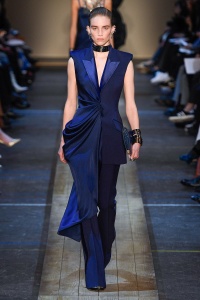
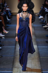
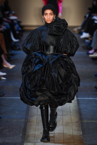
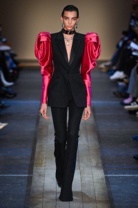
Alexander McQueen F/W 2019.20 Paris
- Thread starter vogue28
- Start date
dior_couture1245
Fat Karl
- Joined
- Jan 30, 2006
- Messages
- 9,225
- Reaction score
- 4,749
I absolutely hate it.
Sarah Burton is a terrible designer. This is on the same - low - level as the likes of Prabal Gurung and Altuzarra.
Sarah Burton is a terrible designer. This is on the same - low - level as the likes of Prabal Gurung and Altuzarra.
TianCouture
Well-Known Member
- Joined
- Jun 26, 2009
- Messages
- 1,228
- Reaction score
- 876
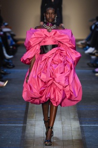
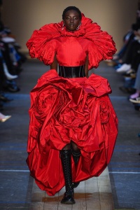
More prolapse dresses. Sorry in advance if I can't say that.
The one redeeming factor is the dress Alex Fury posted about on Insta
The one redeeming factor is the dress Alex Fury posted about on Insta
jeanclaude
Well-Known Member
- Joined
- Feb 12, 2012
- Messages
- 3,619
- Reaction score
- 8,755
Great, another McQueen collection which doesn´t remind of Alexander at all...please, just change the name of this brand to "Sarah McQueen" or something; because here there´s not a single thing relatable to Alexander´s style.
Those Valentino-esque dresses at the end feel so desperately trendy...and Alexander wasn´t a trend-follower designer, for God´s sake!!
Those Valentino-esque dresses at the end feel so desperately trendy...and Alexander wasn´t a trend-follower designer, for God´s sake!!
AnaD
Well-Known Member
- Joined
- Mar 2, 2015
- Messages
- 911
- Reaction score
- 214
So boring and ugly. The tailoring is amazing, but it's such a waste to see it used on such hideous designs. Can Sarah Burton even design anything that doesn't use the same five colours and materials? Remember when McQueen used chiffon, feathers, lace, and colours like green, orange and yellow?
dior_couture1245
Fat Karl
- Joined
- Jan 30, 2006
- Messages
- 9,225
- Reaction score
- 4,749
There really is something about this particular color palette that just is SO cheap. It's that combination of really flat and dull whites, blacks, reds and that Yves Klein blue. It's such a NY fashion week color story. I've always hated it.Can Sarah Burton even design anything that doesn't use the same five colours and materials?
And I can't even deal with those floral prints. Obscene!
perfect blue
Well-Known Member
- Joined
- Sep 30, 2018
- Messages
- 512
- Reaction score
- 457
No offense to Sarah Burton, who I respect and I know she means well. I just think that Lee really meant it when he said his shows are too personal for his fashion house to continue without him. Sarah's collections are very commercial and trendy, which is not what Alexander McQueen meant. I am conflicted about it all because I like Sarah since she is sincere in what she does. I just don't know how what she does represents Lee's world that he created.
GivenchyHomme
Well-Known Member
- Joined
- Sep 3, 2009
- Messages
- 5,251
- Reaction score
- 4,389
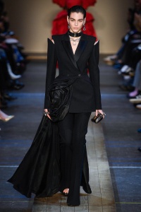
It’s boring and safe but you can’t deny the immaculate tailoring. Even at his wildest McQueen never forgot that women have a shape That is one signature that Sarah has kept alive.
What's the opposite of greatest hits? Worst misses? This is a collection of that, I mean it just looks like some forgettable looks from previous shows and modified them a little. I don't necessarily think she's a bad designer, she does better when being true to herself and not doing the avant garde mcqueen thing, and the tailoring is almost always impeccable, so that usually redeems the collection a tiny bit(unlike MGC at dior, where both tailoring and design are terrible).
Not Plain Jane
Well-Known Member
- Joined
- Mar 3, 2010
- Messages
- 15,422
- Reaction score
- 718
i think a lot of it is pretty great; there are a number of dresses and suits i'd wear.
especially this pinstriped suit:
imgbox - fast, simple image host
especially this pinstriped suit:
imgbox - fast, simple image host
zacatecas570
Well-Known Member
- Joined
- Sep 27, 2008
- Messages
- 7,088
- Reaction score
- 579
Only the two navy blue looks in the middle were good, the rest is boring.
blackcherrified
Well-Known Member
- Joined
- Aug 6, 2011
- Messages
- 250
- Reaction score
- 205
This is an ok collection for any designer, but nope, it has nothing got to do with Lee McQueen or his vision for the house that bears his name. They should just rename the house but the name ‘Alexander McQueen’ is more marketable (just by the ring of the name).
I am guessing they are trying hard to get the royal warrant as soon as possible given the extremely commercial design. And once they get it, we can soon expect a haute couture collection coming soon...
I am guessing they are trying hard to get the royal warrant as soon as possible given the extremely commercial design. And once they get it, we can soon expect a haute couture collection coming soon...
PierreGotha
Well-Known Member
- Joined
- Mar 26, 2018
- Messages
- 170
- Reaction score
- 284
Honestly, her latest collections has been conceptually decent. But, this one lacks strong vision and concept. Just like any Sarah Burton collection, it's becoming repetitive again. Once you discounted the precise and intricate tailoring of her garments, there's nothing much into it. A Sarah Burton garment is beautiful in construction, but with a devoid purpose.
Fashionstuff
http://fashionworldstuff.
- Joined
- Aug 18, 2015
- Messages
- 1,097
- Reaction score
- 44
My thoughts too... nothing to do with Lee McQueen.
The colours and the garments are "poor" . Few seasons ago her collections were more interesting but this one simply to look and to forget because this is a forgettable collection, not even one look to remember.
The colours and the garments are "poor" . Few seasons ago her collections were more interesting but this one simply to look and to forget because this is a forgettable collection, not even one look to remember.
Similar Threads
- Replies
- 71
- Views
- 15K
- Replies
- 50
- Views
- 7K
- Replies
- 15
- Views
- 4K
Users who are viewing this thread
Total: 2 (members: 0, guests: 2)


