Burberry Prorsum Mens S/S 2014 London | Page 3 | the Fashion Spot

Burberry Prorsum Mens S/S 2014 London

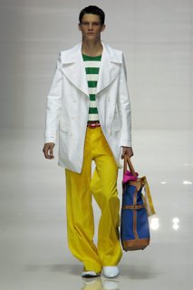
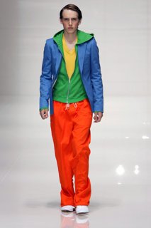
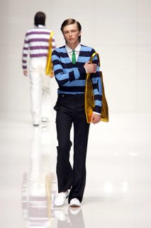
This is the most basic and generic collection he's ever done. It reeks of commercial desperation. This is barely worthy of a lookbook, but a runway show? No.
 
Instead of Prada (which I do see), I'm seeing a lot more of his previous SS05 collection, when he used to show in Milan. The colors, prints, silhouette, everything really.

BTW..does anybody else think he was a lot better off in Milan? I get he's trying to support all things British by showing during London FW instead, but the collections just don't have that same spark as before. Hell, even the standard variations on the trench seem not as thoughtful as before.

src: style.com
 

Attachments

  • 00001m.jpg
    00001m.jpg
    23.3 KB · Views: 3
  • 00004m.jpg
    00004m.jpg
    23.1 KB · Views: 5
  • 00023m.jpg
    00023m.jpg
    22.6 KB · Views: 4
  • 00034m.jpg
    00034m.jpg
    23.5 KB · Views: 2
Instead of Prada (which I do see), I'm seeing a lot more of his previous SS05 collection, when he used to show in Milan. The colors, prints, silhouette, everything really.

BTW..does anybody else think he was a lot better off in Milan? I get he's trying to support all things British by showing during London FW instead, but the collections just don't have that same spark as before. Hell, even the standard variations on the trench seem not as thoughtful as before.

src: style.com

Doubt the location of the show has much to do with it, it's always been designed out of London despite being shown in Milan.
 
The styling is all over the place and everything looks way too forced. From the polka dots, to the bags passing by the silhouettes. All the charm and nonchalance of his earlier work has been lost in favor of blatantly commercial collections.
 
Dots, stripes, patterns, pure colors...all the common elements in an excellent combination. A nice collection and I do love the palette.
 
Mr. Bailey seems to be tired and it's reflected in his job. Basic collection, nice colors, but it only saves itself because is Burberry.
 
Since when being commercial and wearable is a crime?

Its nice, wearable, colorful and basic. In the economic climate we currently live it, there isnt much room for play ...

Id wear 100% of this collection. Proudly.
 
i don't hate it, but it's basically a mixture of Prada and Marni. i don't see any Prorsum in there...
 
Instead of Prada (which I do see), I'm seeing a lot more of his previous SS05 collection, when he used to show in Milan. The colors, prints, silhouette, everything really.

BTW..does anybody else think he was a lot better off in Milan? I get he's trying to support all things British by showing during London FW instead, but the collections just don't have that same spark as before. Hell, even the standard variations on the trench seem not as thoughtful as before.

src: style.com

Completely agree. There was something fun and desirable about his work when he was showing in Milan. I think this collection is fun, cool, upbeat, and interesting, but it's by no means outstanding. I think the color-blocking idea was executed fantastically here, but it just seems to similar to what Prada did last season. Nonetheless, there are definitely some lovely pieces in here, especially those clear sunglasses.
 

Users who are viewing this thread

New Posts

Forum Statistics

Threads
214,853
Messages
15,277,743
Members
88,904
Latest member
Xqw8
Back
Top