Fendi F/W 10.11 : Anja Rubik and Baptiste Giabiconi by Karl Lagerfeld

Yeah, that would be difficult to do better than last season...
Don't really like it, bit boring, but let's wait for bigger pictures to judge!
 
This is pretty decent. I'm interested to see them in an actual magazine.
They have a very cinematic feel to them and Anja plays her part prefectly.....although the first pic hardly looks anything like her.:huh:
This would be a whole lot better of course minus Derek Zoolander.:ninja:
 
I'm pretty over those shots. After getting through this thread, I agree about the editorial-like mood of the campaign - something I didn't take notice of at first glance - but it doesn't bug me at all, I'm actually glad Karl went for a different concept than the dream-like one he used for the past two seasons. The pastel-colored setting showcases the clothes even more effectively, and I like the non-haphazard side of the atmosphere. As for Anja, she looks stunning - my single grief would go out to Karl's obsession with Baptiste. I've got a bittersweet feeling about him turning up in the campaign - relieved because he appears on only one shot, annoyed because he looks like an unecessary accessory.
 
I don't really know what to think yet - I love the setting and the accessories, and I love the clothes and I think Lagerfeld chose the set well as the clothes are strange and difficult to put into a situation IMO. The things that put me off currently though is the makeup and the promotion of the shoes which, tbf, are horrific.
 
the concept is good but anja & baptiste are as lifeless as the furniture, that aspect ruins the ads
 
I'm really disapointed by this. They could have made a fantastic campaign with such a good collection and Anja. The aim was good, I like the retro vibe and all, but the result is awfully weak.
 
I was told by a sale assistant for Fendi that they were not printing any brochure/catalogues this F/W season as opposed to last S/S 2010. That would be a right shame if it were true. Anyone heard of this?:o
 
Anja- again, Baptiste- again:innocent:... It's boring, . The idea is good though.
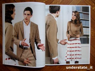
 
this reminds me of an old prada campaign from her forties' inspired collection. i'm glad that sort of cinematic fashion photography still has an audience.
 
Oh no :ninja: Last season Fendi (and Anja!) actually managed to convince me and I was really looking forward to see how they adapt that to this season's campaign. Now, looking at the shots: what a dissapointment.
 
im sorry but i dont get th Italian couple theme
they look like they are either business partners or they
are brother and sister on a family trip...

and when I say this looks like an editorial i mean its telling a story as a whole instead of just one image being able to sell by itself, seperately the only shot that I would stop to look at is the green jacket(exquisite) and the shoe ad
the other ones are far off and i look at those hideous walls before I do the clothes
 
i like it but i agree with xerq it really does look like an editorial. But will say i did not expect this
 
it reminds me of this ten year old prada campaign...

(source: ebay user understate_it)
 

Attachments

  • prada2003.jpg
    prada2003.jpg
    86.7 KB · Views: 7
One of the most disappointing campaigns of the season so far. I adored the last 2 Fendi campaigns and when I heard Anja was going to do it again, I was so excited. But this is definitely not what I was expecting. I can barely recognize Anja in the shots and I think it's pretty boring.
 
It takes me a few seconds to recognize Anja. Karl should move Baptiste out of the fourth pic, no need to paint the lily.
 

Users who are viewing this thread

New Posts

Forum Statistics

Threads
212,564
Messages
15,189,147
Members
86,453
Latest member
fragmar619
Back
Top
monitoring_string = "058526dd2635cb6818386bfd373b82a4"
<-- Admiral -->