You are using an out of date browser. It may not display this or other websites correctly.
You should upgrade or use an alternative browser.
You should upgrade or use an alternative browser.
Fendi F/W 10.11 : Anja Rubik and Baptiste Giabiconi by Karl Lagerfeld
- Thread starter NeverDrinkAgain
- Start date
darri
Member
- Joined
- Nov 11, 2005
- Messages
- 683
- Reaction score
- 23
Super boring


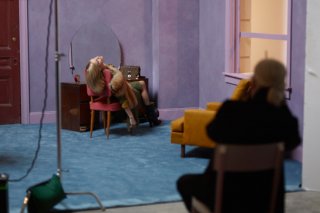
 SOOOOOO BORING!!!! Even the backstage images are putting me to sleep!!loll Especially:
*Fendi.com (posted by Chanelcouture09)
Attachments
Tigertonio
External Optimist
- Joined
- Mar 27, 2006
- Messages
- 175
- Reaction score
- 2
It's the September ad season and as usual, for me, it's visual overload. Fendi, in particular, is one of the campaigns that has resonated within me for some time now. And I didn't expect it to do so after first seeing them posted here at tFS. But after seeing them in print, the subtle and quiet tones are speaking to me much more than the busier ads of the season. This along with Hermes and Talbots are my favorite ads of the season.
It is not a favorite of mine, but I think that the Fendi folks have wisely chosen the photos that have actually run in the magazines.It's the September ad season and as usual, for me, it's visual overload. Fendi, in particular, is one of the campaigns that has resonated within me for some time now. And I didn't expect it to do so after first seeing them posted here at tFS. But after seeing them in print, the subtle and quiet tones are speaking to me much more than the busier ads of the season. This along with Hermes and Talbots are my favorite ads of the season.
Last edited by a moderator:
florider2000
Member
- Joined
- Apr 24, 2010
- Messages
- 545
- Reaction score
- 0
whole campaign: FNEDI F/W 2010
The catalog's 24 shots read like a photo-book or stills of a film if you like. I love the simplicity in the lines created by the props, colors found in backgrounds and chairs. There is an understated sense of composition similar to those found in paintings and still- lives. The models are the silent characters, not overpowering.
A welcome change to the rather absurd backgrounds found in ROBERTO Cavalli and Balenciaga(?) (to name only 2) campaigns this season.
florider2000
Member
- Joined
- Apr 24, 2010
- Messages
- 545
- Reaction score
- 0
^ Is there any chance that you can share with us. I would love to see those pics.
I can't. sorry.
Eh this is so boring!! The backdrop is nice but Anja and Baptiste are so plastic with no life to them. Its so bad compared to the last few seasons. I understand Baptiste is Karl's muse, but seriously, he is way tooo over used in all the campaigns.
Similar Threads
- Replies
- 12
- Views
- 3K
- Replies
- 68
- Views
- 14K
- Replies
- 14
- Views
- 5K
- Replies
- 51
- Views
- 11K
- Replies
- 123
- Views
- 54K
Users who are viewing this thread
Total: 1 (members: 0, guests: 1)


 Thanks