You are using an out of date browser. It may not display this or other websites correctly.
You should upgrade or use an alternative browser.
You should upgrade or use an alternative browser.
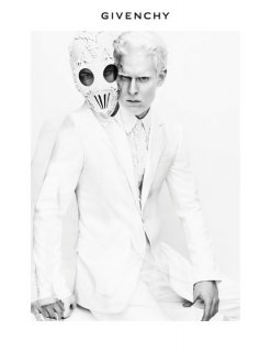
Givenchy S/S 2011 by Mert Alas and Marcus Piggott
- Thread starter Flashbang
- Start date
Donatello89
Active Member
- Joined
- Jan 15, 2009
- Messages
- 3,010
- Reaction score
- 0
really wonderful, just so pure !!!
jeremydante
Well-Known Member
- Joined
- Jul 15, 2009
- Messages
- 3,740
- Reaction score
- 1,433
great for daphne; can't wait to see the rest of this.
super excited about the male models who'll be cast for this.
super excited about the male models who'll be cast for this.
lightningfields
Member
- Joined
- Sep 1, 2008
- Messages
- 199
- Reaction score
- 0
I love the sound of this. OMG. :']
KatherineCouture
Active Member
- Joined
- Feb 15, 2010
- Messages
- 2,305
- Reaction score
- 1
it looks amazing!!!
But where is Natasha??? She was confirmed for this campaign, no?
But where is Natasha???
 She was confirmed for this campaign, no?
cottonmouth13
Well-Known Member
- Joined
- Jan 24, 2009
- Messages
- 6,716
- Reaction score
- 5,106
Wow! Striking, indeed. 

Valentine27
Well-Known Member
- Joined
- Jan 4, 2010
- Messages
- 13,137
- Reaction score
- 2,145
I'm not a fan of Daphne but this looks brilliant.
I really can't wait to see the whole campaign.
I really can't wait to see the whole campaign.
BerlinRocks
Active Member
- Joined
- Dec 19, 2005
- Messages
- 11,216
- Reaction score
- 15
Street_a_Licious
Active Member
- Joined
- Oct 21, 2003
- Messages
- 10,950
- Reaction score
- 24
i those those 2 shots! even tho the b/w makes Stephen less Albino and more like the regular model, but with the current trend, bleached hair everywhere.
it's still dark and creepy, just omitting black (which is genius)
it's still dark and creepy, just omitting black (which is genius)
Similar Threads
- Replies
- 77
- Views
- 20K
- Replies
- 117
- Views
- 40K
- Replies
- 72
- Views
- 26K
- Replies
- 217
- Views
- 60K
Users who are viewing this thread
Total: 1 (members: 0, guests: 1)
New Posts
-
-
Jonathan Anderson - Designer, Creative Director of JW Anderson & Christian Dior (15 Viewers)
- Latest: BalkaniStaCouture
-
-
-


