You are using an out of date browser. It may not display this or other websites correctly.
You should upgrade or use an alternative browser.
You should upgrade or use an alternative browser.
InStyle - Worldwide
- Thread starter seleria73
- Start date
magsaddict
Well-Known Member
- Joined
- Oct 25, 2016
- Messages
- 964
- Reaction score
- 291
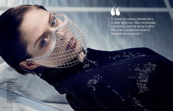
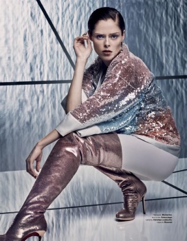
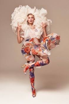
InStyle Russia March 2018: Coco Rocha
InStyle Russia Instagram
InStyle Russia Instagram
Benn98
Well-Known Member
- Joined
- Aug 6, 2014
- Messages
- 42,582
- Reaction score
- 20,818
Thanks for bumping this thread, Magsaddict!  Btw, when you said Joanna Krupa's cover was good I was like, 'Uhm, it's Joanna Krupa! Can't be that good!". But I'm pleasantly surprised. Looks more suited to the Australian edition with such heavy styling, though.
And they've gone way overboard with the Ps on Coco's cover, but I like the neat layout. Laura Brown is missing out on so much, but it serves her right.
 Btw, when you said Joanna Krupa's cover was good I was like, 'Uhm, it's Joanna Krupa! Can't be that good!". But I'm pleasantly surprised. Looks more suited to the Australian edition with such heavy styling, though.
And they've gone way overboard with the Ps on Coco's cover, but I like the neat layout. Laura Brown is missing out on so much, but it serves her right.
magsaddict
Well-Known Member
- Joined
- Oct 25, 2016
- Messages
- 964
- Reaction score
- 291
You're welcome! Here's the Krupa cover if anyone is interested.
InStyle Poland March 2018: Joanna Krupa
InStyle Poland Instagram
InStyle Poland March 2018: Joanna Krupa
InStyle Poland Instagram
magsaddict
Well-Known Member
- Joined
- Oct 25, 2016
- Messages
- 964
- Reaction score
- 291
InStyle Australia March 2018: Drew Barrymore
InStyle Australia Instagram
InStyle Australia Instagram
carolisque
Well-Known Member
- Joined
- Dec 5, 2017
- Messages
- 6,059
- Reaction score
- 1,449
magsaddict
Well-Known Member
- Joined
- Oct 25, 2016
- Messages
- 964
- Reaction score
- 291
InStyle Spain March 2018: Paz Vega
Paz Vega Instagram
Wearing the same Gucci as Drew on Aussie InStyle.
Paz Vega Instagram
Wearing the same Gucci as Drew on Aussie InStyle.
Last edited by a moderator:
Benn98
Well-Known Member
- Joined
- Aug 6, 2014
- Messages
- 42,582
- Reaction score
- 20,818
Paz had the guts to post that cover herself? Looks awful, sorry, and it's mainly down to her haircut.
I actually like Coco's editorial. Nobody does futuristic Klein-ish shoots better than her. She could lessen the expressions though.
Ming Xi's cover looks a mess due to the styling and her slouchy pose. Surprised China went for the US typography, which imo looks really commercial.
I actually like Coco's editorial. Nobody does futuristic Klein-ish shoots better than her. She could lessen the expressions though.
Ming Xi's cover looks a mess due to the styling and her slouchy pose. Surprised China went for the US typography, which imo looks really commercial.
carolisque
Well-Known Member
- Joined
- Dec 5, 2017
- Messages
- 6,059
- Reaction score
- 1,449
carolisque
Well-Known Member
- Joined
- Dec 5, 2017
- Messages
- 6,059
- Reaction score
- 1,449
magsaddict
Well-Known Member
- Joined
- Oct 25, 2016
- Messages
- 964
- Reaction score
- 291
InStyle Australia June 2018: Elle Macpherson by Simon Upton
from Elle Macpherson's Instagram
looking fresh faced and in her element, a beautiful cover but very similar to her two most recent Australian Harper's Bazaar covers.
from Elle Macpherson's Instagram
looking fresh faced and in her element, a beautiful cover but very similar to her two most recent Australian Harper's Bazaar covers.
- Joined
- Jan 9, 2008
- Messages
- 37,255
- Reaction score
- 26,008
Yeah, the whole beach shoot has definitely become a magazine's go-to concept when Elle Macpherson's their cover subject but I won't complain. I saw this on Elle's Instagram earlier and immediately liked it. I can see the Aussie Harper's Bazaar team looking green with envy as I type. What is there not to like? Nice one, InStlyle!
Similar Threads
D
- Replies
- 12K
- Views
- 3M
- Replies
- 30
- Views
- 182K
- Replies
- 156
- Views
- 37K
Users who are viewing this thread
Total: 1 (members: 0, guests: 1)


