Jil Sander: Bright Is Right
By SUZY MENKES
Published: June 18, 2010
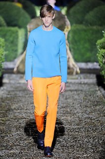
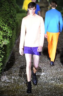
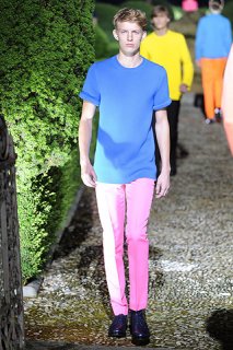
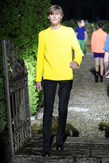
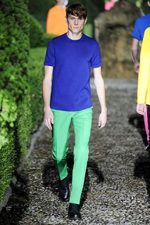
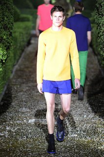
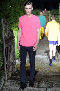
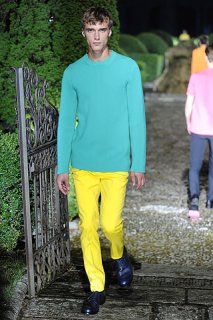
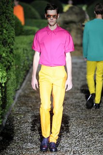
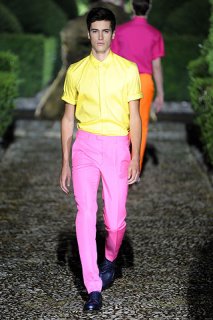
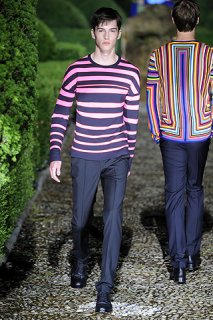
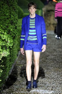
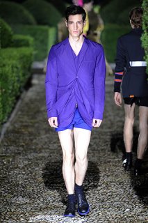
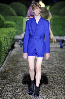
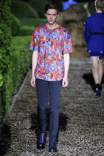
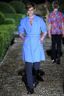
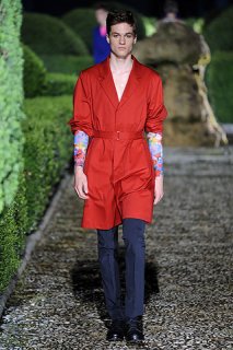
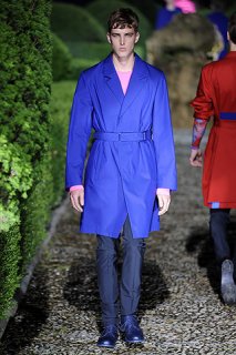
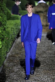
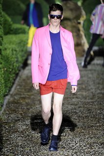
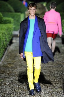
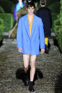
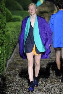
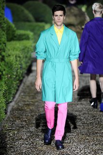
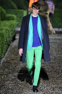
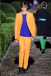
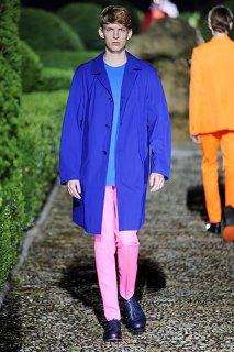
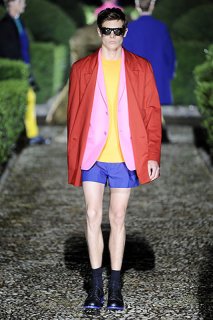
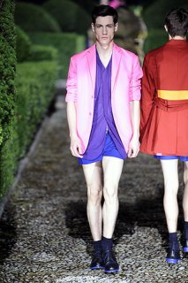
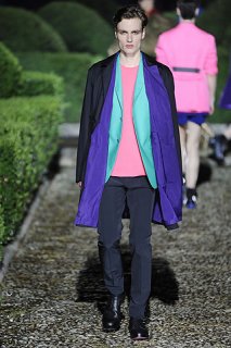
FLORENCE — Behind the dripping box hedges and with a lurid, stormy sunset as a backdrop, color sang out: a turquoise jacket over a sky-blue sweater, pink with orange, nectarine with purple.
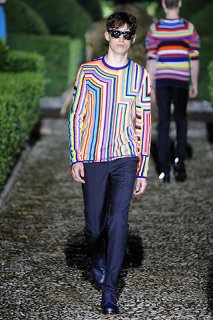
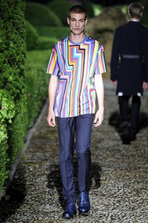
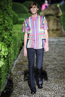
By the time the models had emerged from the topiary, this Jil Sander show had become even brighter — fluorescent shades, from the simple round-neck sweaters to the soles of the formal shoes, glowing with iridescent blue.
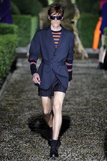
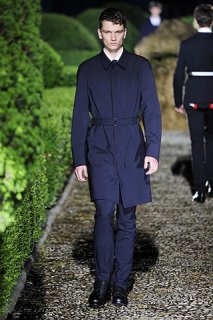
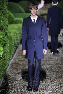
Even when a slim coat seemed relatively quiet, its back would have a tab of intense color below a line of concertina pleats.
“It’s bringing the ‘Jil’ back to Jil — easy to wear and all about color,” said the designer Raf Simons. “I like the idea of colors in juxtaposition and to bring electricity to this romantic environment.”
Mr. Simons could not have imagined that an electric storm would add to the otherworldly effect of stark and colorful geometry set in the grounds of a classic, Florentine hilltop villa. The yellow ochre of its facade was about the only color that did not appear in the arresting combinations.
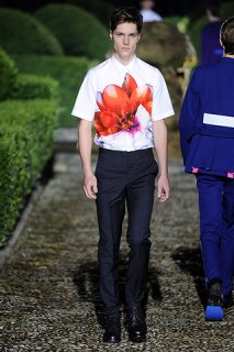
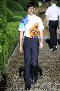
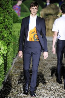
The shades were drawn from nature — tropical plants or less-exotic geraniums, poppies and daffodils. They appeared as occasional floral prints, abstracted as a hazy pattern on part of a T-shirt, rather than competing with the abundant flowers in the summer garden.
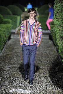
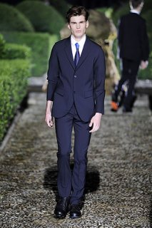
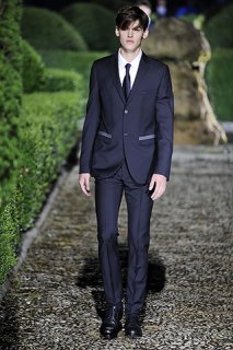
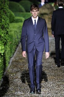
Perhaps the designer might have added to the snug or boxy jackets in bright shades more narrow, navy coats. Although often with a single flash of color at the back, they set off the arresting geometry, which included sweaters with eye-popping angular patterns.
This Jil Sander collection was exceptional and powerful — not least because each piece, worn singly with a plain partner, could be extracted from the designer’s mix of pink top with purple pants, rose jacket with tomato red shorts or turquoise sweater and orange trousers.
Mr Simons also made the strong and uncompromising statement for the season that was the theme of a colorful Pitti Uomo fashion fair.
But the Italian designers mostly worked a muted palette, using the country’s skills of treatment and texture to give subtlety to the surfaces.
The Piombo collection was a masterpiece of colors vivid and muted, from the terry-cloth beachwear inspired by Picasso paintings, to the blend of smoky shades for a scarf. Or there might be a flash of fuchsia from a pocket handkerchief. Cotton jackets printed with a tweed pattern were another way of expressing the current meld of color, pattern and mixed seasons.
At Cruciani, hand-sprayed color that gave a shadowy blur to cashmere and silk had a contemporary and original feel for reversible double-faced knitwear. This idea of softening the shades, giving a vintage vibe to luxury clothes, will surely resonate with men who are wary of full-on color.


