Lula #8 Spring/Summer 2009: Chanel Iman by Damon Heath
- Thread starter rubyfixed
- Start date

last season..

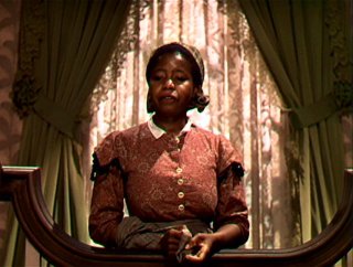
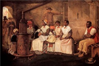
Ermm....you guys do know that 'antebellum' means PRE-civil war, correct? In my opinion, this cover looks absolutely NOTHING like the antebellum south (a vision I'd rather not conjure). Rather, this reminds me of the vacant portraits of housewives and/or school photos from 1950s America. I do see the slightly disturbing undertones in it, but certainly not pre-civil war references!
Ermm....you guys do know that 'antebellum' means PRE-civil war, correct? In my opinion, this cover looks absolutely NOTHING like the antebellum south (a vision I'd rather not conjure). Rather, this reminds me of the vacant portraits of housewives and/or school photos from 1950s America. I do see the slightly disturbing undertones in it, but certainly not pre-civil war references!

 that was my biggest pet peeve in American history last year - people who didn't know what antebellum meant. And here I am not thinking, and using it incorrectly. But I still think the styling makes me think of generally that area, but obviously Reconstruction. When I first saw the image the first thing I thought of was of Beloved.


 has Lula done multiple covers before?