You are using an out of date browser. It may not display this or other websites correctly.
You should upgrade or use an alternative browser.
You should upgrade or use an alternative browser.
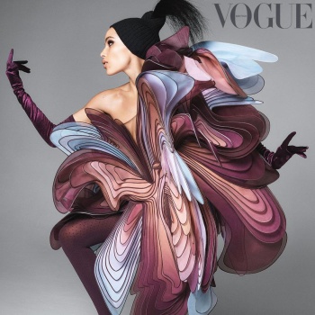
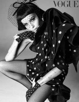
UK Vogue July 2019 : Zoe Kravitz by Steven Meisel
- Thread starter vogue28
- Start date
honeycombchild
Well-Known Member
- Joined
- Jan 22, 2009
- Messages
- 8,841
- Reaction score
- 727
She looks absolutely beautiful here. I like it, nice to see bold summer colours used as well. The hair and make up is great.
GinAndTonic
Active Member
- Joined
- Apr 7, 2010
- Messages
- 438
- Reaction score
- 61
I love everything about it except (as usual) the font and text placement but I’m a subscriber so it should be ok
slayage
Well-Known Member
- Joined
- Mar 20, 2019
- Messages
- 198
- Reaction score
- 200
I love it, I love it and I love it!
Yet again, the placement and color choices for the cover lines are so weird but I think the coverlines are always hideously placed on the UK Vogue’s newsstand covers.
Thank goodness I’m a subscriber.
Yet again, the placement and color choices for the cover lines are so weird but I think the coverlines are always hideously placed on the UK Vogue’s newsstand covers.
Thank goodness I’m a subscriber.
Last edited:
Benn98
Well-Known Member
- Joined
- Aug 6, 2014
- Messages
- 42,530
- Reaction score
- 20,571
The colours and that stare certainly won me over (wonky eye aside)! It's an odd cover and composition, but somehow it works. Was hoping for a summer setting, but I'll take this.
As for the photography, it may well have been shot by Richard Burbridge and I'd be none the wiser. I'm not getting the Meisel touch here.
As for the photography, it may well have been shot by Richard Burbridge and I'd be none the wiser. I'm not getting the Meisel touch here.
Handbag Queen
Well-Known Member
- Joined
- Apr 5, 2006
- Messages
- 1,719
- Reaction score
- 204
Love her and love this cover!!!
Benn98
Well-Known Member
- Joined
- Aug 6, 2014
- Messages
- 42,530
- Reaction score
- 20,571
......but the covers from Meisel for UK Vogue seem too formulated.
Right? I'm not expecting the same VI-level production value, but his studio shoots alone used to be son strong and directional.
mathiaskatz
Well-Known Member
- Joined
- Feb 4, 2015
- Messages
- 1,230
- Reaction score
- 566
What is she wearing/what is that orange thing?
Miss Dalloway
Well-Known Member
- Joined
- Mar 3, 2006
- Messages
- 25,704
- Reaction score
- 997
What a stunning cover, this formula for them never fails! Can't wait to see it in print!
mepps
Well-Known Member
- Joined
- Mar 31, 2014
- Messages
- 1,589
- Reaction score
- 1,598
She's wearing Saint Laurent.
I wonder why Meisel chose to shoot her rather than Madonna
How do you know he chose her over Madonna? Perhaps he wasn't given a choice, or perhaps she's the one who chose M&M over him.
happycanadian
Well-Known Member
- Joined
- Mar 2, 2005
- Messages
- 8,207
- Reaction score
- 270
My god, that FACE just takes your breath away. She is so startlingly beautiful, I can't stop staring at the picture.
LOVE the bright orange and pink accents on the cover. It's clean, sophisticated and fresh. They really knocked it out of the park with this one.
LOVE the bright orange and pink accents on the cover. It's clean, sophisticated and fresh. They really knocked it out of the park with this one.
Similar Threads
- Replies
- 44
- Views
- 17K
- Replies
- 52
- Views
- 10K
- Replies
- 97
- Views
- 46K
D
Users who are viewing this thread
Total: 2 (members: 0, guests: 2)


