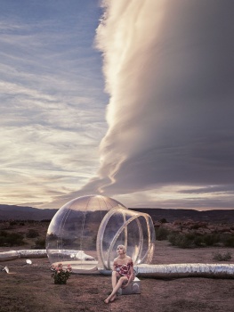
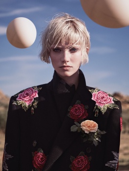
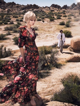
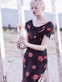
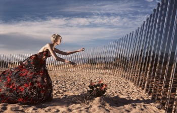
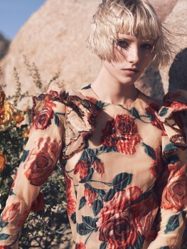
US Vogue June 2017 : Elle Fanning by Annie Leibovitz
- Thread starter Scotty
- Start date


 You reckon she'll be a Vogue favourite? I don't actually mind her. She's got a budding film career, tons of personality, and great personal style. Much better than Emma or Lupita.
Similar Threads
Users who are viewing this thread
New Posts
-
 Alaia Summer/Fall 2025 : Loli Bahia by Tyrone Lebon & Nastassia Legrand by Frank Lebon (26 Viewers)
- Latest: PDFSD
-
-

-

-