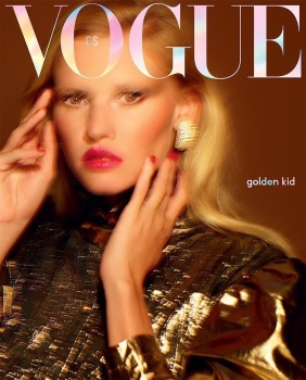
I'm actually a fan of this! Love the gilded mood, and the blue foil (?) adds a nice touch. Certainly covetable.
But what's with the new 'Vaseline on the lens' approach lol being laid on Kate and Lara? Or maybe they wanted something surrealistic?
It seems the fashion trend for autumn is to see things 'at the height of the party' while the rest of the world looks on and wonders why cover shots aren't even in focus anymore.
No idea why this is so liked, because this looks basic as hell. This looks like they had 5 minutes to shoot, the best shot came out blurry, and so they decided to go with it and retouch the hell out of it.
Rankin for Vogue???? Now that’s something you don’t see very often. If I remember correctly he did some covers for Vogue Germany around 2003/2004, but that’s it.
What a surprise to see Rankin after so many years I haven't seen his name credited on the magazines. But I still dislike their art direction, especially that weird pov from the model's groin
I like the feel of the image but it could use a bit more focus so that her stare had more definition, it's weird to see a vaseline smeared close-up since I'm so acustomed to Knight/Sims/Charlotte Wales using it for full body shots, Sims usually uses a subtler blur when shooting up close. I'm not sure about the masthead color
I like the feel of the image but it could use a bit more focus so that her stare had more definition, it's weird to see a vaseline smeared close-up since I'm so acustomed to Knight/Sims/Charlotte Wales using it for full body shots, Sims usually uses a subtler blur when shooting up close. I'm not sure about the masthead color
I do like the faint blur Sims often use, it adds way more atmosphere to the images. Couple that with the movement of hair and/or styling detail, it just intrigues me way more.
As for the masthead, I think I prefer the blue one. Gives the cover a more festive feel, this would have been perfect for December. That's why I don't understand how the second one even made the cut.
This site uses cookies to help personalise content, tailor your experience and to keep you logged in if you register.
By continuing to use this site, you are consenting to our use of cookies.