Vogue Czechoslovakia September 2018 : Karolina Kurkova by Branislav Simoncik

Another 'avant-garde' wannabe Vogue like Ukraine, Portugal, Italia, etc... PASS!
 
And no, weren’t gonna bash it to begin with. First issues are always highly-anticipated as it always gives people a look of what to expect. People are almost always fair when it comes to inaugural issues. So please don’t discredit comments.

And magazines are a commercial product - as such, potential consumers are entitled to express disappointment with what they see, if it's not to their tastes.

Our opinions might not count for much anyway - sales figures will matter far more than anyone's words on this forum. That might be where the real disappointment lies.
 
I'm really interested to see the contents, particularly the main editorial.

I will also say, I really wish you could see KK's face on the cover.
 
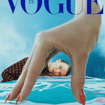
I'm taken by surprise. This is not what I expected but something joyfull or glamour to celebrate the first issue as if it was already christmas. Karolina Kurkova was a good choice, I thought, for this.
Then I feel this cover is not made to please me or a worldwide audience. I think this choice is a good idea : talking to a public which is the first able to buy the magazine, start by a cultural and historical reference to begin with a common background of this public. They make a difference, focus on a target. It says "this is where we come from". I realise my expectation was to understand with their first cover "where Vogue CS is going" and that's why I was so confused at first. So now I wait for the second issue to know !

Saying that, if Vogue CS aims to be a fashion magazine, I think this photo, because of its lightening, has not the standards for a cover.
 
I found the idea of the cover fascinating but one must be intrigued by the image first before reading the detailed explanation as to why a cover came to fruition. After all, a magazine cover needs to be able to show an image first and foremost, not a subtext.
Can you explain to me? Haha
 
^ This is just pretentious and ugly, for me is the worst cover EVER, what a waste of KK
 
Cover story preview:

Vogue-_CS.jpg

fashionweekdaily
 
Some of the comments are so intense even for me :lol:.. Vogue is consistently garbage, it's not 1955 anymore, so it doesn't matter what angle they go for, "breathtaking beauty" "commercial" "unapologetically pop star" "pop star like you've never seen her before" "avant-garde", just letters, a hallway, a model inside a hexagon, face you've never seen before... it's likely going to be bad, why? because it's a f*cking catalog, of an archaic lifestyle and once you're grilled by advertisers, you never unsee that and it shows.

Looking back at the thing that brings us to this thread, it's actually not that bad, just.. a back.. of a model that managed to be tolerable even when photographed by the most painfully commercial photographers (most of her career..), plus nice lighting and not a desperately trendy getup by Balenciaga/Prada/Dior/LV/you name it. It will survive the taste of time with more dignity than all of the issues put out by the 'big' Vogues this year.. if you consider the level of expectation they have, their huge market, their obscene budgets and the interests (political, social, artistic) behind.. yeah, how dare Vogue Czechoslovakia ventures out of that freak show, who do they think they are.. pretentious.
 
There's another cover shot by Michal Pudelka which should also be thrown away in the garbage.
 
This sells for 645Kc, I wonder how long they are going to last
 

Users who are viewing this thread

New Posts

Forum Statistics

Threads
210,726
Messages
15,125,299
Members
84,428
Latest member
treasureagence
Back
Top
monitoring_string = "058526dd2635cb6818386bfd373b82a4"
<-- Admiral -->