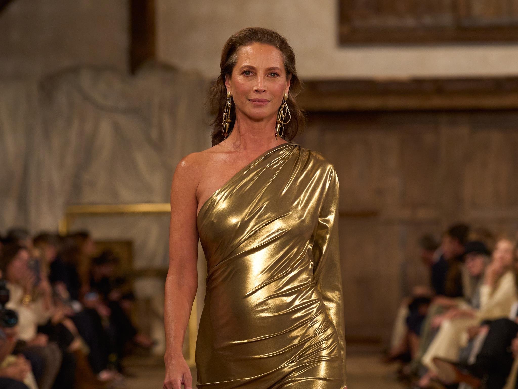
The vibe is verry 70's & 80's glam, but this covers are so lackusters such a waste of resources, this magazine is one of the last vogues that can have an Ines & Vinoodh exclusive editorial and every time the end result is Bad.
You are using an out of date browser. It may not display this or other websites correctly.
You should upgrade or use an alternative browser.
You should upgrade or use an alternative browser.
Vogue Mexico & Latin America March 2024 by Inez van Lamsweerde & Vinoodh Matadin
- Thread starter JPineapple
- Start date
blueorchid
you soft and only
- Joined
- Apr 4, 2009
- Messages
- 13,885
- Reaction score
- 15,055
The lighting is so so so so bad in these photos. What were they thinking? Obviously they're trying to re-capture 80s glam on the covers, but they're lacking the softness of that lighting and photography. There was a glow to those 80s glamour portrait Vogue covers. These are just harsh and ugly.
Something about the ¡Regresa de la oversize bag! cover line tells me this magazine is low on ideas.
Something about the ¡Regresa de la oversize bag! cover line tells me this magazine is low on ideas.
JPineapple
Well-Known Member
- Joined
- Jul 1, 2018
- Messages
- 2,837
- Reaction score
- 3,978
They're doing exactly the same what they did for V Magazine a few months ago.
Xone
Well-Known Member
- Joined
- Sep 1, 2004
- Messages
- 5,042
- Reaction score
- 4,246
I have no words...i blame Karla and Valentina too....it's your choice not publish some horrible pictures...the few times I&V did VM was alway bad...
Everything should have look timeless and classic instead looks old,tacky and bad....
Everything should have look timeless and classic instead looks old,tacky and bad....
D
Deleted member 141523
Guest
It's criminal that the last one is digital. Reminds me of to the Vogue Italia covers from the early 80s.
The vibe is verry 70's & 80's glam, but this covers are so lackusters such a waste of resources, this magazine is one of the last vogues that can have an Ines & Vinoodh exclusive editorial and every time the end result is Bad
D
Deleted member 1957
Guest
Well they have set a record as the first people in history to make Christy Turlington look bad. That third photo and the fact that it was even picked makes me think that someone needs glasses or wanted to sabotage her. They literally made her look like a serial killer under interrogation. Same as Raquel's second photo where they were trying to go for a Jerry Hall vibe but chose the wrong photo. Only Angelina and Mahany look decent.
D
Deleted member 1957
Guest
LMAO are you joking? Just because she doesnt dye her hair or use botox doesnt mean that she's aging terribly.However, the third photograph of Turlington is unfortunate but I also do not think that she is aging well either.

vanityfair
Bertrando3
Well-Known Member
- Joined
- Mar 22, 2010
- Messages
- 5,466
- Reaction score
- 2,131
I'm shocked beyond compared, HOW HOWWW can any photographer take bad pictures of Christy???
That's quite a feat. All the images, from all the models look sooooo mediocre, the lighting is BEYOND AMATEURISH. I'm truly and honestly shocked. I'm pleased to see Raquel and Christy once again on Vogue covers but damn this makeup and lighting and retouching and the angles are truly truly bad.
That's quite a feat. All the images, from all the models look sooooo mediocre, the lighting is BEYOND AMATEURISH. I'm truly and honestly shocked. I'm pleased to see Raquel and Christy once again on Vogue covers but damn this makeup and lighting and retouching and the angles are truly truly bad.
YohjiAddict
Well-Known Member
- Joined
- May 26, 2016
- Messages
- 3,563
- Reaction score
- 4,881
I know it’s bad fashion photography (whose subjects should always look flawless, glamorous and sexy) but at the risk of being committed to a mental institution…I’ll say that I actually like Christy’s third picture. I like the seduction gone wrong aspect of it, it represents a certain sordidness that is anathema to fashion photography but it’s actually quite expressive.
crmsn
Well-Known Member
- Joined
- Jun 6, 2018
- Messages
- 2,653
- Reaction score
- 8,105
This concept would have worked if they booked EJG instead of I&V.
It has all the recipe for a solid Vogue Paris-like throwback, but the photos lack refinement.
It's just as bad as their work in Vogue UK April 2023 issue.
It has all the recipe for a solid Vogue Paris-like throwback, but the photos lack refinement.
It's just as bad as their work in Vogue UK April 2023 issue.
Similar Threads
- Replies
- 30
- Views
- 7K
- Replies
- 102
- Views
- 9K
- Replies
- 106
- Views
- 31K
- Replies
- 36
- Views
- 10K
D
- Replies
- 24
- Views
- 8K
D
Users who are viewing this thread
Total: 1 (members: 0, guests: 1)


