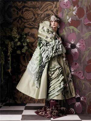
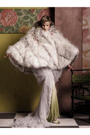
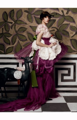
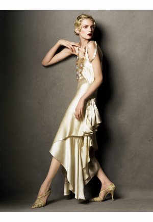
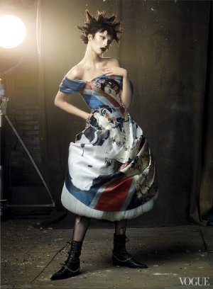
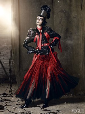
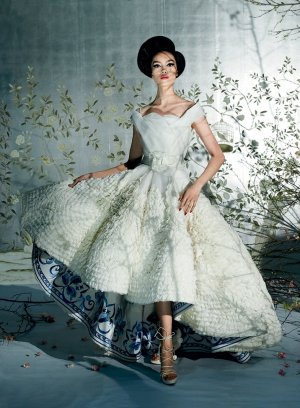
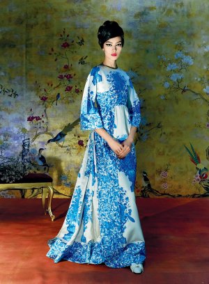
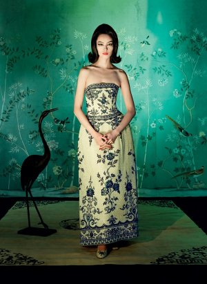
for the dark times of fashion publishing this issue is beautiful, I don't agree with the choice of stylists, Amanda, Oliver Rizzo and Law, the editorial of the meet should have gone to Grace Coddington (who with Meisel is a perfect match for the Met), Galliano's one should have gone to Grace anyway (she alone knows how to recreate the magic of the Belle Époque, I still remember that editorial of the September issue 2007 in 1920s style) and the cover story should have gone to Tonne Goodman
You are using an out of date browser. It may not display this or other websites correctly.
You should upgrade or use an alternative browser.
You should upgrade or use an alternative browser.
US Vogue May 2024 : Zendaya by Annie Leibovitz
- Thread starter crmsn
- Start date
MModa
Well-Known Member
- Joined
- Oct 19, 2023
- Messages
- 2,228
- Reaction score
- 2,899
Looking at the past Met Gala photographs by Meisel and this year's offering, I still think there is a level of quality this year that is quite high and equally beautiful.some examples of Steven Meisel and Grace Coddington for the Met Gala editorias for Vogue US, another level, I think Natalia's editorials is unsurpassed
View attachment 1262548 View attachment 1262549 View attachment 1262550 View attachment 1262551 View attachment 1262552 View attachment 1262553 View attachment 1262554 View attachment 1262555 View attachment 1262556 View attachment 1262557 View attachment 1262558
WAVES
Well-Known Member
- Joined
- Aug 29, 2020
- Messages
- 3,358
- Reaction score
- 3,634
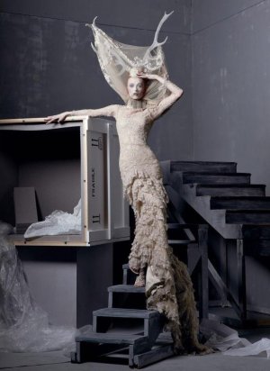
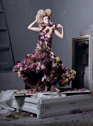
I’d give all the kudos to Meisel if ‘Sleeping Beauties: Rewakening of Fashion’ was his ‘entire’ creation but unfortunately it’s not. it’s a combination of animation and AI.
it does say on Vogue Magazine’s Instagram that it was shot by Meisel.
it does say on Vogue Magazine’s Instagram that it was shot by Meisel.
MModa
Well-Known Member
- Joined
- Oct 19, 2023
- Messages
- 2,228
- Reaction score
- 2,899
From the article at vogue.com, it seemed to me that elements in the Met exhibition are AI and animation. There was no word that these photographs are part of AI or animation.I’d give all the kudos to Meisel if ‘Sleeping Beauties: Rewakening of Fashion’ was his ‘entire’ creation but unfortunately it’s not. it’s a combination of animation and AI.
it does say on Vogue Magazine’s Instagram that it was shot by Meisel.
Last edited:
tomtakesphotos
Well-Known Member
- Joined
- Feb 21, 2014
- Messages
- 367
- Reaction score
- 514
i stand by meisel over anything
but the set design on that shoot is insane, i think maybe they thought wow the DG campaign was great all the kind fake location stuff meisel did recently they wanted to play that up but it would have been so strong just as an irving penn esque strong studio grey backdrop story, and elizabeth is beaaautiful and elegant in an old world way, but shes had some awful photoshoots, her face is frozen in all these shots
but the set design on that shoot is insane, i think maybe they thought wow the DG campaign was great all the kind fake location stuff meisel did recently they wanted to play that up but it would have been so strong just as an irving penn esque strong studio grey backdrop story, and elizabeth is beaaautiful and elegant in an old world way, but shes had some awful photoshoots, her face is frozen in all these shots
D
Deleted member 141523
Guest
Tonne and Grace, yes, where are them?!
caioherrero
Well-Known Member
- Joined
- Sep 2, 2017
- Messages
- 3,044
- Reaction score
- 1,602
When was the last time Grace worked for Vogue US?Looking at the past Met Gala photographs by Meisel and this year's offering, I still think there is a level of quality this year that is quite high and equally beautiful.
Fiercification
Well-Known Member
- Joined
- Apr 17, 2008
- Messages
- 6,286
- Reaction score
- 1,485
It's a bit of a buzzkill to see Amanda Harlech and Olivier's names attached to Meisel's contributions this month, particularly the latter, given that he's simply not an interesting stylist anymore and he styled the Margiela show, so what is he really bringing to the table beyond a cut & paste job from the original runway show? Besides that both editorials look a little more "processed" for a lack of better words than Meisel's usual output. And although I would ironically say that Annie's work obviously more often than not looks "processed" these days, her Edward Hopper story with Grace from a few months ago was seemingly much more impressive than what Steven has done here, so much so that it broke my near decade dry run of not purchasing US Vogue.
I do think that it's difficult to judge many "editorials" in their online format however, and US Vogue, even at its most banal these days produces content that looks much better and more cohesive in print form than online. So I look forward to seeing these in print. The 'Sleeping Beauties' editorial seems quite good on the whole and I still love seeing that Loewe collection a year later!
I do think that it's difficult to judge many "editorials" in their online format however, and US Vogue, even at its most banal these days produces content that looks much better and more cohesive in print form than online. So I look forward to seeing these in print. The 'Sleeping Beauties' editorial seems quite good on the whole and I still love seeing that Loewe collection a year later!
When was the last time Grace worked for Vogue US?
Last december.. together with Alex Harrington she styled the Edward Hopper story by Leibovitz
Cocteau Stone
Well-Known Member
- Joined
- Feb 12, 2022
- Messages
- 2,016
- Reaction score
- 5,048
The Debicki ed is an extremely chintzy mess. And they gave her such a crap selection of items for her to wear. It's a very childish and saccharine overview of the exhibition that seems very face value and that's it. I'm sure it'll be a social media crowd pleaser because for the most part, these garments were all over social media at some point/s but it leaves me with a strange sense of second hand embarrassment.
Meisel is really leaning into his Anna Sui time in this issue with his contributions. Those god awful beauty campaigns I see in both his edits.
Meisel is really leaning into his Anna Sui time in this issue with his contributions. Those god awful beauty campaigns I see in both his edits.
Lola701
Well-Known Member
- Joined
- Oct 27, 2014
- Messages
- 13,925
- Reaction score
- 37,327
In the era of AI I’m becoming less and less fan of images that are literally botched through post-prod.
So while Elizabeth is a strong celebrity/model, I just can’t warm to it. I feel like the post-production or whatever was done to her ed overpower the photographic talent of Meisel.
As time pass, I’m holding even more to « real » photography.
Give me a white background Meisel Ed over this.
I’m happy for the return of Meisel in the pages of American Vogue but it’s not the type of things that touches me. The past, the past, the fairytales stories and all and the constant rehashes.
I like the emergency of fashion photography being a witness of it time.
Meisel and Benjamin Bruno for US Vogue is what I want to see.
D
Deleted member 141523
Guest
KoV
The Fault in Our Czars
- Joined
- Sep 17, 2009
- Messages
- 6,412
- Reaction score
- 9,948
196 pages, I think the eds are all online (Zendaya, Kendall, the two Meisel ones) for the most part, but there’s an additional short one by Stefan Ruiz with Lulu Tenney and Felice Nova Noordhoff (Paloma, Jay Will, Amelia Gray, and Stanley Simons are also inexplicably included)
MModa
Well-Known Member
- Joined
- Oct 19, 2023
- Messages
- 2,228
- Reaction score
- 2,899
Even though the page count is low, the issue feels thicker than usual because of a few foldout ads that appear inside. It is a beautiful and well edited issue.196 pages, I think the eds are all online (Zendaya, Kendall, the two Meisel ones) for the most part, but there’s an additional short one by Stefan Ruiz with Lulu Tenney and Felice Nova Noordhoff (Paloma, Jay Will, Amelia Gray, and Stanley Simons are also inexplicably included)
KoV
The Fault in Our Czars
- Joined
- Sep 17, 2009
- Messages
- 6,412
- Reaction score
- 9,948
Honestly for an American magazine, the page count isn’t even that low. Of the 4 magazines I received in the mail today, Vogue was the only one over 110 pages. Feels like it’s been a few years since an issue that wasn’t March or September hit 200 pages.
jeremydante
Well-Known Member
- Joined
- Jul 15, 2009
- Messages
- 3,719
- Reaction score
- 1,396
Oh, I knooooooooooooow they were battling it out on who should've gotten the cover.
But Zendaya, with the met theme and her being a co-chair, she had to take it.
Elizabeth did well through the lens of Meisel.
But Zendaya, with the met theme and her being a co-chair, she had to take it.
Elizabeth did well through the lens of Meisel.
The photography in Kendall's ed is cute.. but am i supposed to be excited and inspired with the clothes in that ed? They are so.. casual.. and not elevated.
The accessory ed is a little bit elevated styling wise (Thanks to those jewelries), but the photography is so pedestrian..
They should have just gone full fantasy this month.. give us more dresses.. give us more glamour.
I am yet to warm up with these "Casual Luxury" look US Vogue has been pushing in the past 5 years..
Alquimista
Well-Known Member
- Joined
- Oct 1, 2023
- Messages
- 1,089
- Reaction score
- 3,160
What a useless magazine. These editorials tell a whole nothing about the current fashion conversation. What's Vogue point of view on the current fashions? I know who they favor in Hollywood, their institutions (Met), but I can't see any pov, ideas about fashion.
Similar Threads
- Replies
- 5
- Views
- 3K
- Replies
- 239
- Views
- 62K
- Replies
- 193
- Views
- 76K
- Replies
- 20
- Views
- 7K
- Replies
- 32
- Views
- 7K
Users who are viewing this thread
Total: 1 (members: 0, guests: 1)

