You are using an out of date browser. It may not display this or other websites correctly.
You should upgrade or use an alternative browser.
You should upgrade or use an alternative browser.
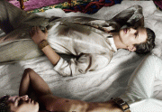
Versace S/S 2010 : Georgia May Jagger & Simon Nessman by Mario Testino
- Thread starter Northern Star
- Start date
LagerfeldBoy
Active Member
- Joined
- Jul 5, 2008
- Messages
- 4,259
- Reaction score
- 4
#131- this would have been so great. wow.
Couldn't agree more. It just oozes sex appeal compared to Geogia's shots that just look contrived.
VersaceLuva586
Active Member
- Joined
- Aug 2, 2009
- Messages
- 1,333
- Reaction score
- 0
I love the new shot with the Pink dress.....it looks alot more vibrant in colour than on the runway.
I just want to see some standing up shots like the one i posted from Vogue UK.
Those killer shoes need to be advertised properly!
I just want to see some standing up shots like the one i posted from Vogue UK.
Those killer shoes need to be advertised properly!
After looking at the newest shot, my verdict is.... I don't like the ad campaign. Georgia is beautiful in her own right, but she cannot model at all. Why couldn't they have just used Lara Stone!? They look alike on the face, but atleast Lara actually has some sex appeal to sell Versace clothes and fits the Versace aesthetic more.
- Joined
- Jan 9, 2008
- Messages
- 36,920
- Reaction score
- 24,854
Just came across this scan from Vogue UK and wouldn't this have been awesome for the campaign??
Versace Twitter
Yes without a doubt that would make one stunning campaign shot. I thought the exact same thing when I saw it in UK Vogue.
With a dramatic background to make it less editorial, it would work to perfection. I love the energy from Constance and Alla there.

The new shot is the best out of the lot. Nice change in angle, shame about the rest. Thanks for posting!
testinofan
███████████████
- Joined
- Aug 24, 2004
- Messages
- 7,407
- Reaction score
- 124
wooow love this shot
- Joined
- Dec 25, 2009
- Messages
- 8,527
- Reaction score
- 13
ugly.tacky.insult to the collection.
the only shot i'd save is the one with the black&white suit..the rest are..
this collection was perfect for a campaign with isabeli fontana
This I have to agree with. Isabeli's got a better body and she's more beautiful.
Northern Star
French Chic
- Joined
- Apr 1, 2006
- Messages
- 16,026
- Reaction score
- 270
As an advertising tool the newest image is probably the best....unfortunately facially for Georgia it's by far the worst. Clearly she looks better upside down.
As an advertising tool the newest image is probably the best....unfortunately facially for Georgia it's by far the worst. Clearly she looks better upside down.

FashionPower
Well-Known Member
- Joined
- Jul 7, 2008
- Messages
- 10,500
- Reaction score
- 4,563
Ah ah love the last shot!
Georgia has this kind of sl*tty air in all the shots,which I love
Great to see those killer shoes too,they're gonna rock next season!
Georgia has this kind of sl*tty air in all the shots,which I love

Great to see those killer shoes too,they're gonna rock next season!
KhaoticKharma
Amour Comme Hiver
- Joined
- Jul 13, 2005
- Messages
- 4,550
- Reaction score
- 10
lol that new one looks kinda sl*tty. Especially when it's Georgia, she kinda gives off a "My sugar daddy bought me this dress" vibe.
I actually feel like this is fashion's new direction... from the Babydoll's of the '00's to the sex kittens of the 10's. Something tells me that five years from now, lots of ads will look like this one. Goes hand in hand with the hard economic times, too.
Donatello89
Active Member
- Joined
- Jan 15, 2009
- Messages
- 3,010
- Reaction score
- 0
vogue pic is awefull !!!
testinofan
███████████████
- Joined
- Aug 24, 2004
- Messages
- 7,407
- Reaction score
- 124
Wooow This Is So Hot No Amazing Loveethis Campaing
Similar Threads
- Replies
- 105
- Views
- 18K
- Replies
- 93
- Views
- 17K
- Replies
- 1
- Views
- 1K
- Replies
- 159
- Views
- 28K
Users who are viewing this thread
Total: 1 (members: 0, guests: 1)
New Posts
-
-
-
-
Jonathan Anderson - Designer, Creative Director of JW Anderson & Christian Dior (18 Viewers)
- Latest: TomBlanksFullFatMiuMiu
-


