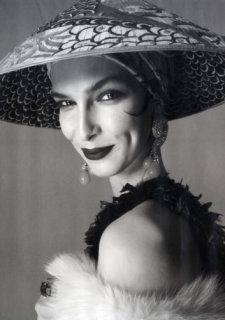
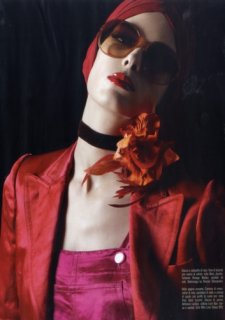
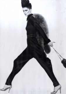
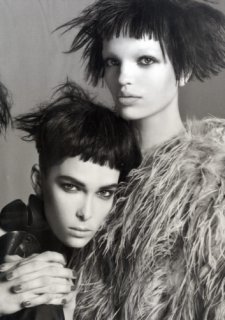
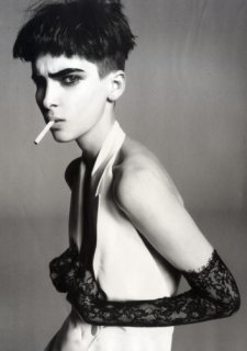
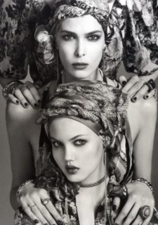
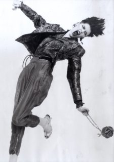
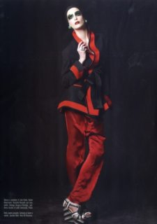
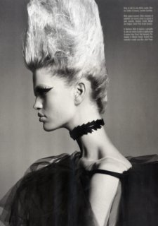
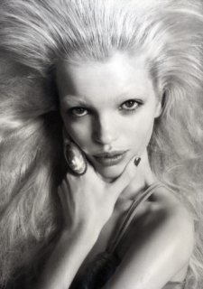
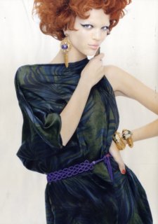
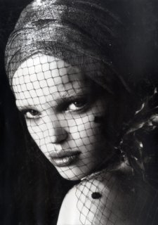
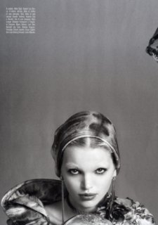
Vogue Italia April 2011 : Kristina Salinovic by Steven Meisel

That's the resulf of choosing the most random model, the most random clothes, probably Meisel was drunk when he come up with this, I just google the model and she has such an interesting look, why the stylist don't use that to make the cover more edgy, I agree with some people this looks like a 90's cover, really this is the worst Vogue Italia cover EVER! :judge::innocent:


quite frankly not even that could excuse it...I mean, someone at the magazine had to have chosen this particular photo...was this really the best pic from the whole shoot?
 
With a face like hers they should have gone with a close-up.

I'm not sure where this is going as I don't think she will become one of Meisel's favorites but the cover is not so bad. It kind of looks like a banana advertisement,what the hell is she wearing? A belt over her breasts? I like the bright orange in contract to the black. I would never go with that but I'm sure it will be catchy at the newsstand. I also like the ugly brace but that pose. I hate it on covers. It's like they are trying so hard to show that this is Vogue not Marie Claire or Allure.
 
I'm one of the few loving this cover here..

I think Kristina looks fenominal.
The make-up is iconic.
The colors of the outfit and accessories are amazing.
The photography style is very interesting and different from what you'd excpect from Miesel.

The only thing I don't like a lot is the HUGE text.

Very well said. :flower:^_^
 
I agree with ZFashionBlog, the only thing off about this cover is the text placement, I cannot for the life of me understand how this could be even considered among the worst Vogue Italia covers. Honestly, this is a lovely image, the colors are fresh and eye-cathing, Kristina is the exact right choice (cannot believe people are surprised that Meisel is loving this girl given her edgy look and parallels to another Meisel favorite, Jamie Bochert) and the styling actually makes me excited to see the editorial, which I cannot say for the last couple of VI covers.
 
The more I look the more I see appeal. Although I don't understand how this could be considered one of Vogue Italia's worst covers. Even the text doesn't bother me, Vogue Italia doesn't usually go overload. However I dislike the styling and have to agree with tigerrogue, I don't see how that outfit can do Kristina justice. Hopefully after seeing the main editorial, the cover becomes coherent.
 
i'm surprised nobody noticed the ressemblence btw that cover and the first days of tFS' Vogue Cover Challenge ...
:D
 
quite frankly not even that could excuse it...I mean, someone at the magazine had to have chosen this particular photo...was this really the best pic from the whole shoot?
THIS! The fact that the stylist chose that outfit. the model struck that pose and the photographer snapped it is understandable to me (not that I think that all of those aspects are perfect), but what has me scratching my head are the decisions made after that, it is the selection of that particular image when presumably dozens are taken per outfit. Furthermore, it is not the font size, font color and background color, rather it is the number of words and the words themselves.
 
Last edited by a moderator:
^I may be wrong, but I've heard that photographers shoot cover images in a different way than other images in an editorial. They mind where the text goes and they use different frames or something like that. I don't think they just choose the best image and make it the cover.
 
Well, I don't hate it for starters... It's a simple, beautiful picture and I'm so glad that it's Kristina on the cover. I like that is a different side of her usual tough, edgy look. It doesn't feel obvious.

The text size, color and placement are odd and overkill the entire cover.
 
Her face is gorgeous here.
I also like the photography.
I don't like the ruffled orange top.
I HATE the font and the caption...

What to wear with what? srsly?
 
^I may be wrong, but I've heard that photographers shoot cover images in a different way than other images in an editorial. They mind where the text goes and they use different frames or something like that. I don't think they just choose the best image and make it the cover.
Yep you're right, but my point is that several images are taken and this one just looks like a bad selection for the cover, namely that the pose and outfit are incongruent, but when the photographer and model are "in the moment" on set, even if they know that they are shooting the cover, I don't see them being that analytical. Specifically, the model poses and the photographer directs and snaps and therefore I don't "blame" Kristina or Meisel or even Enningful (not crazy about the necklace and maybe the top) for this cover, I am inclined to believe that there were more suitable images on the roll.
 
Last edited by a moderator:
The ghost of Carmen Miranda possesed a carrot and somehow managed to land on a VI cover. Oh, what our world has come to.
 
Yeah you're right, first Japan then Libya, now this Vogue Italia cover, it's truly the end of days.
 
I like the dark/orange thing, and I love the pose and expression. I suppose the text must be the interesting imperfection.
 
womenmanagement
 

Attachments

  • 3166_154490.jpg
    3166_154490.jpg
    110.6 KB · Views: 34
  • 3166_154491.jpg
    3166_154491.jpg
    115.1 KB · Views: 48
  • 3166_154492.jpg
    3166_154492.jpg
    80.4 KB · Views: 31
  • 3166_154493.jpg
    3166_154493.jpg
    130.2 KB · Views: 42
  • 3166_154494.jpg
    3166_154494.jpg
    97.8 KB · Views: 48
  • 3166_154498.jpg
    3166_154498.jpg
    142.6 KB · Views: 53
  • 3166_154497.jpg
    3166_154497.jpg
    97.6 KB · Views: 37
  • 3166_154496.jpg
    3166_154496.jpg
    107.1 KB · Views: 40
  • 3166_154495.jpg
    3166_154495.jpg
    85.5 KB · Views: 38
....
womenmanagement
 

Attachments

  • 3099_154518.jpg
    3099_154518.jpg
    104.2 KB · Views: 58
  • 3099_154519.jpg
    3099_154519.jpg
    116.8 KB · Views: 75
  • 3099_154520.jpg
    3099_154520.jpg
    121.2 KB · Views: 61
  • 3099_154521.jpg
    3099_154521.jpg
    119.2 KB · Views: 53
  • 3099_154522.jpg
    3099_154522.jpg
    103 KB · Views: 48
Daphne looks fantastic :heart:, great she's working with Meisel, i wish she was on the cover though.
 

Users who are viewing this thread

New Posts

Forum Statistics

Threads
212,496
Messages
15,187,228
Members
86,385
Latest member
muglaasli
Back
Top
monitoring_string = "058526dd2635cb6818386bfd373b82a4"
<-- Admiral -->