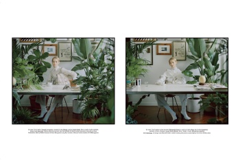
Vogue Italia April 2017 : Sara Grace Wallerstedt by Mert Alas & Marcus Piggott

Wow! I can't remember the last time I was slightly interested in a editorial by Miles Alridge since Immaculée for Numeró literally a decade ago. (One of the most memorable shoots in the last decade IMO). By the Sea, is by far more cinematic than his usual kitsch, technicolor, Stepford wife editorials he does for Vogue Beauty.
 
We all know if this said Steven Meisel you'd all be falling over yourselves about it.
 
We all know if this said Steven Meisel you'd all be falling over yourselves about it.

So true. Meisel would probably deliver another uninspired story as everything he's been doing for the past couple of years. :lol:

That being said, the cover does very little to me. I'm still waiting for that Roversi or Tim Walker cover. A Tim Walker Sicily-inspired cover for table 2, please!
 
Wow! I can't remember the last time I was slightly interested in a editorial by Miles Alridge

I'm surprised too! I normally hate his work but this ed is pretty good.

The main ed is also great. It's a mix of Tim Walker, Meisel and McDean but I do love it.

The rest is pretty boring and C-list.
 
Julia Hafstrom looks so beautiful in the Akrans editorial. I think the issue seems quite strong so far (though what is with the pink morph suits in the cover editorial? LOL)
 
this issue came so early! I'm curious about the next L'Uomo. This second issue is so pretty :heart:
 
M&M edit is on another level of copycatting, the grey skies and the off-kilter styling brought Vanderperre to my mind...Other than that I love the images but I agree that Sara could have handled the edit on her own.

Overall is such a nice departure to see something with actual substance in this magazine, Aldridge has been on auto-pilot for so long I've had forgotten he once was a talented photographer.

PD: Also VI's threads are so much more readable now that it isn't fillled with people making excuses for Meisel's mediocrity...
 
As much as I love sara on the cover and think she's the best choice for that kind of cover, the Cara shots do everething to me on the story...
NIce Miles Ladridge edit I agree
I love how soft is the story by akrans
very solid issue
 
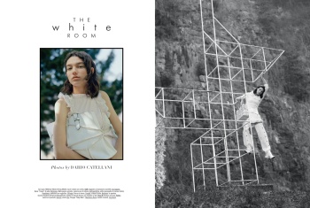
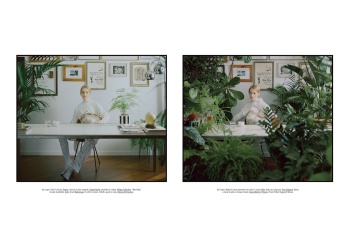
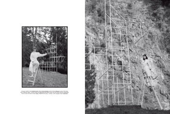
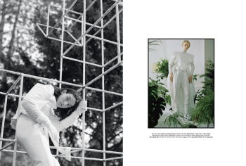
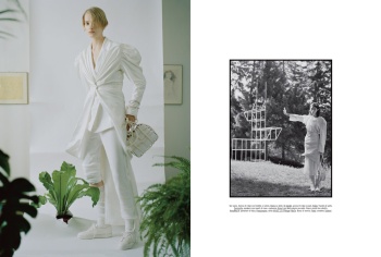
Here's some of Mckenna Hellam's editorial, shot by Dario Catellani:
 
Wow, odd how the strongest edits so far are from Aldridge and Akrans! With Aldridge, I now wonder whether it wasn't Franca who kept asking for the oversaturated and mannequin type of beauty stories. This is so remarkable, instantly renewed my interest in his work. The stripped down beauty in Camilla's edit is also remarkable. You wouldn't say Keira Knightley is actually a celebrity, she's giving the models a run for their money in her story. Actually helps to give Leith Clark's styling a nice dramatic and dark twist. I imagine Leith may have insisted on Keira, they are frequent collaborators. Odd to see her at VI........

Anna Ewers should consider taking a break. Honestly, what's with the lazy posing in that edit? In all fairness, Sorrenti is partly to blame here.
M&M have reached epic proportions with their copycat antics. It's sickening that they're getting such a platform for something not even original. Nothing in their edit interests me, it's been done before (and better!!).

Is the second girl trangender?

Ansley? Nope, she's all woman. I don't know why she was cast next to a lesser version of herself. Her features are far more distinct and intense than that of Sara's. It's a shame that they chose to disguise Ansley's freckles with layers of make-up. Just have a look at her model thread on here, there's a portrait pic in the OP which actually rivals the main cover shot.
 
Wow, odd how the strongest edits so far are from Aldridge and Akrans! With Aldridge, I now wonder whether it wasn't Franca who kept asking for the oversaturated and mannequin type of beauty stories. This is so remarkable, instantly renewed my interest in his work. The stripped down beauty in Camilla's edit is also remarkable. You wouldn't say Keira Knightley is actually a celebrity, she's giving the models a run for their money in her story. Actually helps to give Leith Clark's styling a nice dramatic and dark twist. I imagine Leith may have insisted on Keira, they are frequent collaborators. Odd to see her at VI........

Anna Ewers should consider taking a break. Honestly, what's with the lazy posing in that edit? In all fairness, Sorrenti is partly to blame here.
M&M have reached epic proportions with their copycat antics. It's sickening that they're getting such a platform for something not even original. Nothing in their edit interests me, it's been done before (and better!!).


Ansley? Nope, she's all woman. I don't know why she was cast next to a lesser version of herself. Her features are far more distinct and intense than that of Sara's. It's a shame that they chose to disguise Ansley's freckles with layers of make-up. Just have a look at her model thread on here, there's a portrait pic in the OP which actually rivals the main cover shot.

Transgender women are 'all woman' actually. I'm so sick of seeing transphobia on here.
 
Full editorial: First Light

88f089d81dc1b55fed7f1944eb080594_w800_h800_cp_sc.jpg


Julia Hafström photographed by Camilla Åkrans.

b754009cd2c509ea6cdc8ef3d50e4956_w800_h800_cp_sc.jpg

e2c0b0f08e599df4d7ec8d4e011e134a_w800_h800_cp_sc.jpg

891fe4d767d6abd2e169f88d1133c055_w800_h800_cp_sc.jpg

96a9acccd5a5b82682c5cbf23de998e8_w800_h800_cp_sc.jpg

0ca2d2e318daa00b3b26e3709ef12a2f_w800_h800_cp_sc.jpg

11d2caa4bcfbff1cf589952e9a40eda3_w800_h800_cp_sc.jpg

37f69c13f679f6d39ccd7aacee2d6517_w800_h800_cp_sc.jpg

d9704071811eaf342d31d045242a45ae_w800_h800_cp_sc.jpg

lundlund
 
It's always a pleasure to see Camilla Akrans! I feel like we rarely see her work these days.
 
I quite like this. Sara looks beautiful as usual and the whole cover gives me an 'alien' vibe. I just wished they removed the ugly text.
 
We all know if this said Steven Meisel you'd all be falling over yourselves about it.

+1

Franca was a legend and a colossus and her vision will remain unparalleled and inimitable but the magazine lost its touch in the past years. This issue is a step in the right direction, this is the best it's looked in a very long time, and I'd be more than glad to support it.
 
The only good editorial in here is Dario Catellani's, most original for that part as well. The other stuff is quite boring (Akrans, 4 of the shots are exact same of Julia lying down/shoulders up and the rest is just uncomfortable looking with a sunburn) and repetitive (M&M-going back to where they started? and Alridge). Ewer's editorial is anything but VI, so embarrassing!
 
Last edited by a moderator:
The White Room

Photography: Dario Catellani
Styling: Elisa Zaccanti
Hair: Paolo Soffiatti
Makeup: Helena Komarova
Models: Mckenna Hellam, Sunniva Vaatevik


clm-agency.com
 
I like it a lot, it has a poetry feel going on. I really like the colours.
 

Users who are viewing this thread

New Posts

Forum Statistics

Threads
212,573
Messages
15,189,573
Members
86,468
Latest member
littlelous
Back
Top
monitoring_string = "058526dd2635cb6818386bfd373b82a4"
<-- Admiral -->