thefunkykitten
Member
- Joined
- May 23, 2006
- Messages
- 405
- Reaction score
- 0
*drooooool*
It's beautiful, the details are stunning and it's certainly a bit more interesting than Dior has been, but let's face it, these are the same shapes we've been seeing, just done in different colors with different embroideries and a different reference as the starting point.
Even the reference point, Dutch Masters and Baroque painting is something he's touched on a few times in the last 4 years. But the thing with these recent Dior collections that's so disappointing is that Galliano just isn't doing anything interesting with his references anymore. He doesn't blend a bunch of disparate elements together to get an amazingly creative end result, and that really was what made John so incredible.


please do not quote images. thank you.
getty


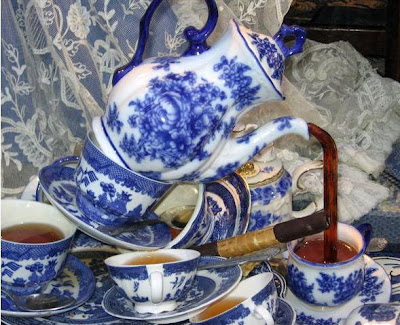
This looks like painted china:
please do not quote images. thank you.
http://parisbreakfasts.blogspot.com/2008/09/painting-blue-and-white.html
I love this collection!


