Color Theory : Do You Clash?

i couldn't live without color in my wardrobe! i don't adhere to any color mixing 'rules' and love to mix and match colors within different prints....bring on the black and yellow 'bumble bee' color connotations ^_^. i wear a marigold yellow sweater with black diamond print on the sides, which i adore; 'star trek' comparisons from co-workers be damned! as long it looks and feels good to the wearer, that's all that really matters, imo.


that said i generally keep the accessories and layering of garments to a minimum when i do have a lot going on in terms of prints/colors. bright primary colors set against a backdrop of black is my favorite color combo, ever. some examples from my own wardrobe:


close-up of my favorite dress print and favorite sweater cuff detailing:
color.jpg sweater.jpg
my scans


also it's good to know which colors or specific shades of colors suit you; i.e. which brighten your complexion, brings out your features or adversely wash you out and make you look tired. from those basic color building blocks, the possibilities are endless.


here's one of the most genius examples of unexpected color combos in a fashion editorial: chocolate brown and powder blue.


" The Taming of the Tan "
Harper's Bazaar May 1996
Ph: Patrick Demarchelier
source: philA @ bellazon

Posted by pipoca
 
The only rule I follow is that it should look good.
The success of mixes all depends on the texture, hue, saturation and balance.

But I agree about heeding cultural contexts about Halloween, Christmas, flags etc.


Ohhh palest lavender/lilac with just an accent of almost vermilion lacquer red is one of the most magical color combinations out there...
Like a palest lilac linen dress with cherry red nails and lips :heart:

I will admire it on you :wink:

I have worn orange and black before ... I've owned at least two orange dresses. I considered the Halloween thing, and then went for it ...

I almost never wear green, but I do decorate with red and green ... definitely possible to do without evoking Christmas.

Red/white/blue, no problem :wink:

PS Re coworker comments, I've gotten a lot of 'Dorothy' for my red shoes ... hasn't stopped me, I love red shoes!
 
Last edited by a moderator:
i have some platinum jewelry on my left hand...

but i recently bought this pamela love bracelet in brass. fashiolista

do you think it will be less clashing if i just kept the cuff on my right hand? or maybe no one will really care...


Attachments

  • penta1.jpg
    penta1.jpg
    25.8 KB · Views: 2
i have some platinum jewelry on my left hand...

but i recently bought this pamela love bracelet in brass. fashiolista

do you think it will be less clashing if i just kept the cuff on my right hand? or maybe no one will really care...


:o 
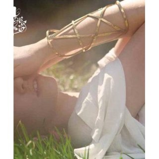
What a beautiful bracelet! I want!!

Do you mean platinum rings??
I'd say it would depend on the style of the rings.
 
i have some platinum jewelry on my left hand...

but i recently bought this pamela love bracelet in brass. fashiolista

do you think it will be less clashing if i just kept the cuff on my right hand? or maybe no one will really care...


Nice!
I actually think it would look quite cool with the platinum jewellery on one hand and the brass bracelet on the other. To some extent I think it could create an effect similar to the effect asymmetry creates.
Especially if your platinum jewellery are somewhat delicate.? In my head the clashing of the colours and the 'size' of the jewellery creates friction in a good way.

In general I think complimentary (or almost complimentary) colours are hard to pull off. e.g. red and green. But I do think that combining more off beat nuances of the colours in question provides a more 'neutral' look. I also think that it often looks more original. e.g. poison green and wine red.
 
Last edited by a moderator:
On some tv-show I saw a stylist claiming that 'blue and green should never be seen'.

Maybe I've seen the same show, I can never wear blue and green together (though my wardrobe is almost basically black, white and green so it's not very hard:D). And when I see people wearing blue and yellow together, I always start think of the swedish flag!
 
Last edited by a moderator:
It depends on the shades for most color combinations, but yellow+black is a definite no-go for me...
 
Maybe I've seen the same show, I can never wear blue and green together
I wore that so often this winter (blue sweater + military jacket or blue coat, mint green sweater + dark blue parka). It looks alright to me.. not difficult at all.

Agreed on yellow and black.. I find yellow in general to be hard to wear, even on accessories, it must be a really nice shade of yellow (like mustard) and the garment has to have good proportion, and I don't think it looks good on all body types. I think gray is yellow's best companion.. maybe cream. And yeah, yellow + green = Brazilian flag, yellow + blue = Swedish flag.. can't stand that :lol:.. I find nationalistic combinations on purpose tacky in general, especially when you're not attending a specific event that requires that and are just wearing it to work or when doing the groceries.

I always combine silver + golden jewelry by the way :ninja:... all my bracelets and watch are silver, but earrings are sometimes golden, same for necklaces. Lately I've been loving the idea of a small golden cross in one ear and a long silver chain (as an earring) on the other. Probably doesn't any sense, but yeah. :lol:
 
Last edited by a moderator:
Maybe I've seen the same show, I can never wear blue and green together

:lol: In the UK that saying goes: "blue and green should not be seen without a colour inbetween".

Even with a colour inbetween, I don't think I can get on board with the two together.

I like tan and black together, but not really dark brown. I do like navy and black together though, especially a really deep midnight blue.
 
I think it is entirely up to the individual what colours they wear together and it is more shade and texture that is more important. I have a pair of russet brown suede boots which I often wear with black jeans, but Mr Feline tells me black and brown should not be worn together and I disagree with him. I think it is something he got from his mother as I have never seen her in black and brown. What I find harder is wearing different shades of the same colour in one outfit. For instance, the other day I couldn't decide if dusky pink boots looked good or bad with a darker pink jacket. The rest of my outfit was black. In the end I wore them and I think it worked.
 
What I find harder is wearing different shades of the same colour in one outfit. For instance, the other day I couldn't decide if dusky pink boots looked good or bad with a darker pink jacket. The rest of my outfit was black. In the end I wore them and I think it worked.
I think so too. I think it's really about the right hue, for example there is a blueish green and a more yellowish green and they clash more than a lighter blue-green together with a darker blue-green. If that makes any sense :P
 
No portuguese man could combine red and green without being associated with the national flag. :lol: I was taught that «blue and green should never be seen» as well, and although I don't exactly care for pre-established rules regarding style matters and always trust my personal taste instead, I still can't bring myself to wear those two together.
I always had a hard time combining brown with other colors as well, which made me get rid of every single one of my brown pieces.

I really like blue and grey, especially in the Winter. Black and blood red are a current obsession of mine (which is odd, considering that I've never been one for red and now I'm obsessed), but I'm always afraid of ending up looking like a Marvel character. :lol:
Whenever I need to look particularly polished, I usually go with the classic dark suit/white shirt/black tie dynamic, but after a few days of formal events it gets incredibly dull. A few days ago, I decided to take a risk and combine a black suit with a blood red shirt. However, as soon as I got out of the house, I realized that the suit was actually dark blue - and after a brief moment of panic, I realized that it actually worked perfectly well.
I'm glad it did, because I was way too late to go back and change anyway. :rofl:
 
Last edited by a moderator:
I think navy and black can look good together but my problem is when the black is faded. I would never wear too many pastel colors together cause than one looks childish or lie a giant Easter egg.
 
^ I loved how Phillip Lim mixed up to 3 pastels for this summer and it still looked lovely (probably because the materials are so soft and the cuts are all quite minimal).

3484sjp.jpg
2z7hbbo.jpg

[stylebistro]

I also think it was pretty smart to use white as either top or bottom cause it works as a nice canvas to balance things out and not look overly trendy.
 
I think the white did a good clash with the pastels. That's one of the occasions when I will say pastel works.

I guess when I talked about the all over pastels I was thinking of the Clueless head to toe pastel outfit.
 

Users who are viewing this thread

New Posts

Forum Statistics

Threads
212,037
Messages
15,170,349
Members
85,849
Latest member
bellison1
Back
Top
monitoring_string = "058526dd2635cb6818386bfd373b82a4"
<-- Admiral -->