You are using an out of date browser. It may not display this or other websites correctly.
You should upgrade or use an alternative browser.
You should upgrade or use an alternative browser.
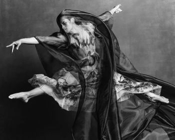
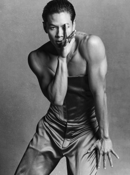
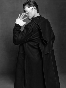
CR Fashion Book Issue #25 F/W 2024.25
- Thread starter vogue28
- Start date
fauxfashion
Well-Known Member
- Joined
- Oct 11, 2023
- Messages
- 1,001
- Reaction score
- 3,813
Deleted member 116957
New/Inactive Member
- Joined
- Apr 4, 2009
- Messages
- 13,746
- Reaction score
- 15,824
None of these are good...
WAVES
Well-Known Member
- Joined
- Aug 29, 2020
- Messages
- 3,361
- Reaction score
- 3,637
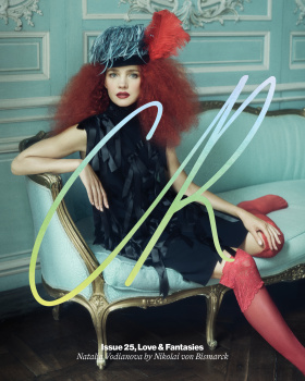
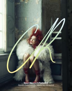
LOVE LOVE LOVE Natalia’s 2nd cover - it’s giving 2000’s and I am here for it.
she looks gorgeous and even if I have doubted lately of her modelling skills due to previous campaigns and whatnot she looks stunning.
will definitely buy this one being Natalia a fave of mine and Mrs. Supernova totally deserves it.
she looks gorgeous and even if I have doubted lately of her modelling skills due to previous campaigns and whatnot she looks stunning.
will definitely buy this one being Natalia a fave of mine and Mrs. Supernova totally deserves it.
Zorka
Well-Known Member
- Joined
- Jan 29, 2014
- Messages
- 19,022
- Reaction score
- 21,991
Avonlea
Well-Known Member
- Joined
- Feb 10, 2020
- Messages
- 3,314
- Reaction score
- 13,577
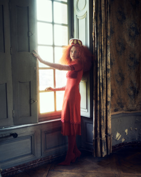
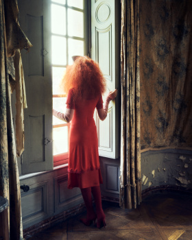
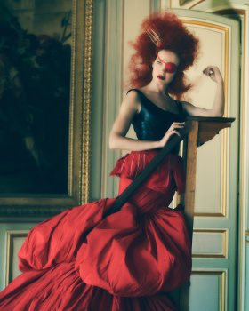
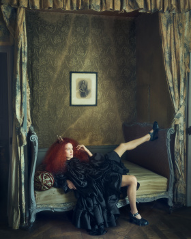
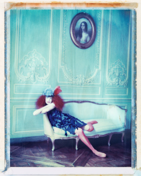
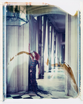
I don't consider Nikolai to be a particularly strong photographer but when he sticks to his usual formula (old interior + film) it works quite well.
Carine is so clueless with this magazine. Every issue is a disjointed mess.
Carine is so clueless with this magazine. Every issue is a disjointed mess.
BalkaniStaCouture
Well-Known Member
- Joined
- Mar 6, 2024
- Messages
- 5,389
- Reaction score
- 7,410
BalkaniStaCouture
Well-Known Member
- Joined
- Mar 6, 2024
- Messages
- 5,389
- Reaction score
- 7,410
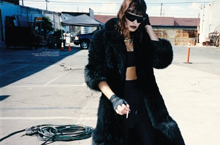
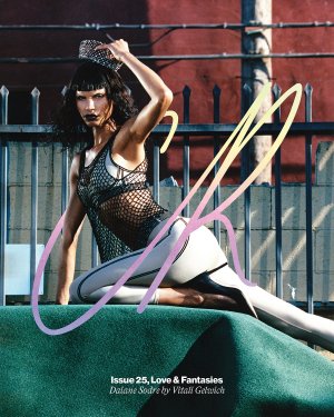
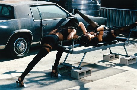
CR FASHION BOOK ISSUE 25 COVER
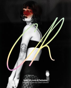

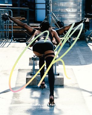
Photographer: Vitali Gelwich
Styling and Editor-in-Chief: Carine Roitfeld
Hair: Tiago Goya
Makeup: Homa Safar
Creative Director: Emmanuelle Levesque
Art Director: Guillaume Lauruol
Casting: Ali Kavoussi
Set Design: Romain Goudinoux
Models: Isabeli Fontana & Daiane Sodre
(thelionsmanagement.com)
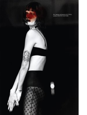
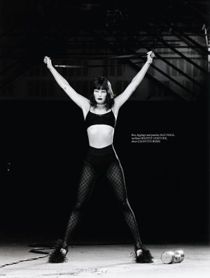
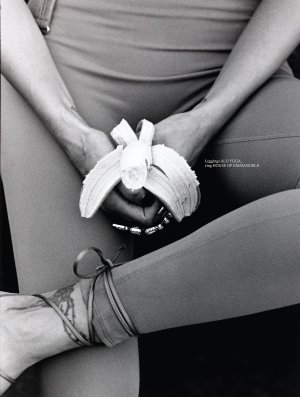
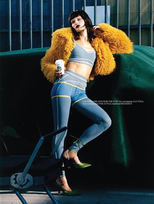
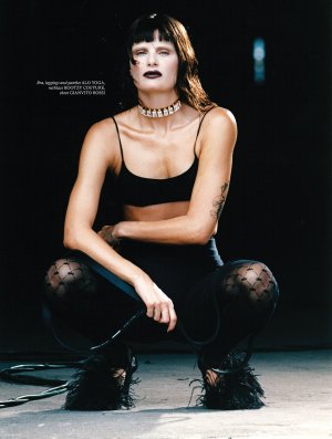
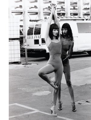
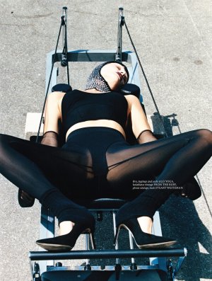

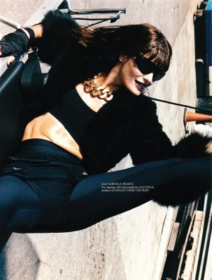
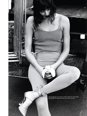
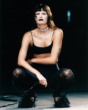
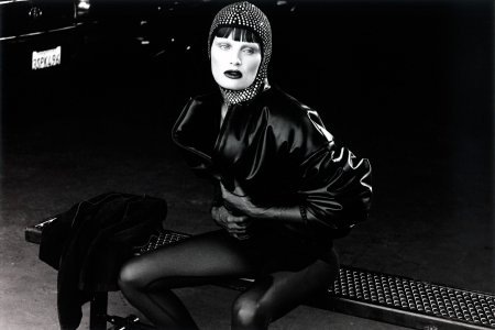
BalkaniStaCouture
Well-Known Member
- Joined
- Mar 6, 2024
- Messages
- 5,389
- Reaction score
- 7,410
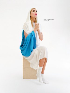
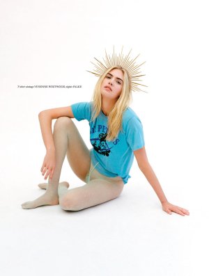
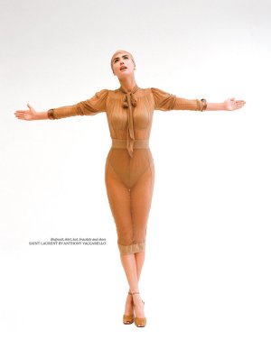
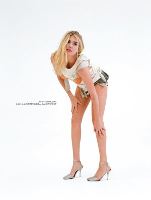
CR FASHION BOOK ISSUE 25 COVER
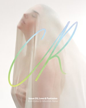
Photographer: Sebastian Faena
Styling and Editor-in-Chief: Carine Roitfeld
Hair: Karim Belghiran
Makeup: Stephane Marais
Creative Director: Emmanuelle Levesque
Art Director: Guillaume Lauruol
Casting: Ali Kavoussi
Set Design: Sylvain Cabouat
Manicure: Cecilia Abbas
Model: Kate Upton
(thelionsmanagement.com)
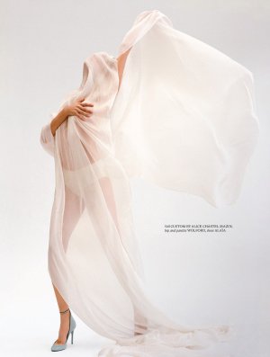
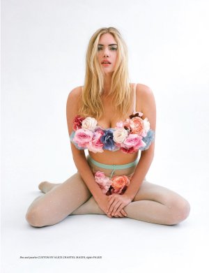
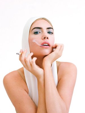
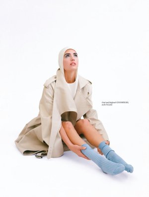
BalkaniStaCouture
Well-Known Member
- Joined
- Mar 6, 2024
- Messages
- 5,389
- Reaction score
- 7,410
CR FASHION BOOK ISSUE 25 COVER
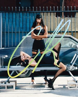

Photographer: Vitali Gelwich
Styling and Editor-in-Chief: Carine Roitfeld
Hair: Tiago Goya
Makeup: Homa Safar
Creative Director: Emmanuelle Levesque
Art Director: Guillaume Lauruol
Casting: Ali Kavoussi
Set Design: Romain Goudinoux
Models: Daiane Sodre & Isabeli Fontana
(thelionsmanagement.com)
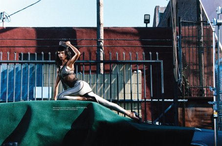
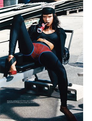

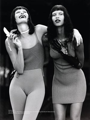
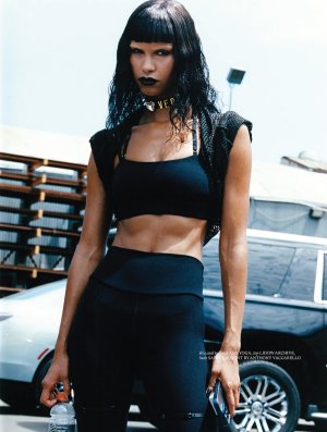
Royal-Galliano
völlig losgelöst
- Joined
- Nov 25, 2005
- Messages
- 16,121
- Reaction score
- 826
i never understood the point of this magazine. none of the features work together, it's just a random mashup of second class photography, not even the a-lister models help here. why not spare the paper that goes into this.
- Joined
- Jan 9, 2008
- Messages
- 36,920
- Reaction score
- 24,854
Cover #18 with Anna Ramfel by Brigitte Niedermair:
Cover #19 with Jill Kortleve by Kacper Kasprzyk:
Cover #20 with Jill Kortleve by Kacper Kasprzyk:
Cover #21 Mila van Eeten by Vitali Gelwich:
Cover #22 with Luca Biggs by Erika Kamano & Ben Perreira:
Cover #19 with Jill Kortleve by Kacper Kasprzyk:
Cover #20 with Jill Kortleve by Kacper Kasprzyk:
Cover #21 Mila van Eeten by Vitali Gelwich:
Cover #22 with Luca Biggs by Erika Kamano & Ben Perreira:
jeremydante
Well-Known Member
- Joined
- Jul 15, 2009
- Messages
- 3,725
- Reaction score
- 1,412
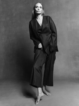
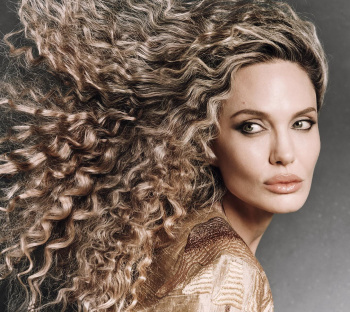
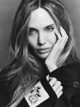
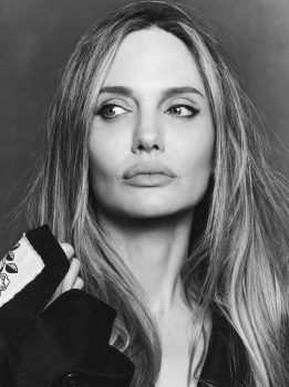
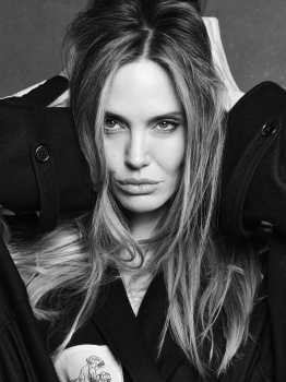
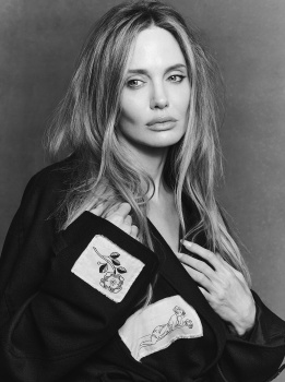
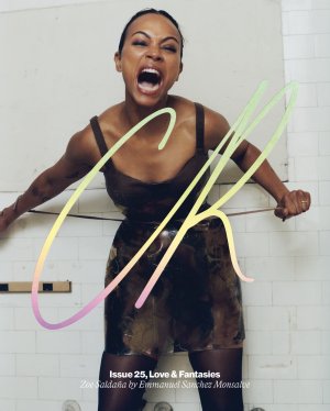
Seeing Angelina's editorial, they chose the wrong cover image. I've never been a fan of hers, but love the images with her straight hair, her hair isn't naturally textured the ways it's styled in her cover shots, it was unnecessary.
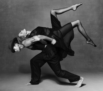
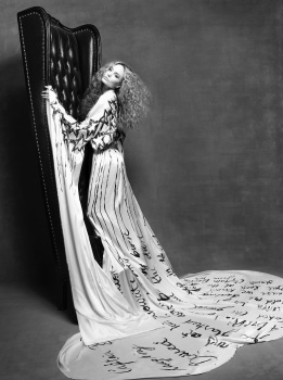
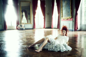
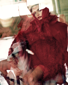
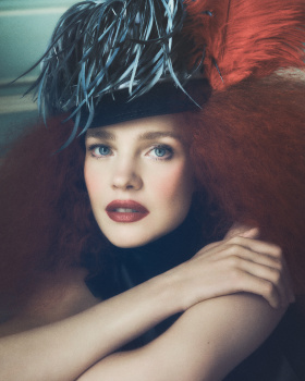
Natalia Vodianova's spread and covers(?) a no-brainer, obviously she can serve that like and we love to see it after all these years. The cover series alongside one another is so expansive im not sure who the cover star is or even sure how each cover is tied to each other. It's all over the place.
Carine is very much a genius, but the utility and intention of CR's covers is almost always a miss in it's attempt to achieve was a proper cover series should do. Great editorial content, but I'm not sure much was propelled forward.
helmutnotdead
Well-Known Member
- Joined
- Jan 29, 2018
- Messages
- 2,050
- Reaction score
- 5,605
Marie Amelie and Emmanuelle are probably laughing hard looking at this mess.
Similar Threads
- Replies
- 15
- Views
- 3K
Users who are viewing this thread
Total: 1 (members: 0, guests: 1)

