You are using an out of date browser. It may not display this or other websites correctly.
You should upgrade or use an alternative browser.
You should upgrade or use an alternative browser.
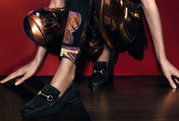
Gucci S/S 2014 : Amanda, Elisabeth, Luca & Tommaso by Mert Alas & Marcus Piggott
- Thread starter Northern Star
- Start date
valliaddict
Active Member
- Joined
- Jul 15, 2011
- Messages
- 3,500
- Reaction score
- 5
I just don't understand why they decided to use that shiny red background.  This whole campaign would've worked so much better if the setting was maybe a fancy suite (think Gucci S/S 12 or Versace S/S 07). The casting if off too, but I think separately the girls look alright, just not together. I would've casted two more girls & put them in between Amanda & Elisabeth. Sometimes campaigns can look too crowded with more than three girls, but in this case it would've worked. Had Nadja & Andreea been in between Amanda & Elisabeth, this could've been awesome.
 This whole campaign would've worked so much better if the setting was maybe a fancy suite (think Gucci S/S 12 or Versace S/S 07). The casting if off too, but I think separately the girls look alright, just not together. I would've casted two more girls & put them in between Amanda & Elisabeth. Sometimes campaigns can look too crowded with more than three girls, but in this case it would've worked. Had Nadja & Andreea been in between Amanda & Elisabeth, this could've been awesome.
- Joined
- Jan 9, 2008
- Messages
- 35,373
- Reaction score
- 20,480
The newest shot where they're wearing the purple pieces, is by far the strongest image we've seen. The colours work well together and I like the symmetry between the two girls. For the time time a handbag from the collection actually looks desirable too.
Thefrenchy
Well-Known Member
- Joined
- Nov 13, 2006
- Messages
- 12,004
- Reaction score
- 1,241
Tommaso is the best thing about this campaign 

Mat Cyruss
Mag Master
- Joined
- Jun 4, 2012
- Messages
- 6,307
- Reaction score
- 33
the video
via gucci.com
via gucci.com
Verhangenheit
Active Member
- Joined
- Apr 25, 2012
- Messages
- 1,095
- Reaction score
- 4
They use “Tai Chi” in this AD video,Good idea!But still feel wrong model choice,wish Natasha come back!
TREVOFASHIONISTO
Active Member
- Joined
- Jun 2, 2008
- Messages
- 15,357
- Reaction score
- 65
Amanda is the best of the two, but nothing about them feels Gucci to me
zacatecas570
Well-Known Member
- Joined
- Sep 27, 2008
- Messages
- 7,090
- Reaction score
- 594
Until now I'm getting the asian vibe. The girls are not enough strong to be in this Gucci campaign. The blonde one should be Natasha and the brunette Karmen. 

Deleted member 116819
Active Member
- Joined
- Mar 31, 2009
- Messages
- 2,459
- Reaction score
- 10
Vitamine W
Well-Known Member
- Joined
- Oct 15, 2010
- Messages
- 2,939
- Reaction score
- 894
Looks like a lookbook to me. One of their worst campaigns to date.
Similar Threads
- Replies
- 77
- Views
- 17K
- Replies
- 61
- Views
- 14K
- Replies
- 14
- Views
- 10K
- Replies
- 18
- Views
- 11K
D
- Replies
- 229
- Views
- 59K
Users who are viewing this thread
Total: 2 (members: 0, guests: 2)


