iriswills
Well-Known Member
- Joined
- May 11, 2006
- Messages
- 711
- Reaction score
- 135
8 pictures but there might as well be 2
And yet, I could stand twenty more.
Share your thoughts on... The 2026 Met Gala!
8 pictures but there might as well be 2
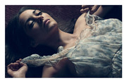
That cover would be gorgeous if it came on thickly textured paper, with a tactile dimension to the expanse of skin and shadows.
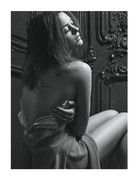

Are you kidding? I think it is the most beautiful editorial Marion has ever been featured in... And I am not her fan at all.Wow...
I hate that editorial, a lot. The bad part is I thought "could it get any worse?" & It didn't, and I hate it even more!
Are you kidding? I think it is the most beautiful editorial Marion has ever been featured in... And I am not her fan at all.
 But I don't follow Marion's work. I don't dislike her, nor am I a fan. But, I just don't think this is beautiful. That's only my opinion though. If I was one of Marion's biggest fans, I certainly would not go out of my way to get my hands on that editorial.
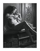
Not enjoying the grain in the cover. The last issue I bought was the Madonna one and the lack of print quality of the cover really made me angry. The close-up idea is pretty clever because it brings direct intimacy, but they could have done it properly, without doing cropping, at least it seemed to. I can't say the same about Megan Fox's cover due to its photoshop overdose.
But the Madonna one was personally upsetting. I hope the same doesn't happen this time. The other pictures from the ed. seem to be much more powerful than the Bland cover. I can't tell if she's having a sexy moment or just dread.
I'm quite indifferent if she's Marion or Maria, but please, change your face if you are try to tell us you're somebody
Well, isn't it rather simple? Either you get grain or some other evasive manouvre on your cover, photoshop overload or, dear lord, wrinkles?
")