You are using an out of date browser. It may not display this or other websites correctly.
You should upgrade or use an alternative browser.
You should upgrade or use an alternative browser.
tFS Fashion Photographers - Share Your Work. Before Posting, please read Post #1
- Thread starter pamelaz
- Start date
BetteT
Well-Known Member
- Joined
- Jan 22, 2003
- Messages
- 22,818
- Reaction score
- 111
verseau said:Wow.. there is some very very good work here!
Yeah ... there is!
 Welcome to tFS, Verseau .... you'll enjoy it here.
sinstinker
Member
- Joined
- Sep 28, 2005
- Messages
- 772
- Reaction score
- 3
I have a question, when you are a colllector I have orginal prints of avedon and arthur elgort and some from magazines, I notice know that firstview and getty you can purchase pictures from them, now if I wanted to purchase recent fashion work how could I go about this? any advice I know some photographers are with agencies or for client but if you are a private collector how could you approach this? any thoughts or answers I would be greatful

Last edited by a moderator:
imagedistillery
Member
- Joined
- Sep 29, 2006
- Messages
- 20
- Reaction score
- 0
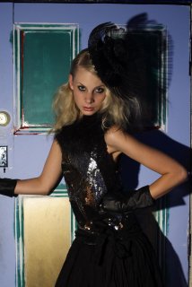
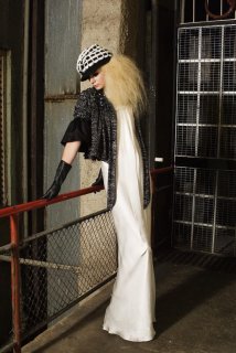
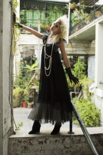
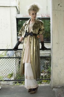
Generally speaking the photographer is the copyright holder so the best bet would be to get in touch with either the photographer or their agent.
Vital Agibalow
Attachments
-
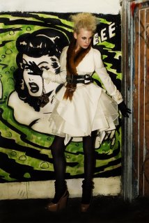
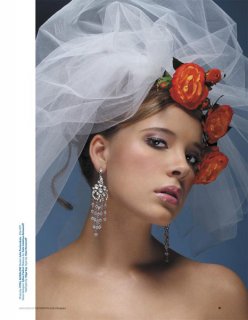
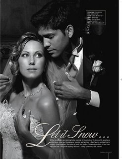 RBM_F_W_Pages_111_12007.jpg100 KB · Views: 2
 -
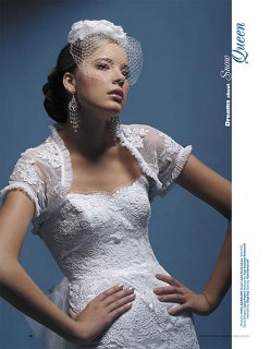
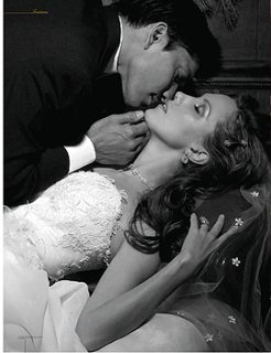 RBM_F_W_Pages_111_12008.jpg98.2 KB · Views: 1
 -
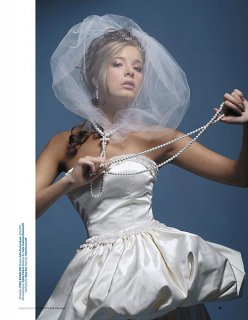
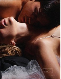 RBM_F_W_Pages_111_12009.jpg126.3 KB · Views: 1
 -
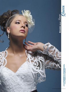
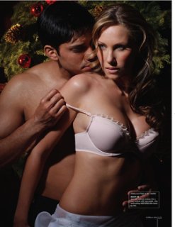 RBM_F_W_Pages_121_13003.jpg112.3 KB · Views: 4
 -
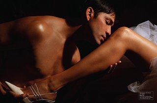 Untitled-1.jpg95 KB · Views: 2
 -
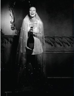 RBM_F_W_Pages_121_13008.jpg77.6 KB · Views: 4
 -
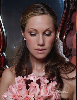 RBM_F_W_Pages_121_13006.jpg143.9 KB · Views: 2
 -
 Untitled-2.jpg104.5 KB · Views: 3
imagedistillery
Member
- Joined
- Sep 29, 2006
- Messages
- 20
- Reaction score
- 0
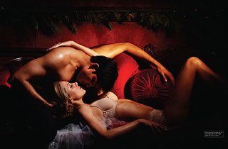
Beautiful shots, love the lighting
imagedistillery
Member
- Joined
- Sep 29, 2006
- Messages
- 20
- Reaction score
- 0
BetteT
Well-Known Member
- Joined
- Jan 22, 2003
- Messages
- 22,818
- Reaction score
- 111
Go to this thread in Careers and Education ... this topic has already been started ... and post your question there, if it doesn't already answer your question.
http://www.thefashionspot.com/forums/f90/what-best-slr-digital-camera-48597.html?highlight=camera

http://www.thefashionspot.com/forums/f90/what-best-slr-digital-camera-48597.html?highlight=camera
driftninja
Member
- Joined
- Aug 11, 2005
- Messages
- 1
- Reaction score
- 0
I was just wondering if i could get some feedback i just finished my website. good/bad /harsh i can take it just dont make fun of my mullet. www.icandyimage.com
|PerfectTonight|
Active Member
- Joined
- May 20, 2005
- Messages
- 7,084
- Reaction score
- 14
If you want more visitors avoid flash animations. Consider that different people have different access to the internet. The design is great but navigation wise I find it somewhat complex.
Good luck!
Good luck!
driftninja said:I was just wondering if i could get some feedback i just finished my website. good/bad /harsh i can take it just dont make fun of my mullet. www.icandyimage.com
I must say, the photos are nice but all the animation and text is distracting from the photos. I think it would be better if you kept it more simple, you don't want people to be more drawn to the design and animation of the page, that detracts from the actual work which is what everyone who goes in there wants to see.
 Just my 2¢...
Cheers,
Ivonne
i agree with those who have already posted...
i think the most "complicated" aspect was the sort of floating menu... at first i wasn't sure if i was supposed to wait for it to stop spinning around but then it seemed like i had to catch the one i wanted..
something more simple and streamlined would be better so that you can let your work speak for itself and don't draw too much attention away from it

BetteT
Well-Known Member
- Joined
- Jan 22, 2003
- Messages
- 22,818
- Reaction score
- 111
Welcome to tFS, drfitninja!
I have NOT looked at your site yet, so this is not a critique of your site. I just wanted to comment on the subject of flash and graphics on photogbraphers' sites.
If you go to photographer's forums ... there's always a lot of discussion about this very issue and the consensus is always that "less is more" and flash is not only not necessary ... that flash is a negative.
They say that the art directors and others that hire photographers are busy people and will not take the time to wade through a flash site, waiting for it to load and trying to figure out how to get to the images ... which is the ONLY thing they are interested in. They will just leave the site and move on to the next photgrapher.
Most AD's (and I've hear this from photographer's agents too) state that they prefer, no flash, simple graphics and easily identified portfolios by arranged in categories (like fashion, commercial, portraits, celebrities, whatever is applicable to your work), so that they can quickly find the images they are interested in. The also like thumbnails rather than a scroll ... so that they can readily click on only those images that they want to take a close look at.
Keep it simple, fast and focused on your work. Don't fall into the trap of paying a webmaster to show off his work ... he needs to show his fancy graphics and cool effects on his own site, not yours.
Last edited by a moderator:
.francesca
about to fall or fly
- Joined
- Jan 7, 2005
- Messages
- 3,951
- Reaction score
- 0
i agree with this 100% - if it's any indication, we've been talking more about the site than we have about your actual work, which should tell you that in this case, less is really more.
the vast majority of flash is overrated, in my opinion. when it comes to something like photography, which is inherently still, using a lot of flash just detracts. bette is totally right - agents and ads and photo editors aren't going to want to wade through a lot of fancy graphics or wait for the portfolio page to load - they're going to move on. so no matter how amazing your work is, they'll never know, because they don't have the time or inclination to get to it.
good luck! it looks like there's some good work in there. let's see it!

i love this thread, nice to see what others are doing 
my work is here: http://www.ilovefake.com
i'm a photographer from amsterdam, netherlands, 25 years old, and only been doing this for 1 year. next week i'm invited to photography agencies
here are some examples of my work:


the rest are on my site i listed above.
kisses,
jolijn

my work is here: http://www.ilovefake.com
i'm a photographer from amsterdam, netherlands, 25 years old, and only been doing this for 1 year. next week i'm invited to photography agencies
here are some examples of my work:


the rest are on my site i listed above.
kisses,
jolijn
.francesca
about to fall or fly
- Joined
- Jan 7, 2005
- Messages
- 3,951
- Reaction score
- 0
you can see some of my recent work in our new visualising fashion banners! 

AshleyMakeup
Member
- Joined
- Mar 10, 2007
- Messages
- 6
- Reaction score
- 0
glennusdin said:hi, new member here and i wanted a quick read from this group on a test we shot in NYC last week. Model is Anya from 2NY models, MUA, hair and styling by Lani Todd. Lingerie by La Perla. Images shot on Nikon D2X. Any thoughts, critiques, comments and suggestions are more than welcome.


Glenn, I know this is an old post, but I love those images! Beautiful lighting.
Similar Threads
- Replies
- 206
- Views
- 327K
- Replies
- 1K
- Views
- 307K
D
- Replies
- 11
- Views
- 5K
- Locked
- Replies
- 3K
- Views
- 671K
Users who are viewing this thread
Total: 2 (members: 0, guests: 2)

