You are using an out of date browser. It may not display this or other websites correctly.
You should upgrade or use an alternative browser.
You should upgrade or use an alternative browser.
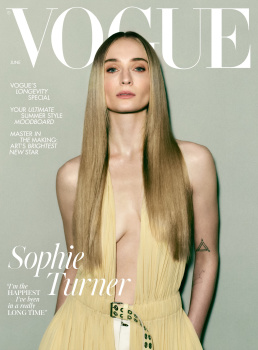
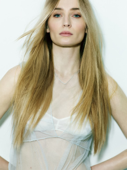
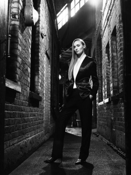
UK Vogue June 2024 : Sophie Turner by Mikael Jansson
- Thread starter crmsn
- Start date
Drusilla_
Well-Known Member
- Joined
- Feb 13, 2008
- Messages
- 2,191
- Reaction score
- 2,105
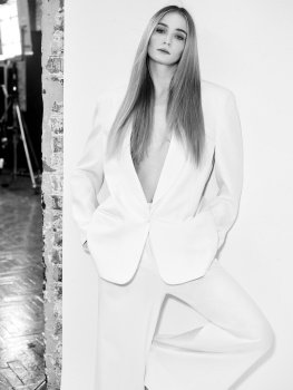
that washed-out background+washed-out dress make for a really drab cover. And it's a summer issue no less. If they really had to use that dress for the cover, they should've at least stood Sophie in front of a contrasting wall, this is a waste of her beauty (but the interview seems interesting, I give them that)
MModa
Well-Known Member
- Joined
- Oct 19, 2023
- Messages
- 2,018
- Reaction score
- 2,498
And that is a great thing! Also, Meisel is finally back in the pages of US Vogue.We can see that after the change of the Global Creative Director, both UK and US started work again with Jansson and Mert
D
Deleted member 1957
Guest
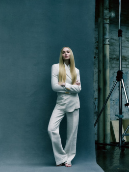
Its very easy to make Sophie Turner look good and photographing her with a washed out colour against a washed out background isn't it. The cover and editorial lack any form of excitement. Heck even the 'Le Smoking' shot looks dull.
Mr Yayo
Well-Known Member
- Joined
- Mar 3, 2021
- Messages
- 345
- Reaction score
- 413
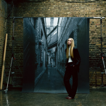
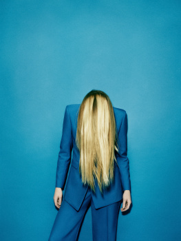
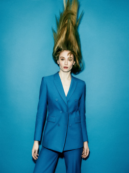
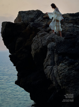
Inside, see the gallery
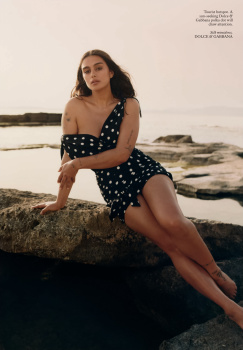
Yesss!! Outdoor shots xx
tigerrouge
Well-Known Member
- Joined
- Feb 25, 2005
- Messages
- 18,876
- Reaction score
- 9,681
I've just received my subscription copy, it's 232 pages, the cover shot isn't any better 'in person'.
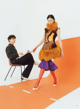
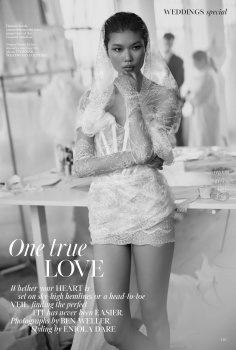
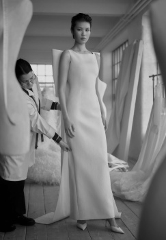
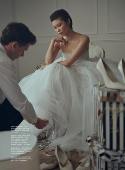
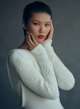
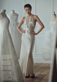
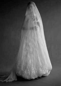
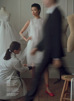
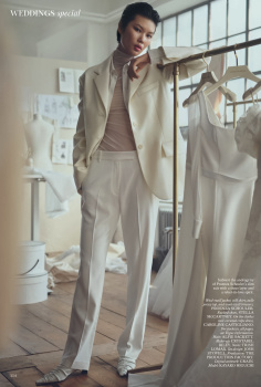
Flicking through it... same as most magazines at the moment, the ads are mainly for accessories, I'm mostly ignoring the content at the front, to get to the main editorial section, but there is an interview with Hamish Bowles about his recovery from his stroke. There's also a special Wedding section.
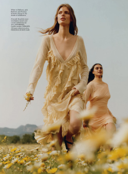
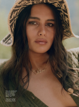
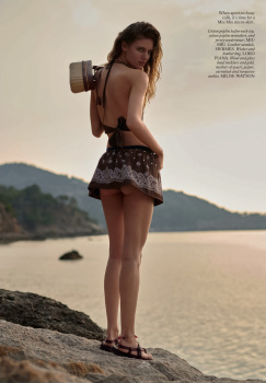
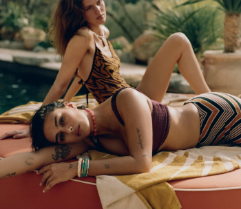
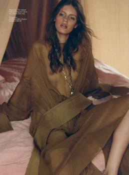
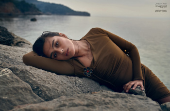
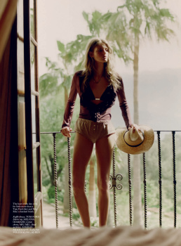
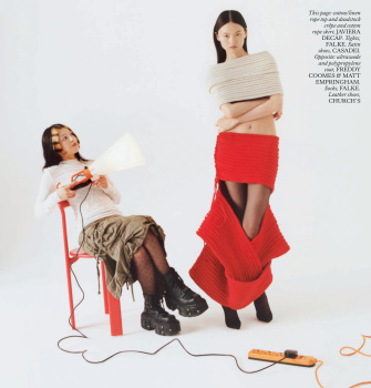
In the main editorial section, it opens with the cover story, followed by Kendall's US Vogue story, then an interview with the Mayor of Paris, Anne Hidalgo, an interview with artist Flora Yukhnovich, then what must be Spanish Vogue's cover story with Jill Kortleve AND Rosalieke Fuchs. Back page is 'What Would Chaka Khan Do?'
That it's 232 pages with not that many editorials tells you how much written content there is at the front of the issue. There's a bit of reading in it. Sophie's cover story looks like it could come from an edition of Elle, while Kendall's reprint stands out as having a proper summer feel.
tigerrouge
Well-Known Member
- Joined
- Feb 25, 2005
- Messages
- 18,876
- Reaction score
- 9,681
I see the newsstand issue might be on sale for £2.
Deleted member 116957
New/Inactive Member
- Joined
- Apr 4, 2009
- Messages
- 13,774
- Reaction score
- 15,808
I still see Harris Reed, I'm sorry!!!
NakedAndAfraid
Well-Known Member
- Joined
- Jan 20, 2024
- Messages
- 130
- Reaction score
- 296
Yeah, Harris Reed was my first thought too.
Also her face looks so relaxed, as if drained of energy from a good massage or sauna. Not something that works for me here.
Also her face looks so relaxed, as if drained of energy from a good massage or sauna. Not something that works for me here.
D
Deleted member 141523
Guest
Bagel Maker?! A noted fashion photographer!!! (Nigel Barker 😋🌻).Dan Martensen? I thought he had quit being a photographer, to become a full time bagel maker? Either way him, plus Ben Weller, gives this magazine a very 2008 vibe!
Phuel
Well-Known Member
- Joined
- Feb 18, 2010
- Messages
- 6,209
- Reaction score
- 11,059
Maybe it’s purely psychological, but this new editor seemed to have further diluted the consumer sensibility that runs throughout the pages— from coverstory, to fashion stories, to feature stories. Everything looks very much dumbed down for mass consumption. And here I thought Edward had already dumbed it down to such incredible lows to be accepted by the masses-- this person comes along and proves me wrong… You can tell she has midrange department-store roots and discount weekly flyer roots: The overwhelming aesthetic has that overcast, flat-lighting budget/oultet billboard look instead of a steamy, smouldering, summer heat (that Emmanuelle’s Vogue Paris would have easily conjured for their legendary June/July issues.)
Dan’s story is by far the strongest. Although you can tell that he was told to reign in the elevated summer escape sensuality, and give the shoot a more consumer-end catalogue look. He’s capable of so much more. And the story is so poorly edited to save on pagecount. Jill ’s the most versatile commercial model to have earned her keep, and more. Understatedly beautiful and effortlessly smouldering as always, she looks so easygoing, so radiant. If only she was given a big wind-swept hair, instead of this flat, limp, mousey hair that just reminds you of reality when every single teen at teh local mall/outlet has the same hair. Vogue 2024: One step forward, 19 steps back as always.
Dan’s story is by far the strongest. Although you can tell that he was told to reign in the elevated summer escape sensuality, and give the shoot a more consumer-end catalogue look. He’s capable of so much more. And the story is so poorly edited to save on pagecount. Jill ’s the most versatile commercial model to have earned her keep, and more. Understatedly beautiful and effortlessly smouldering as always, she looks so easygoing, so radiant. If only she was given a big wind-swept hair, instead of this flat, limp, mousey hair that just reminds you of reality when every single teen at teh local mall/outlet has the same hair. Vogue 2024: One step forward, 19 steps back as always.
Similar Threads
- Replies
- 8
- Views
- 3K
- Replies
- 13
- Views
- 4K
- Replies
- 114
- Views
- 36K
- Replies
- 37
- Views
- 10K
Users who are viewing this thread
Total: 1 (members: 0, guests: 1)

