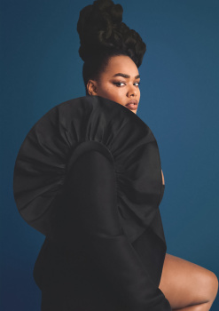
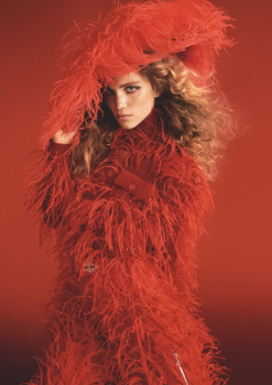
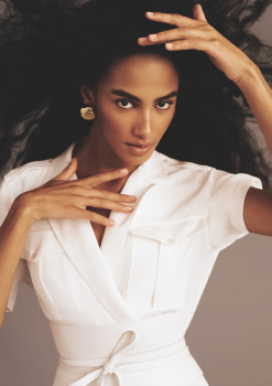
UK Vogue November 2021 : Adele by Steven Meisel

Of course, you're right! I guess I was just surprised at Marc covering his face, considering his vanity and all:lol::rolleyes:.
He recently got a facelift, so this shoot might have been taken while his face was still puffy from it.
 
This could potentially be one of British Vogue best ever issue !!! Just WOWWW: from the cover + to the cover story + to every editorial = magic and high fashion:
- great models,
- great photographers,
- great styling, hair, makeup,
- good layouts,
Everything feels complete and we see FASHIONNN in a fashion magazine lol I almost forgot Vogue could still do it without bringing theatrics and influencers and so on lol.
I was not one of Edward's biggest supporters but with this issue he gave me hope.
 
extremely solid content I like all of the editorials.

thank you @Zorka for your hardwork :flower:
 
You know, I can’t help but see that Edward is blatantly, ruthlessly positioning himself and his Vogue to be the undisputed lead of all European Vogues (and eventually all Vogues). It’s such a power move: He’s already the one editor to rule them all. And already diminishing Italia with rejected B-roll stories and C-list casting. And god knows how he will treat Paris now that Emmanuelle’s left. He won’t let any of the European Vogues to have a chance to outshine his. Emmanuelle’s last contribution with the October retrospect is such masterclass of reminding everyone just how powerful Paris before Edward will undoubtably diminish it as he has with Italia.

This issue: Meisel’s take on Adelle is predictably pretty enough. If anyone is going to shoot her as a suicide-blonde bombshell, then it may as well be him. But as others have mentioned, it’s just same old same old Meisel-template. Alastair’s covershot of Adele resembling Maria Callas is more striking and unexpectedly creative— too bad the rest of that story is so Talbot’s catalogue.

The only strong story here is M&M’s “The Heiress”. Kristen brings such a mood and such reference that always goes beyond a mere fashion statement: She lives a character and this is her story. It also looks and feels so out of place— and above the others’ shiny happy shallow stories. And in that instance, M&M easily outperformed both Meisel’s stories (,..which doesn’t seem that hard these days…).

(Please, Phaidon Press and Fabien Baron— a 400+ page tome of Kristen’s shoots that spans over her 30 years of work needs to be produced. This woman is the industry’s best kept lethal weapon.)
 
I am in LOVE with this issue. Although we don’t see Meisel as much as we use to, it’s still a pleasure to see his work. He deserves to retire, but I’m grateful he’s still around to make contributions to the industry. Mert & Marcus’ “Heiress” edit, while ridiculously good, seems to be an homage to Meisel’s past work. Absolutely no complaints here.
 
I just realized they stopped putting the price of the clothing on the editorial pages..
 
When I saw the cover I commented to some friends that Adele vaguely referred me to Doutzen, maybe because they are blonde, have blue eyes... Now I saw the editorial and it reminded me of Doutzen's first cover editorial for Vogue Italia, has the same team and the same Avedon style!
 
I finally got round to my issue today and I really enjoyed my first flick through it. I have to get my complaining out of the way first though and say how mad I am that subscriber's have been sent that blurry, poorly composed cover photo and the newsstand gets the GLORIOUS shot in the yellow dress. I really resent having to go out and buy another copy, but in this case I have to - the subscriber cover just doesn't cut it. Having said that I, once again, need to moan about the main cover's layout. It feels like the designers think to themselves "where's the worst place we could possibly put the coverlines?" and then go right ahead and put them there - why is the Adele line shoved down in the corner like that?! The whole point of magazine cover design is to create harmony between the text and imagery, their layout choices make it seem like they're embarrassed to have to include type on there in the first place.

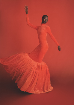
Anyway (complaints aside), the main cover shot is sublime and the story inside is just fabulous. Classic Meisel and I love it, I'll never ever get bored of seeing this type of shoot. It's such a thrill to see Adele lensed by him, I was not expecting that at all. The rest of the issue is really nice - the shot of the red Balenciaga dress against the red backdrop in Up All Night is gorgeous! Anna's story is quite pretty, and the portrait of Saoirse in the cream turtle neck from her feature would have made a lovely November cover had they not landed Adele. I love the M&M story, despite it being them doing their best Meisel-for-Vogue-Italia impression, and it's great to see Kristen again - she's such a star. I can't wait to go back and give it some proper time and attention. The Marc x Meisel shoot is decent enough: there are some cool silhouttes and patterns that make for some striking shots.

So on the whole it's a really solid issue, much better than September I would say. It's such a pleasant surprise for a celebrity cover feature to have a fairly lengthy editorial in this day and age; it sure beats 1 cover photo and only 3 shots inside.
 
Flicking through it online while I wait for my - disappointingly blurry - subscribers cover to turn up, I also liked the issue. If UK Vogue had produced issues like this most of the months since Edward took over as editor - circumstances permitting - then I'd feel very differently about the magazine. And it doesn't seek to lecture you, it just gets on with the job of presenting fashion to you on its pages, with a variety of faces and places, letting that speak for itself.
 
It’s a great issue.
I feel like it’s a longtime coming from Edward to finally give a fashion issue for Vogue UK. All I see is fashion and it’s well executed.

I love the cover, I love the portraits of Meisel but I do not love the full ed. I think the Vogue US ed Is actually far more superior to the Meisel ed.

I think the styling in the full shots is a bit weird and kind of clash with the overall aspect of the portraits.

L’Avventura is cute even if i think they could have done something more aspirational in terms of styling and story telling. The Gucci suit shot is fabulous but feels disjointed to the rest of the story.

Marc’s ed is great. It’s a pity they didn’t choose to highlight a UK designer/brand tho.

Kristen is insane! I wish the styling was even more eccentric! The references to Carlyne are great but I wish Benjamin went really crazy!

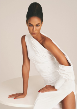
UP all Night! That last shot of the girl wearing the Ralph Lauren white outfit is fabulous! Beyond! Very beautiful and so effortless!

A very great issue! I’m not sure we would have this grace of having a pure fashion issue again but this is well done.
 
I like more McMenamy's ed than the cover and its story. It's the first time that I prefer the non Meisel shoot on a Meisel issue.
 
Hard pass. Same old derivative drivel.

What happened to editors and photographers with mind-blowing sense of style, razor sharp visual wit, zeroing in on THAT detail. Elevating the simplest look to breath-taking, unexpected heights?

Hint, the same ol photographic tropes, flowing, blowing mane and fluttering scarf isn’t it.

Anyone else pick up on the Tina Turner x Avedon reference/copy paste in Adele’s Meisel shoot? Except Tina’s expressions in the Avedon shoot were visceral, conveying such immense power and control. Adele just looks uneasy, queesy, uncertain why she’s making these funny faces.

The rest of the eds are instantly forgettable, and embarrassingly try hard; the art department trying to take mediocre, lukewarm imagery and turn them into artistic statements when there’s zero originality or joy to elevate.

Great photography requires no art direction, (look at any Avedon photo) but these days the photos are so devoid of life, art directors desperately try to inject life in post rather than collaborating in the moment to capture greatness as it unfolds in front of the lens.
 
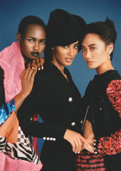
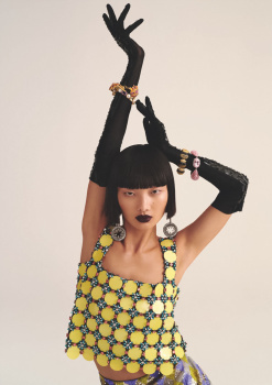
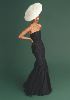
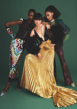
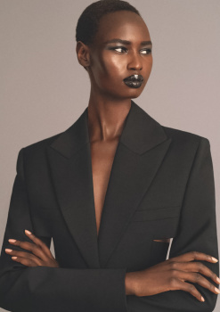
UP ALL NIGHT (Textless)
Photography: Rasharn Agyemang
Styling: Kate Phlean
Hair: Shiori Takahashi
Make-up: Loten Holmqvist
Models: Nyarach Abouch Ayuel, Ash Foo, Precious Lee, Rebeca Longendyke, Sacha Quenby, Joan Smalls & Mao Xiaoxing


UK Vogue Digital Edition
 
I never thought I'd see the day, but with this godforsaken Vogue issue, Meisel has disappointed me big time. The Adele debacle is an unprecedented mix of Disneyfication on the cover and second-hand embarrassment in the editorial. Like the proverbial deer caught in the headlights, Adele seems unable to react to the camera in front of her, adopting a sometimes frozen, sometimes panicked expression that is nothing short of comical. It is hard to see such a talented artist looking so hopelessly out of place. What's worse, Meisel didn't even seem to care. I could say this is him at his worst, but in fact, it's more like Meisel being a parody of Meisel. As for his Marc editorial, it reminds me of Oliviero Toscani for Benetton. I'm seriously in uncharted territory here.

Then, of course, Kristen shows up and I forget all about that.
 
Small thing, but interesting to note: I picked up the newsstand cover yesterday and the price printed on the front is £4.99, but the price printed on my subscription copy of the same issue is £3.99. Has anyone ever noticed this before?
 

Users who are viewing this thread

New Posts

Forum Statistics

Threads
212,873
Messages
15,201,865
Members
86,910
Latest member
Olmeca
Back
Top