Benn98
Well-Known Member
- Joined
- Aug 6, 2014
- Messages
- 42,582
- Reaction score
- 20,756
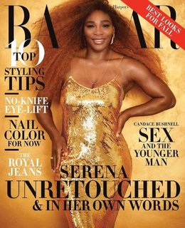
Why do her features look so pronounced??? Her facial features, her back muscles, the arms.
And yes, I know what she looks like. These covers are unflattering, sorry. The garish backdrop on the first one, but pale colours of her bathing suit? The second one is somewhat better, but the pose looks photoshopped.
It looks like they'll never be able to top the Marion Jones cover, without a doubt the best way an athlete has been depicted in a fashion magazine. Because they didn't make her look bionic!