mint condish
Active Member
- Joined
- Dec 19, 2005
- Messages
- 2,554
- Reaction score
- 3
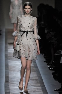
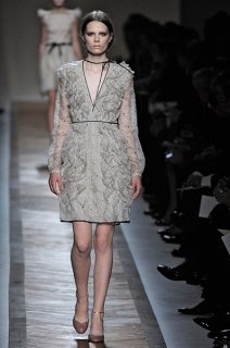
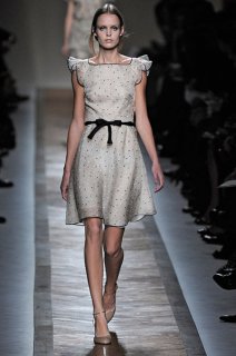
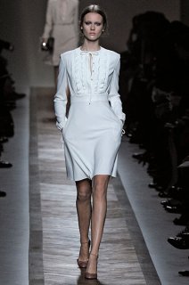
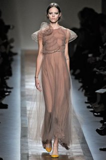
I actually really liked it! So, so, so pretty!
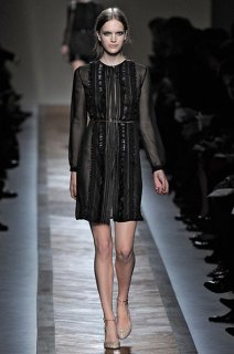
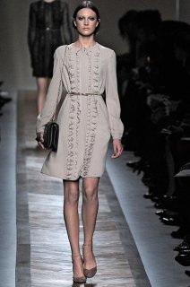
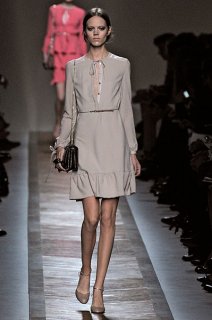
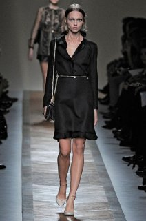
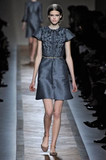
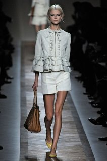
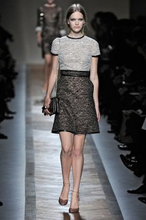
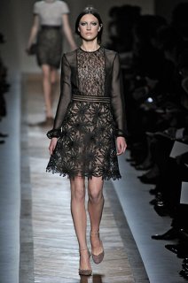
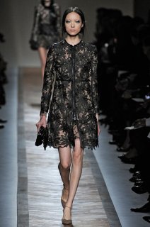
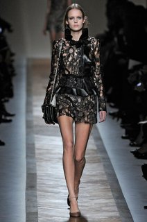
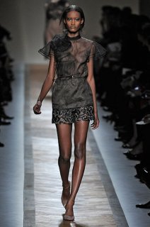
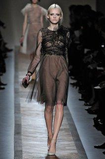
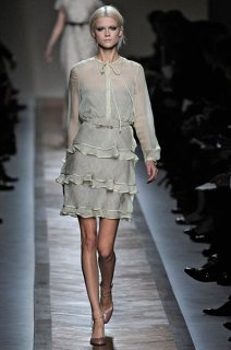
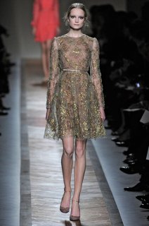
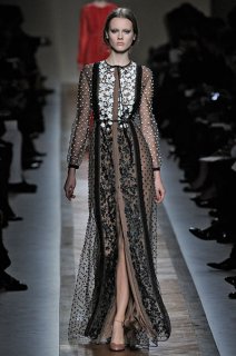
It looks like the rejects from last season's collection. This collection lacks luxury and that Valentino lustre.

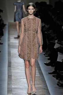
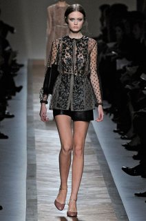
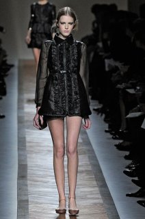
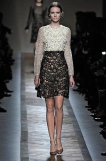
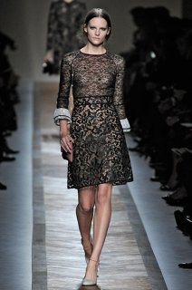
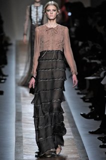
Also, is it just me, or does the finish on the pieces look a lot more luxurious? It looks much more thought out than in previous seasons. Perhaps they are slowly learning to apply couture finishes to their ready-to-wear?


I'm appreciating it much more after seeing detailed shots. It looks pretty and luxurious.
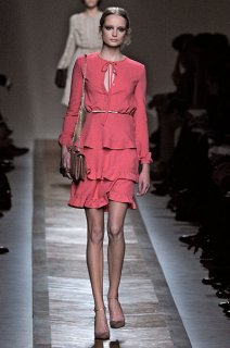
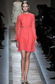
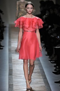
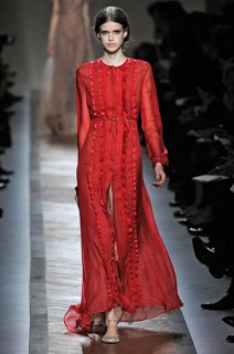
But it still lacks that certain something, that passion. The red should have been bold and strong, not so pale and flat. I don't know what to think really.
I agreeThe red should have been bold and strong, not so pale and flat