You are using an out of date browser. It may not display this or other websites correctly.
You should upgrade or use an alternative browser.
You should upgrade or use an alternative browser.
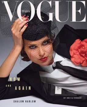
Vogue Italia December 2018 : Shalom Harlow by Inez van Lamsweerde & Vinoodh Matadin
- Thread starter vogue28
- Start date
helmutnotdead
Well-Known Member
- Joined
- Jan 29, 2018
- Messages
- 1,779
- Reaction score
- 4,331
try to convince me that this is Shalom.
Nymphaea
Well-Known Member
- Joined
- Oct 30, 2012
- Messages
- 6,196
- Reaction score
- 689
There is a disconnection between the hair/make up/hat and the clothes. All that grey is swallowing her. Love the nails, they are for me the focal point of this cover. An average cover.
That label, ugh! All about money.
That label, ugh! All about money.

Perickles
Well-Known Member
- Joined
- Apr 4, 2010
- Messages
- 2,361
- Reaction score
- 964
I'm fed up with the 90's models and that hat is hideous. It almost looks like Dazed's cover with Lila Moss. I don't like Celine's label. It's too obvious that they are being sold. They are making themselves look affordable and accessible.
phungnam96
Well-Known Member
- Joined
- Jul 7, 2011
- Messages
- 1,126
- Reaction score
- 759
This magazine is dead. Can we ignore it from now on?
Miss Dalloway
Well-Known Member
- Joined
- Mar 3, 2006
- Messages
- 25,704
- Reaction score
- 997
I LOVE this, there is something so 80s Helmut Newton for VP about this cover, it's just perfect antidote to all the indie crap we are seeing lately. It will look even better in print.
Similar Threads
- Replies
- 30
- Views
- 7K
- Replies
- 106
- Views
- 30K
- Replies
- 45
- Views
- 11K
Users who are viewing this thread
Total: 2 (members: 0, guests: 2)


