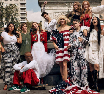
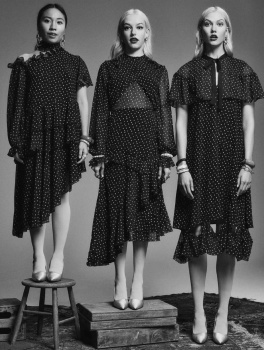
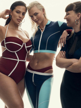
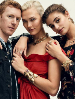
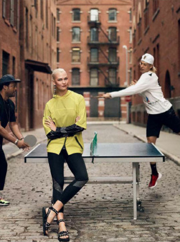
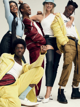
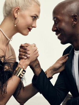
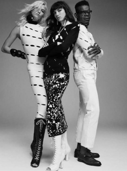
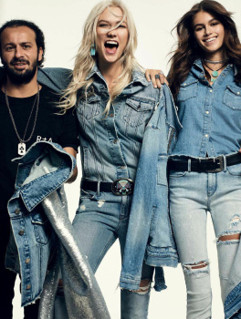
Maybe I’m just tired of superduper-serious, art-school student pretentious, dour, gormless expressions and forced poses that’s being hailed as some new wave that’s infested so many other publications, but this particular issue is actually refreshing with an effortless glow (and I don’t mean just the saturated color-correction of the images).
And I don’t mean it’s anything visionary nor the brand of high fashion that I find inspiring— just that besides Daisy looking so gorgeous despite wearing such an ugly dress for the cover, that brand of commercial, energizing, smiling faces that’s so typical of classic, cheerleading Americana simply works in this instance. I even like the Raquel edit with the seamless set against the cooly, weekend-at-the-lakeside-cottage backdrop: Sure, it shouldn’t work since that beautiful lake is obscured by the seamless— but it works here in a playful fashion...
There’s a lightness, joy and this unity of people that simply flows. It all still looks like a high-end department store catalogue in the end… just better. Good enough for American Vogue to stand out as refreshing this time.
