Having just flipped through this issue, I think it's probably clearer than ever that US Vogue has lost it's lustre. I should've known by the high stacks in the bookstore that this issue wasn't worth it. Yes it's been some time coming to be honest, but I'm just amazed at how hollow it is. There's no excitement or any image that make you go 'wow.' Maybe it's due to the sujects not being up my alley? Anna's banging on and on about Germanotta and Karlie in her editor's letter, but I'm not buying. Then there's Stormy. And if that's not enough, drivel in the form of longform text that is the food feature on eggs.
A mediocre puff piece about Margiela's new fragrance, and here not even the Leibovitz shot is anything to write home about, and maybe the Duckworth and Columba stories are vaguely interesting. It's just not enough. I don't know who this magazine is aimed at. Too politically mature for millenials, yet too immature in fashion content to appeal to anyone over 45+. I suppose this is what happens when you want everyone to be your audience.
How can she repair all this? Firstly, narrow down VLife! It's unnecessarily lengthy, and definitely make it more visual. It's way too heavy on text. Also, by visual I mean actual images. Leave the paintings for W and illustrations for Glamour. This is Vogue, there's no need for glamour to be that intellectualised. It looks out of place next to the cheesy Peter Thomas Roth and Disney ad campaigns. And while you're at it, brainstorm a new title because VLife sounds a lot like the title of an insurance scheme.
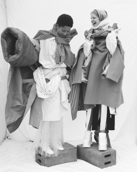
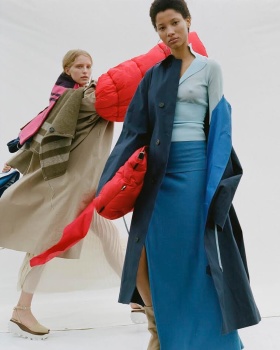
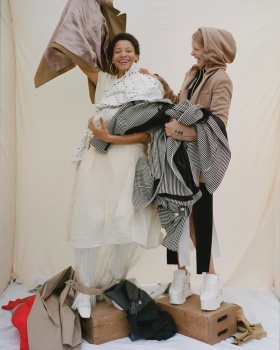
Sharpen you editor's eye! For many years Anna had a knack for balance of editorial styles. With this issue it clearly failed her. Stylistically speaking, the three fashion edits are too alike. While I did sympathise with Lucinda when she was so abruptly sacked, I can still admit that she's not a great fit for US Vogue. The problem is that she's doing precisely what she did at British Vogue. Cluttered layering in a dour setting! What makes it worse is this time around it's right next to equally dour images of Hawkesworth and Nickerson doing a lighter version of that. Once you exclude that gleaming shot of the model in glitter, with the sunlight shining through the window. Flip past a few more pages and you'll find Wetherell playing at being Demarchelier in a story styled by Bickham. While not another piling edit, the colourful styling doesn't quite set it apart from the former two. Where's that one 'to the point' filler edit styled by Bruno, just to lighten things up and offer some variety?
That same editor's eye should be applied to the photographer casting.
Pay your advertising department a surprise visit because all these cheap ads are slowly ruining Vogue's prestige. We all know L'oreal is a big spender, and I can somehow deal with Maybelline thrown in to amp up your income. But adding Garnier, Ponds, Neutrogena to it all cheapens the magazine to Cosmo level. I'm amazed at the lack of hf fashion campaigns in this issue.


")
