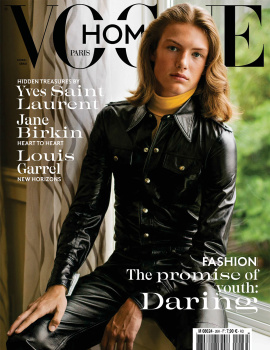
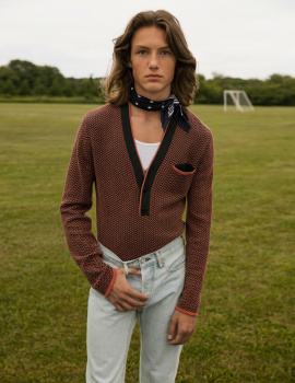
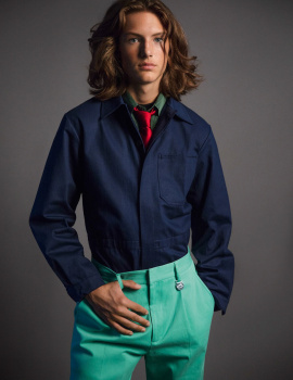
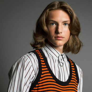
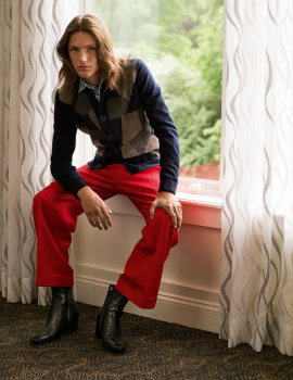
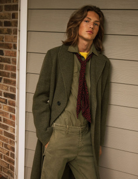
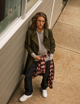
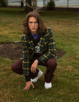
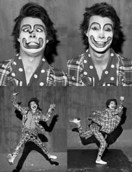
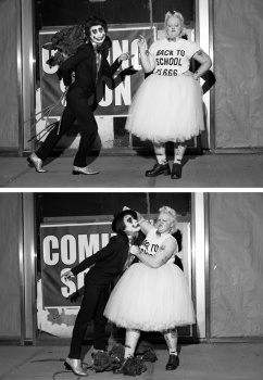
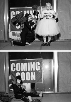
Except for a Lindbergh story that adds a much needed dose of romance and skilled lighting, the rest are forgettable, miserable, and gloomily shot edits. It’s like they all wanted to channel youths in Northern English towns where the weather is forever overcast, grey and every day is like Sunday: Come Armageddon come come nuclear bomb… OMG— how is a French publication diseased with that awful aesthetic that’s plagued all the once-great men’s publications like Arena Homme Plus and Another Man…???? Miserable miserable miserable photography and styling throughout this issue ...Just trash. Sigh…
(And the most obnoxious layout that has no sense of hierarchy and flow-- forcing my eyes to go cross, with the most annoying typeface.)


")