It is interesting to read your comment. Despite I'm a big fan of Linda, I also feel sometimes that her expressions fall below expectations, lack inspiration and life. This is valid both for her early work and current pictures, but more frequent in her work by Meisel. This is even more surprising that there are editorials where she is a true actress... I'm tempted to say she just delivers the expressions that she was asked to deliver.
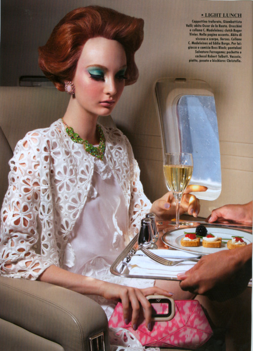
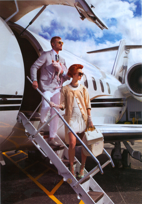
This May 2012 Vogue IT editorial reminds of another "Linda and the boys" that is totally different and where Linda is "facially" perfectly tuned with the atmosphere :
She was the kind of dame...
Moreover, I've noticed that Linda is more often the target of this critism than other models, but if you compare, let's say Kate Moss' empty glaze and Christy Turlington's social smile, they are equally poor delivers. So maybe Linda's features just don't allow neutrality.


 , esp the first shot is gorg, love the blue streaks in her hair, cant wait to see the complete edit.