-
Share with us... Your Best & Worst Collections of F/W 2025.26
You are using an out of date browser. It may not display this or other websites correctly.
You should upgrade or use an alternative browser.
You should upgrade or use an alternative browser.
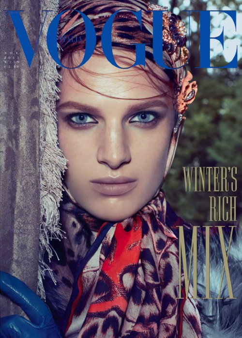
Vogue Italia November 2023 : Anna Ewers by Bruno Staub
- Thread starter vogue28
- Start date
Phuel
Well-Known Member
- Joined
- Feb 18, 2010
- Messages
- 5,886
- Reaction score
- 9,491
Scott Schulman street photography circa2007 is now as good as Vogue Italia gets LOL ..Even more hilarious— and/or pathetic is that it actually took a team to conjure these random InstaGallery shots for the coverstory.
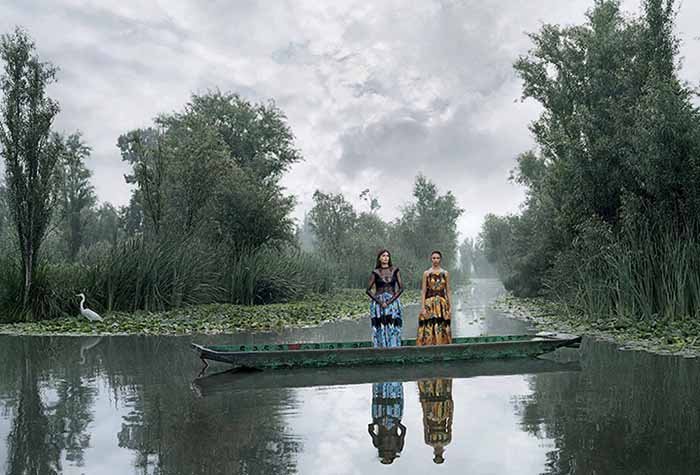
Vogue Italia resembles the aesthetic of a Neiman Marcus or Saks on 5th outlet warehouse— where there’re plenty of bluechip brands on display, but the sensibility is just so highly discount looking that it just blends into the consumer brands right next to it. The only stronge image in this issue that bares teh faintest trace of Vogue Italia is the one of Mexican actresses Celeste Romero and Aneken Zaldivar by Emmanuel Lubezki’s “Il Paese delle Leggende” (…looks a tad on the digital-composite side, but I'll take it…

Vogue Italia resembles the aesthetic of a Neiman Marcus or Saks on 5th outlet warehouse— where there’re plenty of bluechip brands on display, but the sensibility is just so highly discount looking that it just blends into the consumer brands right next to it. The only stronge image in this issue that bares teh faintest trace of Vogue Italia is the one of Mexican actresses Celeste Romero and Aneken Zaldivar by Emmanuel Lubezki’s “Il Paese delle Leggende” (…looks a tad on the digital-composite side, but I'll take it…


fauxfashion
Well-Known Member
- Joined
- Oct 11, 2023
- Messages
- 793
- Reaction score
- 2,590
that"What a waste of a great opportunity! Anna Ewers (the same goes with the clothes/brands) deserves *MUCH* better than this washed out Juergen Teller wannabe."

the ed it literally pedestrian

Abby Zacky
Active Member
- Joined
- Jul 30, 2020
- Messages
- 136
- Reaction score
- 65
Oh no, poor Anna
tigerrouge
Well-Known Member
- Joined
- Feb 25, 2005
- Messages
- 18,493
- Reaction score
- 8,636
My digital copy is showing 204 pages. The Archive page looks back at the Meisel cover of June 2011 with Tara Lynn, Candice Huffine and Robyn Lawley. In general, the front of Vogue Italia (and España) can be quite lively, with a lot of content.
When you flick through five different Vogues yet see the same editorials again and again (which weren't even that good in the first place), it becomes apparent that the life force of these editions is hiding in the 'throwaway' features at the front.
Anyhow, what reprints do we have this month... after Anna Ewer's cover story, there's a reprint of the Mexico City shoot by Emmanuel Lubezki (the longer version), a reprint of Larissa Hofmann's shoot with Lila Moss, a reprint of the recent Vogue France cover story with Malika and Ikram, then potentially an original accessories editorial shot by Hedi Stanton... and that's it.
D
Deleted member 141523
Guest
I relate Bruno with men's fashion editorials. He's really good working with male models. But anyway, the cover isn't bad or a disaster to me. It's just simple.
D
Deleted member 141523
Guest
blueorchid
you soft and only
- Joined
- Apr 4, 2009
- Messages
- 13,026
- Reaction score
- 13,671
I don't even remember that Ashleigh Good cover, lol.
D
Deleted member 141523
Guest
2013 was such a great year for VI. This one and Vanessa's cover are classics.
FiveEasyPieces
Well-Known Member
- Joined
- Jul 30, 2020
- Messages
- 245
- Reaction score
- 393
Since the cover and story are supposed to be representative of Anna’s character, I think it’s authenticity works but I do sympathise with people who want to see more grandiose editorial concepts and styling.
I do wonder if these more organic and stripped back editorials are a response to 2010s/2020s excess, like 90s minimalism following the lurid 80s.
I do wonder if these more organic and stripped back editorials are a response to 2010s/2020s excess, like 90s minimalism following the lurid 80s.
D
Deleted member 141523
Guest
Multiple things; as response of the Trump years, the pandemic, the crisis of print media and how that impact to the budget to make a fashion magazine now.Since the cover and story are supposed to be representative of Anna’s character, I think it’s authenticity works but I do sympathise with people who want to see more grandiose editorial concepts and styling.
I do wonder if these more organic and stripped back editorials are a response to 2010s/2020s excess, like 90s minimalism following the lurid 80s.
Xone
Well-Known Member
- Joined
- Sep 1, 2004
- Messages
- 4,916
- Reaction score
- 3,952
it's already on newsstands since tuesday...When is this issue appearing on newsstands in Italy? Or is the issue already on sale?
MModa
Well-Known Member
- Joined
- Oct 19, 2023
- Messages
- 1,119
- Reaction score
- 1,269
Thank you. As I write this, I still do not see a single copy for sale on ebay :/it's already on newsstands since tuesday...
- Joined
- Jul 14, 2017
- Messages
- 14,667
- Reaction score
- 21,256
Since the cover and story are supposed to be representative of Anna’s character, I think it’s authenticity works but I do sympathise with people who want to see more grandiose editorial concepts and styling.
I do wonder if these more organic and stripped back editorials are a response to 2010s/2020s excess, like 90s minimalism following the lurid 80s.
Nah, it doesn't even have to be grandiose but something has to be elevated so that the photos don't look like social media rejects. I personally think this looks terrible. There's maybe one image that I like, two if I'm generous. Since we usually tend to compare everything in this magazine to Meisel's work, the first thing that comes to my mind is one of my favourite editorials from 1992, Shana Zadrick's Basic Story from the May issue. It strips Shana of her usual glamorous vamp look and offers refreshing simplicity without losing the elements of good style and cool - neither of which are present here, unfortunately. Sometimes authenticity simply isn't a good look.
D
Deleted member 141523
Guest
Oh, those early years of VI. Yes! Meisel started to be more avant garde in the mid 90s, but back then the stories by Joe McKenna (and sometimes Lori Goldstein and Carlyne) were more simple or casual.Nah, it doesn't even have to be grandiose but something has to be elevated so that the photos don't look like social media rejects. I personally think this looks terrible. There's maybe one image that I like, two if I'm generous. Since we usually tend to compare everything in this magazine to Meisel's work, the first thing that comes to my mind is one of my favourite editorials from 1992, Shana Zadrick's Basic Story from the May issue. It strips Shana of her usual glamorous vamp look and offers refreshing simplicity without losing the elements of good style and cool - neither of which are present here, unfortunately. Sometimes authenticity simply isn't a good look.
Similar Threads
- Replies
- 154
- Views
- 51K
- Replies
- 97
- Views
- 47K
D
- Replies
- 12
- Views
- 3K
Users who are viewing this thread
Total: 1 (members: 0, guests: 1)


