You are using an out of date browser. It may not display this or other websites correctly.
You should upgrade or use an alternative browser.
You should upgrade or use an alternative browser.
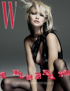
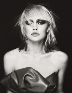
W Volume #8 : Gigi Hadid by Mert Alas & Marcus Piggott
- Thread starter vogue28
- Start date
liv4beauty
Active Member
- Joined
- Jul 21, 2005
- Messages
- 458
- Reaction score
- 80
She looks like a 40 year old actress. That hair doesn’t suit her.
tigerrouge
don't look down
- Joined
- Feb 25, 2005
- Messages
- 18,308
- Reaction score
- 8,128
Gigi needs a holiday more than she needs to celebrate one, from the look of that shot.
Benn98
Well-Known Member
- Joined
- Aug 6, 2014
- Messages
- 42,530
- Reaction score
- 20,571
Smh! Magazines are dropping like flies at CN but W can still afford to book a high-priced model and photographer. So much for all that talk about belt-tightening. Why couldn't this have been shot by an up-and-coming photographer? Maybe it's part of Tonchi's plan to run this magazine in such debt that he can swoop in and buy it for a meager pittance.
Because despite all the parties involved it looks atrocious. Framing andof styling of the shot is too cold for a festive cover, hair colour doesn't suit her, and the art direction is the final nail in the coffin.
Because despite all the parties involved it looks atrocious. Framing andof styling of the shot is too cold for a festive cover, hair colour doesn't suit her, and the art direction is the final nail in the coffin.
TaylorBinque
Well-Known Member
- Joined
- Apr 4, 2010
- Messages
- 2,876
- Reaction score
- 1,138
I forgot W still exists. I didn't expect this cover to be good. But this is worse than my expectation.
VogueGirl8910
Well-Known Member
- Joined
- Apr 14, 2008
- Messages
- 50,021
- Reaction score
- 8,416
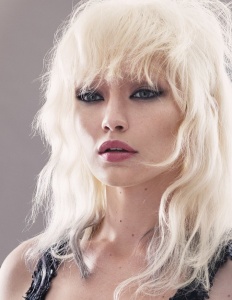
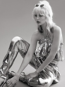
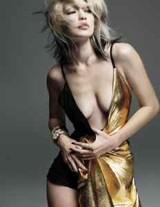
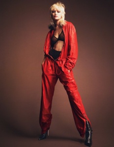
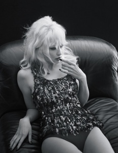
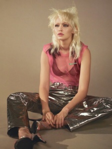
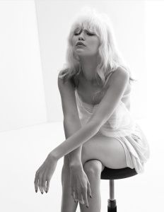
The cover is bland on the holidays season, but see the editorial on the mag's web is way better, because Gigi channels Debbie Harry & the last pic could be an perfect y striking image for the cover.
The editorial
Gigi Hadid Transforms Into Debbie Harry, Queen of Punk
The editorial
Gigi Hadid Transforms Into Debbie Harry, Queen of Punk
D
Deleted member 130879
Guest
Kill it with fire. Stop this mess of a magazine.
- Joined
- Sep 27, 2010
- Messages
- 18,693
- Reaction score
- 3,027
Is it me or did they try to make her look like Kate Moss?
I through the Debbie Harry inspiration was quite clear?
I think she pulls this off quite well. Love the ed. Very Carine's VP
badgalcrush
Well-Known Member
- Joined
- Mar 2, 2017
- Messages
- 728
- Reaction score
- 378
I think Gigi looks great here , not the usual side of her we used to see and that how it should be
The layout is a mess but these days we can't ask for much
The layout is a mess but these days we can't ask for much
djowodjo30
Well-Known Member
- Joined
- Mar 5, 2011
- Messages
- 445
- Reaction score
- 173
She looks more like Dolly Parton than Debbie Harry.
Similar Threads
- Replies
- 154
- Views
- 50K
- Replies
- 4
- Views
- 2K
- Replies
- 77
- Views
- 17K
- Replies
- 410
- Views
- 124K
- Replies
- 5
- Views
- 3K
Users who are viewing this thread
Total: 2 (members: 0, guests: 2)


