You are using an out of date browser. It may not display this or other websites correctly.
You should upgrade or use an alternative browser.
You should upgrade or use an alternative browser.
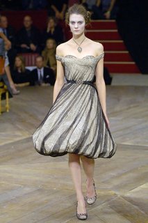
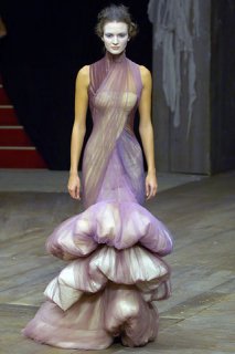
Alexander McQueen S/S 2007 Paris
- Thread starter deeth
- Start date
the bowler hat dress is so pretty!! my favorite
really like the pant suit outfits...but just a couple dresses
most of the dresses are alright
i like his fw collection better though...in terms of dresses...last collection was great
i see another "bride wore black"
really like the pant suit outfits...but just a couple dresses
most of the dresses are alright
i like his fw collection better though...in terms of dresses...last collection was great
i see another "bride wore black"
longlegsue
Active Member
- Joined
- Mar 28, 2004
- Messages
- 1,260
- Reaction score
- 1
Wow. . .this collection literally made me gasp out loud from the first pic. 
I would love to pick apart his brain. . such creative genius!

I would love to pick apart his brain. . such creative genius!
csmboy said:....Same old.....blah blah blah.....zzz
This seems rather harsh. The sheer technical execution of this is jawdropping, so I can't see how anyone can justifiably call it boring.
At first look, it did seem rather anachronistic to me--both because it's such a spectacle, and because there are an overwhelming number of historical/personal references.
But looking at it again, a few things really stand out:
--I love the way he transposed what are traditionally ornaments (birds/flowers) into the fabric and structure of the pieces....not the first time it's been done for sure, but beautifully done, nevertheless.
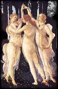
--I *love* the gauzey, transparent fabrics over the white shapes--reminds me of fluttering drapery on greek sculptures and in botticelli paintings. The trapped petals are lovely too....movement and stillness at the same time.
Also liked the body padding, but I haven't figured out a good reason yet.

{style.com & spaceandmotion.com}
Attachments
I have not been so inspired by a collection in so long...its like the emotion when hearing your favorite melancholy bittersweet song...
so gothic, dark, cartoonish, distorted but beautiful at the same time... in the right proportion to each other . Its the feeling you get when you see the beauty and pain in the world rolled into one.
so gothic, dark, cartoonish, distorted but beautiful at the same time... in the right proportion to each other . Its the feeling you get when you see the beauty and pain in the world rolled into one.
shoe_addict
Member
- Joined
- Jul 23, 2005
- Messages
- 315
- Reaction score
- 0
One word: WOW!
Just gorgeous!
Just gorgeous!
mnis said:hqcb.net
Only a couple
Those sheer white dresses with the embroidery are so ethereal. Exquisite. I must say, though, I do not like the super wide hips/shoulders look. It takes away from the designs in my opinion
It is like Mr. Galliano would be giving lessons to McQueen
the collection is so Galliano, but it doesnt is of course
and It is ok, just that it doesnt work for me now!!!
maybe several, several, years ago...
the collection is so Galliano, but it doesnt is of course
and It is ok, just that it doesnt work for me now!!!
maybe several, several, years ago...
Last edited by a moderator:
lmelanie
Active Member
- Joined
- Jul 3, 2005
- Messages
- 3,014
- Reaction score
- 15
Manuva said:Incredible collection.
Probably my favourite from all the Fashion Weeks so far.
I agree!!


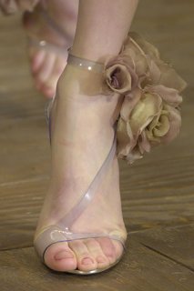
cavanaugh said:favorite shoes of the season...
/quote]
those are amazing!
*AndoraStar*
Day Dreaming
- Joined
- Jun 20, 2002
- Messages
- 10,795
- Reaction score
- 1
now this is art!
ultramarine
chaos reigns
- Joined
- Jan 7, 2003
- Messages
- 6,436
- Reaction score
- 68
Yimi said:It is like Mr. Galliano would be giving lessons to McQueen
the collection is so Galliano, but it doesnt is of course
and It is ok, just that it doesnt work for me now!!!
maybe several, several, years ago...
Should I dye my hair blonde or am I the only one who does NOT understand this post ... at all.
agreed... it's just breathtaking!Pastry said:you know when a collection is good when you start tearing up a little bit...
now I have died and gone to heaven.


cuppycakes
Active Member
- Joined
- Feb 7, 2006
- Messages
- 1,056
- Reaction score
- 1
This is nice
dizzytacks
Active Member
- Joined
- Jul 29, 2005
- Messages
- 1,774
- Reaction score
- 0
i am quite an emotional person (lately, dont ask)haha but anyway this was it for me...
Similar Threads
- Replies
- 38
- Views
- 9K
- Replies
- 71
- Views
- 17K
- Replies
- 55
- Views
- 11K
- Replies
- 48
- Views
- 9K
- Replies
- 60
- Views
- 18K
Users who are viewing this thread
Total: 3 (members: 0, guests: 3)
New Posts
-
-
U la Repubblica November 27, 2025 : Parker van Noord by Ethan James Green (5 Viewers)
- Latest: Kimy Jo
-
-


