Gucci S/S 2009 : Abbey Lee, Lily, Natasha by Inez & Vinoodh

I guess I'm just being an unreasonable, disgusting misogynist by expecting that a female model have discernible breasts of some sort.

Not that I don't appreciate your attempt to twist my observation of the fact that she has no breasts whatsoever into some affront to all womankind.

That's exactly how your comment came off to me, I'm not 'twisting' anything. I'm no feminist, trust me. And considering this is high fashion, I don't see why you're surprised by the fact they haven't used push ups. I just found it uncalled for, no ones calling you a misogynist.
 
I understand that's how you took it, but I think it was even more uncalled for for you to question the point I was making in such a sarcastic and potentially argumentative way.
 
Although this is definitely one of the better images from this campaign:D what's with all the hippieish, floaty arm movements they've employed in this and the last campaign:huh: Surely they aren't gonna make them do this in every subsequent campaign.:unsure:
 
i think the last one is awful lol, i like the colour scheme, but the girls definately do not look their best at all...lily and abbey look like they're trying to cast spells
 
:wub: Natasha outshines in this campaign, but the dress she is wearing looks cheap with the slit.
thanks for posting surrealseven
 
Gorgeous new shot I ve been waiting for one with the finale dresses, the colors are so striking and they look great:heart:
 
^^ I think Natasha's side is better too. I like this shot the best, nicest colors!
 
I agree, this blue one is the best one....and one more for Abbey's side of the pic :lol:
 
Natasha's side of the shot :shock: hands down..
 
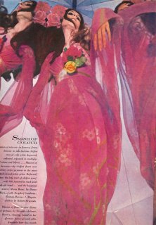
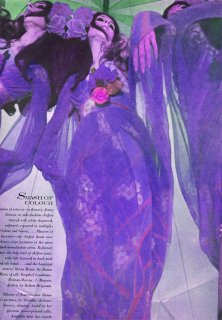
Btw, browzing through an old mag of mine - American Vogue March 1st 1969, I found an editorial by Delarrain, that I think must have served as inspiration for this campaign....?:wink:
 

Attachments

  • american_vogue_march_1_1969__delarrain1sm.jpg
    american_vogue_march_1_1969__delarrain1sm.jpg
    419.5 KB · Views: 16
  • fun.jpg
    fun.jpg
    424.4 KB · Views: 16
Last edited by a moderator:
I can defiantly see the resemblance ^_^
 
^ I think these ads are trying to replicate that whole era in fashion. Needless to say the original is much better.

But I will admit, I do like Abbey in that last shot with the blue gowns. It's entirely out of place given how generic the setting and clothes are, but in a darker context that pose and expression on her face could be amazing. She looks bewitching.

Besides that it's just the most interesting thing about the photo.
 
Kind of boring.
Though I do like the blue/red contrast with the green.

But jungle has so been done by Gucci before, no?
They all seem the same anyway. I suppose that echoes the clothes.
 

Users who are viewing this thread

Forum Statistics

Threads
212,602
Messages
15,190,717
Members
86,506
Latest member
pegaso
Back
Top
monitoring_string = "058526dd2635cb6818386bfd373b82a4"
<-- Admiral -->