Playing with fruit is a dangerous thing. Just as mass market branding picks up on fruit because it's of a distinct form and colour and so easily recalled - Apple, Orange - so the lazy eye in the age of the twitter snap judgment will fall to rest on the most simplistic association.
Just as that YSL collection wasn't 'about' strawberries, so this one isn't 'about' bananas. But it's an association you may well get landed with. The strawberry collection, the banana collection. It's how we end up coming to label and recall it because it's easy and simple to do so.
I can't agree with you Mike that there isn't any, at least engagement, with minimalism or 70's in this collection. Whether one comes to read the references as played with a straight bat or rather a playful deconstruction by way of dialogue is the interesting question but the references are definitely there.
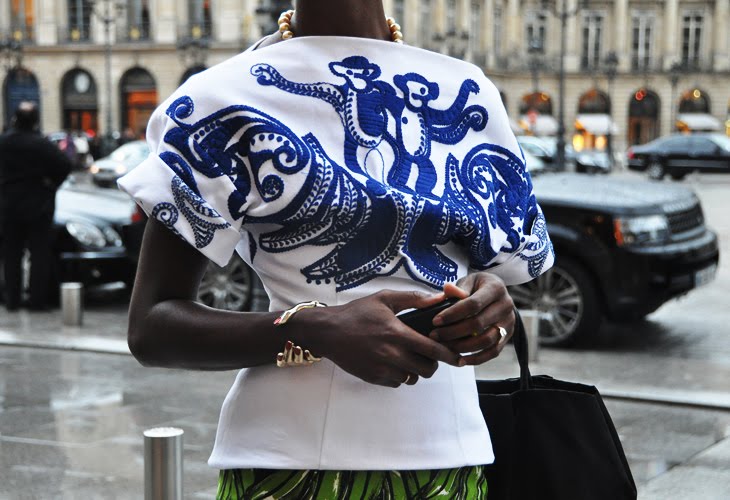
That opening section for instance - clearly minimalist silhouettes almost borrowed from somewhere in Costa's recent history but then on first reception the bright palette seems to subvert the association. (Then you see Jil Sander and it's almost as if Raf turned the subversion on it's head by adopting it and made the first section look like it could have been part of the Sander show - clever)
And all that Bolero and Iberian influence kind of feels 70's doesn't it.
For me what this collection is about is this play of extreme contrasts, a sort of instant deconstruction. You bring a motif then you immediately subvert it with it's opposite. Minimalism - brights; strictness - fruitiness; childlike joy via cartoon prints - sombre death via funereal looks; and so on.
And you're left with a void, nothing solid, everything in flux, reversable in upon itself, a disconnect of broken signifiers and a mirror held up.
That all of that might be lost on most observers as it gets labeled and remembered as the 'banana collection' is sort of delightfully on point.