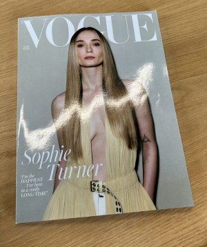
UK Vogue June 2024 : Sophie Turner by Mikael Jansson

This is a poorly cropped image of a person who is the "happiest" they've been for ages, despite looking miserable as sin, because women smiling on the front of magazines is problematic - none of which is helped by the anaemic colour scheme, and that belt flopping about at the bottom of the shot.
 
Drab, lifeless and a complete non-event of a cover. Chioma Nnadi's British Vogue has, so far, left me massively underwhelmed. Three issues in and I am 99.9% certain I will be cancelling my subscription come December...
With Edward's UK Vgoue, there was always at least one or two original fashion editorials shot by David Sims or others. Always looked forward to such edits and looks like I will miss them.
 
Surprised this is by Mikael, it’s horrible. I haven’t even read last month’s issue yet because that cover is just so bad and this isn’t much better. It looks very very cheap and it’s hard to read the text too.
 
Since the new EIC this magazine still look the same from Edward. Do we have any graphic design changes inside? More writing content? Anything new???
 
I like this. I like her. Interview is quite raw. Good for her to stand up for herself and her kids!

To spice it up, a snippet from the interview:

On why she wanted to leave America with their kids

She shared that the gun epidemic was one reason she wanted to move their kids to the UK.

“I couldn’t fathom being a mother of one of those children knowing that this was something your country could fix, that they’d rather have rights to guns than give kids a right to life,” she shared. “Meanwhile, women in the US are being stripped of their rights, left, right and centre. It all contributed to this feeling of I have to get out, I have to get out.”

(vogue.co.uk)
 
Since the new EIC this magazine still look the same from Edward. Do we have any graphic design changes inside? More writing content? Anything new???
It has more writing content from what I've noticed so far. It has the exact layout and regular features from Edward's Vogue.

This month is their wellness issue with an article about healing from stroke, an article about the effects of water therapy, [separate] editorials with Vivien Solari and Jill Kortleve , and a reprint of Kendall Jenner's
US Vogue cover story by Mert and Marcus.
 
Vivien Solari is for the win, always ❤ Sophie looks gorgeous, but the colours and the mood are so dry.
 
Since the new EIC this magazine still look the same from Edward. Do we have any graphic design changes inside? More writing content? Anything new???
What I commented about last month's issue:

In terms of the sum total of the contents, it's becoming a better woman's magazine. Edward's formula was to have a headline-generating cover shoot, but the rest of the content often felt like winds blowing through an empty courtyard, like everything else wasn't a priority at all, it was just scaffolding for the main event.

In the main fashion section, alongside the stories seen above, don't forget there are the two repeated Meisel stories, which help to elevate the this section. For a May issue, the amount of editorial content isn't bad.

But in terms of being a fashion magazine, is any Vogue providing what it used to deliver? If you want to see style or elegance or experimentation, various editions of Bazaar have stepped up to fill that space.


I can't say I'm fond of the way the cover is often announced on Insta more than a week before anyone sees an actual print copy - by the time you're reading it, it feels like old news, like an afterthought. Maybe two or three days beforehand would sustain the excitement, but if I'm having to wait until next week, I'm going back to sleep.
 
The subscriber cover from Chioma Nnadi's Instagram:
IMG_20240516_000018.jpg
 
The word 'British' doesn't tend to appear on any of the issues printed for circulation within the UK, whether they be newsstand or subscriber. I think it's only for export copies.
 
I despise that ‘British’ in the O. Years ago it made an appearance on my subscription copy and I was so disproportionately annoyed by it. It was Arizona Muse’s cover back in 2012, and I would’ve forked out the money to buy an unblemished newsstand issue but I hated that cover and couldn’t justify spending another £4 on it. Now I think of it as a little quirk in my collection.
 
Last edited:
The word 'British' doesn't tend to appear on any of the issues printed for circulation within the UK, whether they be newsstand or subscriber. I think it's only for export copies.
Yup. Everytime I buy copies directly from UK, the word British does not exist on the cover + there's minimal text on the prices beside the masthead compared to the copies I receive from Singapore and Malaysia.
 
@LastNight, I love to hear about other collector's pet peeves! Mine are fold-outs!
I prefer magazine covers being a single page attached to the spine.
I can tolerate inner fold outs (where the cover is regularly attached to the spine and the ad continues from the right side of the cover page), but when the cover floats in the air being attached to the rest of the magazine via the fold-out is so iritating. It usually gets damaged quickly and wants to fall off. I don't like keeping such magazines.
 
We can see that after the change of the Global Creative Director, both UK and US started work again with Jansson and Mert
 

Users who are viewing this thread

New Posts

Forum Statistics

Threads
212,438
Messages
15,184,772
Members
86,272
Latest member
SirKingsley
Back
Top
monitoring_string = "058526dd2635cb6818386bfd373b82a4"
<-- Admiral -->